I'm not sure when the first instance of "airbrushing" first appeared on a baseball card.
However, I do know that it's been fairly prevalent in the cardboard universe in the last half-century or so. While the way card companies "update" their cards has varied over the years (as you'll soon see), the reasoning behind it has always been the same.
In some cases, a team moves or simply adopts new uniforms. The main reason "airbrushing" is needed, however, is due to an offseason trade or free agent signing.
Since card companies usually don't have the chance to snap a shot of the player in his new duds, they have to resort to "airbrushing" in order to update the everyday collector on the whereabouts of their favorite athletes.
Sounds simple enough, right?
Actually...no. Card companies have used many different ways and means of "airbrushing" since its inception.
The following are the ones I'm aware of. Perhaps there's some others that I have yet to see first-hand.
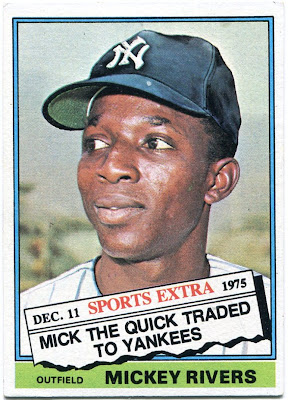
The most common method is actually painting the new hat and uniform on the player. While the famous Yankee cap and pinstripes have been applied well on the above Mickey Rivers card, there are some instances that might end up in a horror movie one of these days.
I always wondered who exactly Topps hired to do these airbrush jobs. Did they hire a professional artist to paint Yankees and Dodgers logos? Or did they just say "draw this" to some random employee at the company?
I still don't have a good answer for that one.
In some cases, the former logo on a player's hat will be blacked out, with nothing airbrushed onto it.
The result is a black blob that ends up sitting on some poor ballplayer's head. I especially enjoy this one, which I recently became aware of thanks to a recent post by everyone's favorite blogger.
I'm still trying to figure out for certain whether or not the sleeves of "Tony C" have been airbrushed on his '71 Topps issue.
If the top of this card didn't say "Angels", I'd have no idea what team Conigliaro played for in 1971.
Isn't that the exact opposite of what airbrushing tries to accomplish?
Then we have the famous "up the nostrils" shot that defined many of the cards of the 1970's.
I always thought that it had to have been disconcerting for a ballplayer to pose for a picture like this. The only reason for a shot like this is if the player would happen to be traded at some point.
I bet the players were aware of that as well.
Minimal airbrushing is needed for cards of this sort. Only Bernie Carbo's uniform needs "fixing" in this case. (Perhaps the brim of his cap as well.)
That is one mean 'stache, though.
The last method of '60s and '70s cardboard doesn't even involve any physical "airbrushing", but it ways a way to "update" collectors on their favorite players.
It's also the one that required the least amount of effort on the part of card companies.
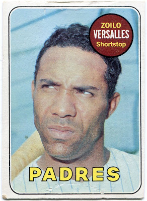
The "no hat" pose.
"If a guy's not wearing a hat, then he could be on any team we want", said Topps. (A paraphrase of something that I'm sure was said at Topps headquarters in the '60s.)
Zoilo Versalles doesn't look to happy about it either.
Airbrushing is still widespread in today's era of baseball cards, although it has taken on a new moniker.
Photoshopping.
It's not done by hand anymore. Computers do all the work. In some cases, they look decent. Besides the fact that the letters on Cliff Lee's uniform look a bit squished, it's pretty believable.
But then again...
...there's still room for improvement.
Overall, the "photoshopping" on this card isn't too bad. But there is one major flaw, as I noticed after I first pulled this card.
The Dodgers have never had red numbers on the back of their uniforms. You'd think someone at Topps would've caught that. (More on that issue here.)
Maybe photoshop is overrated.
If you're not a fan of either, perhaps you're someone who enjoys the "Now with..." type of update, as shown on the above Jody Davis card.
If you are, then I take it you're probably not a fan of Topps Update nowadays.
Personally, I enjoy the "vintage" way of airbrushing. I like the idea of someone physically painting the logo onto the card. It has a more personal feel to it. Plus, I kind of like the quirkiness behind some of the shots.
So, now for the million-dollar question.
Which do you like better, airbrushing or photoshopping?


3 comments:
I'm generally old school since I'm generally old, but in this case I'm for the photoshop method. Most of the airbrushing was bad if not laughable. It was what it was given the technology of the time I guess. As you pointed out Topps can still get sloppy but in general the cards look better. And you don't have to have no hats and no logos. I still don't get why Topps put out cards like the 1969 Zoilo though. The Secretary of State people in Chicago do a better job with license photos than that, even on Elston Ave. I mean, c'mon.
As Hackenbush said the old school airbrushing tends to be bad and laughable. Photoshop is the current way to photo edit so just as long as Topps and the other companies have good graphics departments with good photoshop software I think that is the way to go from now on if it has to be done at all.
Many of the 2012 photoshops for the Miami Marlins uniforms were done well from the cards I've seen and have.
Of course also some of the reasons for blank hats airbrushing back in the 60s and 70s was that Topps and the other card companies didn't have the copyrights/agreements with the leagues for team logos and uniforms for some of those years.
As a kid I never noticed or really paid any attention to the airbrushing except for a few football cards where the logo was missing and the airbrushing was very obvious. I wondered why at the time but didn't really pursue the questions. Eventually time told me the answer.
I don't pay any attention to it. I knew it was done but never gave it a second thought. (or third, 4th, however many some others do)
http://nightowlcards.blogspot.com/2009/06/continuing-case-of-disappearing-umpire.html
http://nightowlcards.blogspot.com/2009/06/which-is-bigger-lie.html
Post a Comment