Monday, October 30, 2017

Through a hurricane and into my mailbox


I worked out my first trade with Hunter H. of the relatively new "Braves Country Cards" blog a while back.

Hunter's blog looks to be dormant for now, a hiatus I hope is only temporary since he put together an all-star package to send my way. But perhaps even more notable than any of the cards I received was the route they took to get to me -- specifically via an email I received from Hunter a few days after we'd worked out the trade, apologizing for a slight delay in shipping with the following:

We're in a tropical storm down here...so I may not be able to make a trip [to the post office] in the next day or two, but I will try soon as possible.

Hunter lives down south, and that tropical storm he referenced was actually friggin' Hurricane Harvey. The guy walked through the aftermath of perhaps the most destructive natural event of my lifetime to mail cards out to me.

I feel like that could be a premise for a somber black-and-white art film or something.


In addition to the Zobrist -- a former Dime Box Dozen need -- came these two goodies, including another check in my snail-like quest to get all the throwback SPs from 2015 Update.


A quartet of fun Opening Day insert needs, although I must say I'm disgusted by the idea of Cracker Jack and Mac & Cheese on a hot dog.

My god, aren't ballpark dogs heavenly enough?


Also thrown into the storm was this Josh Reddick A&G mini, a guy whose presence is a major reason why I'm rooting for the Astros in the World Series.


Thanks to Hunter, these four player collections just got a bit shinier.


Also present was a Heritage SP of Anthony Rizzo that would've cost me an arm and a leg where I live, and an Ichiro which seems like an tiny atom in the 12,569-card universe that is 2008 Topps Moments & Milestones (no, that's not a typo).


Hunter made sure to take care of my two largest player collections with Ichiro and Vlad.

But he also added a new Mark Grace to my binders -- a thrill even if it is icky Diamondback Mark Grace -- which I'm fairly sure is my third-largest collection though I can't say for sure (further reason to actually go through and total up my player collections one of these days).


Finally, Hunter closed up shop with a rare feat: he found a new HOYT!

This (I think) is something called a Green Crystal Shard parallel from 2013 Panini Cooperstown. Attach all the unnecessary adjectives in the world to it, Panini: all I care about is that it's a Hoyt I didn't already have.

And once again, since I'm still not quite sure I believe it: Hunter walked through the dying breath of Hurricane Harvey to send this supreme mix of cardboard to me.

To say I'm flattered would be an understatement.

Saturday, October 28, 2017

Top Five: Justin Verlander


I'm not sure there's a person on this earth I envy more than Justin Verlander.

Dude's been one of the best pitchers in the game during most of my baseball-watching life. He's won a Cy Young. He's won an MVP. He's thrown two no-hitters. He's engaged to Kate Upton. He just got traded from a team going nowhere to a team with a dazzlingly bright future. He's pitching in the World Series right now. And did I mention Kate Upton?

On top of all that, Verlander has been treated kindly by card companies during his career, which makes him a prime candidate for today's Top Five post.


#5 -- 2005 Topps #677 Justin Verlander RC

I'm not sure what my first Verlander card was, but there's a good chance this might've been it.

As is the case with most rookies I pull, I had no idea who this Verlander fellow was back when this one fell out of a pack I opened over a decade ago. It didn't take long for him to become a household name. Drafted in 2004, he'd make his big-league debut the very next year and win 17 games in '06, his first full season.

Judging from that smile, maybe Verlander knew big things were in his future.


#4 -- 2008 Upper Deck #394 Justin Verlander SH

As I mentioned earlier, Verlander has thrown two no-hitters, and both have been well-chronicled in the world of baseball cards.

His first -- spun against the Brewers on June 12, 2007 -- is documented on this gem from Upper Deck in the form of a good old ink-and-print newspaper Verlander appears to have just signed for a fan. (Note the lottery numbers and weekly weather forecast as well.)

Plenty of cards have borrowed designs from newspapers in the past, but how many can say they feature an actual newspaper?


#3 -- 2012 Topps #639b Justin Verlander SP

This neat photo-variation SP is the only card I own to honor both of Verlander's no-nos.

It's also one of the extreme few Flagship short-prints I've ever found in a dime box.


#2 -- 2012 Topps "1987 Minis" #TM-55 Justin Verlander

Need I explain why this card is so great?


#1 -- 2008 UD Masterpieces #32 Justin Verlander

Perhaps the biggest tragedy of Upper Deck's baseball card demise is the fact that we didn't get to see more of UD Masterpieces.

Even a decade later, the brand still gets talked about on a frequent basis, a legacy even more improbable considering it only lasted two years. This Verlander is one of the scores of, well, masterpieces included in those legendary checklists, using a scoreboard capture of the final pitch he'd throw in his first no-hitter as the backdrop for what remains one of the most aesthetically pleasing cards in my collection.

An easy choice for our generation's Luckiest Man on the Face of the Earth.

Wednesday, October 25, 2017

The base card middle finger


There are few more frustrating feelings in this hobby than having a simple base card elude you for a long period of time.

My collection revolves around base cards, so I find it especially stress-inducing when such seemingly simple acquisitions pass me by. Seeing such a gap in my binders is like having the baseball card equivalent of a middle finger waved in my face.

And if a player I collect has the (mis)fortune of being included as a short-print in a Heritage checklist, well you can just about kiss that one goodbye, because Heritage SPs seem to immediately fall off the face of the earth. But thanks to Kerry of "Cards on Cards" fame, that short-print number fell by one when he offered up a spare copy of this Lindor SP from this year's Heritage.

I quickly pounced on it because I had the feeling I'd probably never see it again if I didn't.


But as has been the case with all the trades I've made with Kerry, he packaged the Lindor with a healthy stack of other friends.

These two represent perhaps an even more stressful version of The Base Card Middle Finger: owning parallels of a given card without the base version. While I've gotten more patient with my collection over the years, this is a frustration that has never quite faded.

Both of these are currently sitting all alone in my Royals binder -- the Heritage Hosmer being a short-print, of course -- waiting for the day they'll be joined by their base card spouses.


More non-base of guys I collect, although I'm happy to report that I did already own the standard Bowman version of that Arenado.


From my own experience, early-decade Flagship rookies of bigger names have become increasingly harder to find these days, so I'm ecstatic when I have people like Kerry graciously send them to me out of the blue.


Obscure-brand '90s base also suffers from the aforementioned Off the Face of the Earth syndrome, so kudos to Kerry for sending me a Pinnacle Inside (who remembers that brand?) Vlad that likely never would've ended up in my collection otherwise.

Also, am I the only person who seems to like the green-bordered GQ parallels more than the base cards?


A couple more for the player collections.

The Machado is a sly fox trying to disguise itself as a simple base card -- it's actually a Factory Set rookie variant from 2013 Topps (though I do own his standard rookie as well, thankfully).


Purply parallels!

But fact is seeing that Bumgarner fall out of Kerry's stack paradoxically caused both excitement and despair. Excitement because colorful refractors are always welcome in Dime Boxedonia, but despair because in the saga of The Base Card Middle Finger, that specific Mad-Bum is pretty much the coup-de-grace.

Seriously, I've found multiple variants of that one with ease without the boring old base card ever presenting itself.

But unbeknownst to me, a surprise was waiting just few cards later in Kerry's stack...


THE BASE CARD!

Even with all the terrific inserts and parallels Kerry added to my binders, this -- an ordinary, common base card -- was by far my favorite thing he sent me because of the immense weight it lifted off my shoulders.


For the record: I had the mini, red parallel, emerald parallel, orange refractor, purple refractor, and Opening Day Toys 'R' Us purple parallel(!) of this one before I tracked down the run-of-the-mill base card.

I don't exactly know how that happened, but at least now I can show off this beautiful binder page without that Base Card Middle Finger being constantly waved in my face.

Tuesday, October 24, 2017

Topps Update sucks


I wish to god the title of this post was nothing more than clickbait, a scathing-yet-empty lead designed for the sheer purpose of getting you to look at this blog.

But unfortunately it's no joke, and there's really no way around it: 2017 Topps Update just kinda sucks. This is very painful for me to say -- and worse yet, mean -- because I've been a staunch supporter of Update for as long as I've been collecting baseball cards.

As usual, I had high hopes going into this year. Unfortunately, things got off on the wrong foot: I somewhat bungled what is supposed to be my favorite time of the cardboard year -- which may have been an omen of things to come.

I've bought a box of Update almost every year in the past decade to celebrate its release. This time, in an effort to save a few bucks, I bought from a relatively new Ebay seller...only to discover that he's shipping the box via media mail, which means that it'll take a while to get here. Shame on me for not doing my research. (But to make a bad situation worse, I discovered that the box was just shipped today despite the fact that I ordered it weeks ago.)

So I was left in that fuzzy middle ground of itching to get my hands on Update with a box already on the way, albeit slowly.


And that's how I ended up going to two Targets and a Wal-Mart (sigh) in search of Update this weekend, only to have it finally materialize at the second of the two Targets.

In the hype, I bought two hanger boxes, a rack pack, and three loose packs of the stuff -- the rack pack and three loose packs were the last in stock, in fact, because someone apparently had already pillaged most of the Update before I got there.


When I opened the packs, however, something just didn't seem quite right -- Update didn't feel like Update anymore.

Sure, the All-Stars are still there, although the photos are collectively much more boring than the ones we've seen the last couple years.


There's the standard-if-not-repetitive Rookie Debut subset, which I kind of like because of its throwback to the Topps Debut box sets of the early '90s.

Only problem is that most of this year's Rookie Debuts feature guys who actually broke into the bigs in late 2016, which led to discrepancies like Yoan Moncada appearing with two different teams in this year's Update.

Maybe it's just me, but guys that debuted in 2016 have no business being in 2017 Topps Update.


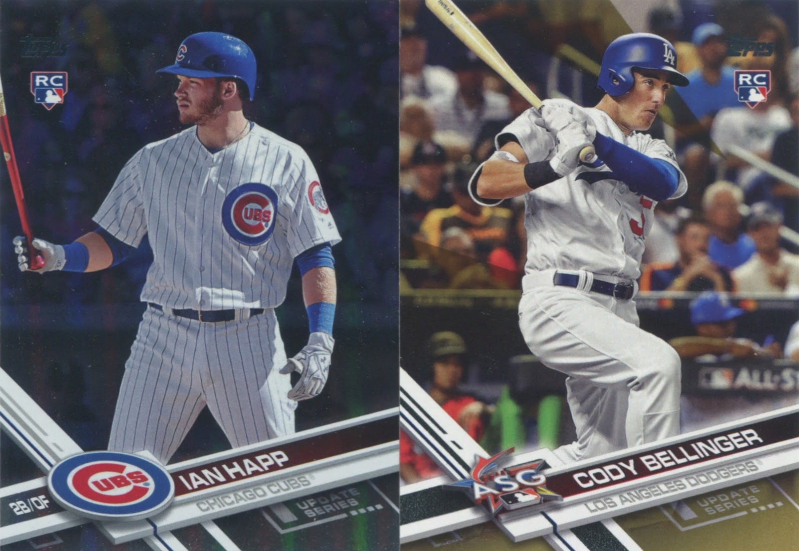
Sure, you'll find a few fun cards spread out throughout the checklist, like these two.


But most troubling is the fact that 2017 Update doesn't feel like it's actually updating anything.

The reason I've loved Update so much in the past is because it's often our first glimpses of guys involved in Trade Deadline deals in their new duds. Almost none of those are found in this year's set: nothing of Jay Bruce as an Indian, no cards of Todd Frazier and/or Sonny Gray as Yankees, no Jonathan Lucroy as a Rockie, etc., etc.

Perhaps even more scary is that one of the few deadline blockbusters to actually appear in Update is Yu Darvish as a Dodger...which the braintrust at Topps decided to relegate to being one of the ten million short-prints in this year's set (more on those later).

So let me get this straight, Topps: you're treating a guy in an updated uniform -- in a set called Topps Update, mind you -- as some kind of outside-the-norm novelty designed to be coveted and chased at a premium price? All while Cody Bellinger and Aaron Judge have SEVEN different base cards in this year's checklist alone (four Bellingers, three Judges)?

What the hell is wrong with you?!


Oh sure, I had little trinkets of fun opening my packs, because there are still minor pleasures to be found in Update.

I've kind of cooled on my quest to complete this year's MLB Network insert set, but I'll certainly take this one...for obvious reasons.


The '87s and Salute inserts return in Update, and I'm at least glad to see that -- if for no other reason than I seem to be the only person who actually likes the Salutes.


Not much to say about any of these.


Parades and baseball cards don't often clash, which is why I'm a big fan of these retail-only Postseason Celebrations inserts, a set I'll probably try to build as time goes on.


I can't much complain about the parallels I pulled, either: Happ (rainbow foil) and Bellinger (gold) are among the most coveted rookies in this year's Update.


But this year's Update just has me feeling empty and malnourished, like a dinner of crackers and cheese sticks.

This emptiness comes from the fact that Topps has made the brand into something almost completely and utterly pointless. And maybe you think Update crossed into this pointless territory long ago. But not for me, if for nothing else than the sheer fact that Update still actually updated collectors in past years, allowed us new rookies and first glimpses of the big Trade Deadline deals in their new wardrobes.

Instead, this year's big hulabaloo is the fact that the photo-variation SPs are much easier to pull -- my loose packs listed them as 1:4, and a whopping five of them fell out of my retail packs alone.


And even though I've long been a begrudging fan of photo SPs, it seems like Topps put a whole lot of effort into something that didn't need fixing in the first place.

Even worse is that they did this while ignoring (and even omitting) many of the cornerstones that make the release of Update such a premier date on the calendar each passing year. Was pulling a Bellinger SP kinda fun? Sure. Are cards of guys signing autographs cool? Definitely.

Are legend SPs brilliant? Of course.


And is this one of the best baseball cards I've ever seen? You bet. (Though, for full disclosure, I didn't pull this one: I actually bought it off Ebay a few days prior.)

But none of these newfangled bells and whistles are necessary, especially when they push aside so many of the nooks and crannies that have made Update exciting for me in the past. I don't need Eddie Murray SPs -- but if you're going to call your set Topps Update, I sure as hell am gonna need my first cards of Pat Neshek with the Rockies.

I'm not even sure I can call it laziness, because it certainly seems like Topps put a good deal of effort and brainpower into certain parts of the set...simply the wrong ones. Update's new look feels like a conscious decision on Topps' part and not one born out of simple obliviousness -- that's what makes it all the more scary to me, to think that the Update I've come to know and love is being willfully yanked out from under my feet.

I was tempted to title this post "RIP Topps Update," but I thought better of it. Fact is, I refrain from a now-and-forever denouncement of Update because I'm hoping this is a one-time deal, a simple misstep. It happens. Hopefully Topps gets it together in time to get everything back on track for 2018. Hopefully Update doesn't become a brand that advertises excitement without actually providing any. Hopefully Update doesn't fade into just another half-assed set.

What I'm most afraid of is that this is what Topps Update will permanently become: a mere shell of its former self, a schizophrenic set that fails to deliver on the upfront promise of its own name.

Wednesday, October 11, 2017

Here we come...


Music and baseball have been my two loves for as long as I can remember.

While I haven't devoted a ton of time to music in the history of this blog, make no mistake: it's just as big of a passion for me as baseball. And that's why I get all giddy inside when someone like Bert of "Swing and A Pop-Up" fame decides to send me a whole bunch of music-related stuff -- specifically, Monkees cards.

The Monkees are just such a strange story. A group of four strangers -- Mike Nesmith, Davy Jones, Peter Tork, and Micky Dolenz -- put together for the sole purpose of starring in a TV comedy about a struggling band, only for their show to become wildly successful and leave them unhappy about lack of musical control, which in turn led them to completely break free from the tube and actually become a real band.

It's still a massive shame they aren't in the Rock 'n' Roll Hall of Fame.


The Monkees have long played a starring role in my life.

They were a favorite of mine when I was a wee lad, fell almost completely off my map during my late childhood/adolescence, only to enjoy a massive renaissance in my life in recent years after stumbling upon a few late-night cable reruns not long ago. These days, they receive more air time on my bus/train commutes than almost any other band out there.

In some ways, I guess I was destined to become a Monkees fan: I've mentioned it before, but my dad missed his one chance to see Mike Nesmith in concert because my mom was heavily pregnant with me at the time.

I'd be born just days later.


One of my pipe dreams has been to assemble a master set of Monkees cards.

They were issued in both 1966 and '67 -- printed by a little-known brand called Donruss well before they'd break into the baseball market -- and all the ones Bert sent come from the latter checklist. While I've never put a ton of concerted effort into chasing the set, I scoop them up at card shows when I can (and will always take extras anyone might have lying around).

And now I'll shut up and let the Monkees do the rest of the talking tonight.


Tuesday, October 10, 2017

Tell me how to feel about Topps Fire


Even with my efforts to keep tabs on the current hobby, some juicy developments still manage to completely pass me by.

Last week, I saw a post on Twitter that said something along the lines of Look for 2017 Topps Fire at your Target today! And my first reaction was, honestly: What the hell is Topps Fire?!

Topps Fire is, as I quickly learned, a new Topps set, and the first (as far as I can remember) sold exclusively in Target stores. It's an extension of last year's Topps Update insert series of the same name -- the only example I can recall of an entire brand blossoming from a past insert set -- and carries a $5.99 price tag for a 12-card rack pack.

Despite the hefty price and my relative apathy for images I'd seen around the 'net, I still found myself purchasing a couple rack packs and a blaster of Topps Fire this weekend.


It's a good thing I did, because from the looks of it, Topps Fire seems to have, well...caught fire.

I had to make a Target run today, in fact, and found that they'd completely sold out of the product in the three days since my original purchase. Standard blasters are selling for $10-15 more than their $20 retail price online, and even the standard base/inserts are commanding inflated prices.

All this makes me glad I pulled an Aaron Judge from my packs, because I seriously doubt I'd be able to reel one in at anything near an affordable price otherwise.


It's been three days since I originally bought these packs, flipped through the cards within those packs at least half-dozen times by now -- and I still don't know how I feel about them.

I can't remember having such a back-and-forth feeling with a product before. On the one hand, they are colorful, and the ones I've placed in my binders provide a spectacular pop to a nine-pocket page. I'm not sure the scans do them justice -- it's a design that needs to be seen in-hand to be fully appreciated, I think.

On the other hand, man are these things loud: the photos are yawners, the backgrounds are obliterated, and every card seems to seemingly depict a player trying to escape a natural disaster.


And try as I might, I can't find any kind of cohesion to the subdesigns apart from semi-team coordinated color schemes: the lightning bolts, octagonal frames, bolded names, etc. seem to be thrown around at random.

But although the big-name legends are the same as you'll see in most other sets (though the Tony Perez sighting is a nice change of pace), Topps Fire does provide a different, modern look at some of these overdone stars.


But the backs suck.


But the parallels are so darn awesome!

This, in a nutshell, is how I feel about Topps Fire. This is cool! But I don't like that. But how great is THIS?! But that doesn't seem right. And this, but that.

Perpetually.


But seriously, the parallels: wow do they pop and sizzle, and what I said before about the cards needing to be seen in-hand goes double for these.

But again, the negative: there's just so many of them to the point where I don't even know what I have. And that just has the feeling of overkill. The Strasburg (numbered to 199) and Jones (/25) were the only numbered cards I received in my breaks, and I think those are emerald and magenta parallels, respectively.

The Heyward was the only notable name I pulled from my blaster-exclusive pack of four Gold Minted parallels. I'm guessing the Arenado and Abreu are Blue Chip parallels, found only in rack packs. And the Schwarber appears to be your standard Flame parallel.

Whew.


And then there's the inserts, which themselves have parallel variations.

The theme of the Golden Grabs series pretty much speaks for itself, and my blue parallel of this insert -- does it get more modern than pulling a parallel of an insert? -- makes Andrew Benintendi look vaguely like an evolving Pokemon.


Now these I like: the Monikers series features famous nicknames on a graffitied background, and I pulled two of the greatest with "The Wizard" and "Mr. October."

And better yet, The Spaceman(!) earned a place in this set, and I already went ahead and purchased a copy, of course.


Last but not least are the Walk It Off inserts, another design I like due to the comic-book-esque vibe I seem to get from them.

Though I don't know if Topps Fire is completely necessary -- it almost strikes me as a more expensive version of Topps Bunt -- I do appreciate Topps giving us something new and at least kinda original. And while I'm not sure how I feel about cards being exclusive to certain retail chains in the first place, it makes me feel lucky to have something like this around when I live right across the street from a Target.

And there we go again with the and/but thing -- god, even the peripheral details here make me all conflicted and mixed-up inside. I feel like examining this set any closer will lead down a dark path that ends with me questioning my life choices.

So tell me how to feel about Topps Fire.