
I wasn't even going to bother with 2015 Archives after the constant disappointments of years past.
But after reading about 892 different posts about it over the last week, I must admit that all you bloggers out there got me a little intrigued. So, when Dad and I walked into Target this afternoon, I was getting a little giddy about sampling the stuff.
We walked out with a blaster (my first blaster of any product in at least a year), and it seems to me that the money should be distributed amongst the blogosphere instead of funneling to Topps or my local Target. Who needs high-paid advertisers when the blogs are around? (Sometimes I think Topps should pay us.)
As I've already hinted at, Archives hasn't been very high on my radar. The original incarnation of the brand in 2001-02 is fantastic, but the more recent editions have simply been too hit-and-miss for me to care much. Aside from Opening Day, Archives is the brand with the most missed potential in this hobby, I think.
I was hoping this blaster would finally prove me wrong.

We might as well get it out of the way now.
I pulled a Will Ferrell card. And, in terms of my personal taste, it was a nearly perfect fit. I would've preferred to get either the Cubs or White Sox issues, but I can't complain much about this one.
The A's are my favorite non-Chicago ballclub, and '65 Topps is the greatest design in the history of baseball cards.

And, hey, Topps even nailed the backs.
They even included Ferrell's complete "career" stats, which was a nice touch.
Admittedly, like so much else of what Topps puts out these days, these are quite gimmicky. Each pack practically screams COLLECT ALL 10 WILL FERRELL CARDS!!!!!!! at you.
Gimmick or not, I do like this idea. I'll make a halfhearted attempt to build the 10-card set if anyone has any extras available, cause I ain't shelling out the 5-10 bucks per that they're currently selling for on the 'Bay. And don't even get me started on the crazy four-figure autographs.
That escalated quickly.

But that's enough about Will Ferrell for now.
Let's move on to the actual base cards. In the past, Archives has featured four different classic designs in the base set. Topps trimmed it down to just three this year, which, while slightly disappointing, isn't a huge deal.
I must say that, on the aggregate, the featured sets in 2015 Archives are the brand's best yet. Each of the three (1957, 1976, 1983) were Top 20 picks in my all-time Topps countdown earlier this year.
In terms of design, though, this year's '57s don't exactly do a great job of honoring the real deals. The colors are all off and the spacing between the team name and positions isn't even close. On top of that, 2015 Archives fails to list the entire team names on the front (N.Y. Yankees vs. Yankees).
This wasn't exactly a promising start.

The other two designs are almost exactly spot-on.
The font is just a tad off on the '76s, and the 2015s read "Outfielder" rather than the "Outfield" seen on the originals. Still, the colors are a near-perfect match, as are the little shadow figures in the bottom-left.
Shame Topps couldn't get a shot of Springer in those Technicolor jerseys.
Now that would've been staying true to form.

The '83s are probably the most consistent with the original design.
The Outfield/Outfielder discrepancy is still present, but you won't find many other faults here. Colors, inset photos, name plates, all pretty much the same.
Yes, there's the trademark thing, but I'm sick of talking about that by now.

While the '57s won't win any awards in the design department, the photos are by far the best in the set.
These serene shots actually feel like authentic '50s poses, which is really all I can ask from a throwback set like Archives.

I'm also glad that Topps actually took some time out of their day to snap Spring Training photos of guys in their new duds.
As you probably know by now, they've gone the lazy photoshopping route far too many times now.

Hey, this blaster even convinced me to start collecting a couple new guys.
Sometimes, all it takes is a single card from a pack to get me wondering Why don't I collect him yet?, and that's exactly what happened with these two.
I'm officially an Arrieta and Kluber guy now.

It seems appropriate that I'd find a couple throwback jerseys in a set like Archives.
These actually came back-to-back in the fourth pack of the blaster, oddly enough.

That's about all the (mostly) positive thoughts I have on this brand.
It's time to get to the downsides, because you had to know that a post about a historically disappointing set like Archives wasn't going to be all bright and sunny.
This first issue isn't even really a complaint, just a strange observation, more or less. Take a look at the order of the cards in the first pack I opened and see if you can spot the oddity.
#266 Gio Gonzalez (1983 design)

#34 Jeff Samardzija (1957)
#145 Daniel Murphy (1976)
#267 Nick Castellanos (1983)

#PC-JC Jimmy Carter, Presidential Chronicles insert
This card doesn't have anything to do with the point I'm trying to make, but, as much as I enjoy my non-sports collection, I will say that Presidential cards seem painfully out of place in Archives.

#22 Josh Donaldson (1957)
#158 Kole Calhoun (1976)
#293 Josh Harrison (1983)
After a card with the '83 design started the pack, the order went '57-'76-'83-insert-'57-'76-'83, in that exact order. This same pattern (or something very close to it) was present in about six of the packs in the blaster, in fact.
I wouldn't exactly call this a collation issue since I'm not getting doubles or anything, but you'd think Topps could mix the cards up a little better.

Most people seem to have a few big gripes with this year's Archives.
One is the card stock, and I can attest to the fact that these are amongst the flimsiest cards I've ever held. It's even worse than the prior editions of Archives, which is saying something. You'd think that a set devoted to "honoring" old cardboard would do a better job.
The second (and perhaps most prominent) concern is the ultra-ultra-ultra short-prints. They fall at a rate of one of every 47 retail packs (no, I didn't pull one) and I think one of every 70 hobby packs. It's a blatant cash grab, no doubt, but, having never been a set builder myself, I can't say it affects me much. If people want to drop hundreds of dollars on gimmicks, let them.
Personally, I think I'm most peeved with the legends that Topps included in the set. It doesn't have anything to do with the players themselves, but more with the way Topps decided to feature them.
I enjoy cards like this Ty Cobb because he obviously never found his way onto a real Topps card.
It's refreshing to see an old-timer like him on a retro design.

It's a different story with the more modern ballplayers.
Archives has always struck me as a Fan Favorites wanna-be, which makes me wonder why the brand isn't more focused on authenticity. Fan Favorites was known for featuring players on designs appropriate for the era in which they played.
The same can't be said for any of these four legends. None of them were actually active on the designs they're seen with here, so they don't make much sense.
Even worse is the fact that they would make sense on other designs featured in 2015 Archives. Willie Stargell was active in 1976. Rod Carew was active in 1976 and 1983. Roberto Clemente and Al Kaline were active in 1957. So why not feature them on those designs?
Maybe Topps was shooting for a "Cards That Never Were" approach, but I would've much rather seen them stick to reality.

But then Topps found a way to screw up the legend cards they actually got right.
Why, yes, Willie McCovey was active in 1976.
But he was a Padre, not a Giant.

Joe Morgan was still around in 1983.
But he was a Giant, not an Astro.

Reggie was still being Reggie in '83.
But he was an Angel, not an A.
I don't know what's going on here. Is Topps just being lazy? Does Topps not know their baseball history? Is Topps not concerned with authenticity? (Is that a stupid question with a set called ARCHIVES?)
I'm not sure of the answers to those questions, but it does seem to at least partially confirm what I've thought about Archives for the last four years.
This is a set that, for whatever reason, Topps just cannot unlock.
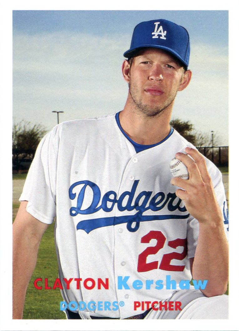
As evidenced by this Kershaw and the many other nifty cards I pulled from this blaster, Archives can show spurts of beauty, which makes the failures all the more obvious.
To the people at Topps HQ, Archives appears to be some kind of riddle that needs to be solved. Problem is, there's no riddle to solve. The loads of untapped potential of this brand is wasted in impossible-to-find SPs and misguided efforts at being "original" or "new."
Topps seems to forget that this is a retro set. New isn't what they should be going for.
All I want is an authentic look at the old.
9 comments:
I like the fact that they made cards of players on the same design as they've already appeared but with a different team and different colors. It's fun!
I think Archives is a pretty interesting set all together but I understand what you're saying. I really don't like how they line up former players with the wrong designs, and screw up the uniforms even if they got the player with the correct generation. I honestly think Topps doesn't care, and focuses more on making the card look good than historically accurate, which you and I clearly find unfortunate.
My only complaint is the 1:70 shortprint odds. That's unforgivable. Sure, nobody says you HAVE to chase them. But it ought to at least be POSSIBLE to build a set. Worse, if you're a team or player guy, you're totally f--- screwed (I meant to say screwed). I'm a Mets guy and I didn't notice any Mets on the SP list. But Topps totally gave Cubs fans the finger. They have something like 5 of the 30 SPs and they're the most desired players. Bryant is bringing over $200 on eBay. Great way to drive collectors away, Topps.
I have never ever ever gotten this complaint about matching players to years they were active. Seriously, I really don't get that complaint at all. I've got a '76 Stargell. Why would I want another one? And, if I didn't already have one then I'd rather go get the real one than the knockoff. I just don't get that complaint at all. To me, it sounds like logic from upside down world. Don't get it.
As for the card stock, I hear this complaint every year. "Its thinner than ever". No its not. Its as thin as its been since they started making them thin. When they get as thin as Donruss always was, then you can call me. You can read through Donruss cards. Topps hasn't had decent card stock since 89 or 90. I'd prefer they were on the old stock, too. But I think its only fair to remember that Topps is a business and their job is making a profit. If they were your company, in spite of anything you'd say since its not, you'd be looking for ways to shave pennies too. Card stock would be the first thing you'd bail on. I'm much more upset that paper plates are hundreds of times thinner than THEY used to be than I am with Topps choice of card stock. Plates are supposed to be functional; cards are just to look at and collect.
I actually prefer that the modern retired players are mostly featured on sets from when they weren't active. For example, I have already seen Rod Carew on both a 1976 design and a 1983 design. Featuring him on one of those two designs would feel a little redundant. But featuring him on the 1957 design feels a little more refreshing (even though I hate that set). Yes he wasn't active then, but neither were any of the currently active players either. I feel the same way about the "wrong" teams being featured for a certain year. Although I do have a slight issue with Joe Morgan being featured as an Astro instead of a Red. Even though he spent a little more time in Houston, he was much better in Cincy.
I appreciate your complaints, and I agree with some of them. I think the real issue with Archives is that everyone has their own opinions about what Archives *should* be, and in many respects those opinions are exactly diametrically opposed to one another.
Personally, my issue as a Brewers fan tends to be simply that Topps pushes as many Yankees into sets like these as it can while ignoring "smaller market" teams. But, I get that, generally. It's annoying, but it is a business for Topps to make money and there are many more Yankees fans than there are Brewers fans.
I think the shortprint odds are the worst thing about this set this year. It's not about player collectors and team collectors as it is a giant "screw you" to set builders generally. Topps pretty much seems to think that these people do not exist and act accordingly. Topps is killing off the set collector with those shortprint odds. And that is a shame.
As I've said before, Topps needs to turn archives into a "Cards that never Were" set and feature missing cards like a '51 Mantle rookie, a 1988 Reggie Jackson sunset card, a 1990 Mike Schmidt sunset and All-Stat card to name a few. They could have Diamond parallel cards, a parallel set without the Fan Favorites logo so cards would be like a continuation of old Topps sets. Throw in some business card cut signatures (Peter Gammons, Bid Selig, Sy Berger, a few GMs and deceased commissioners), a few classic subset cards featuring current players as an insert set (1975 MVP subsets, 1985 Father/Sons, 1972 Boyhood Photos of the Stars), and you have the startings of a good set, and that's without discussing autographed cards and maybe a redemption card #d to 5 that would get you all of a players career Topps cards (including missing one(s)), and maybe a 1 of 1 where the cards would be signed. Maybe this is asking too much, but I probably won't be buying Archives until it returns back to they way it was from '01-'05, and I'd buy even more if it were more like the '03-'05 versions. Just my 2 cents.
The super-shortprint base card thing is upsetting and ominous. Every other complaint about Archives comes down to personal preference.
For better or worse, I can't think of another set that's inspired this much discussion. Just look at all that text in these comments!
I was hoping for the 1976 Killebrew as a KC Royal, but it's just another repeated Twins photo... It's still cool, I guess, to get a new design for a Killebrew card, but it seemed like a perfect opportunity to do that.
Post a Comment