Friday, May 31, 2013

Gems of Junk Wax Bracketology: The Sweet 16 (Pt. 2)


I just noticed that this is my 40th post of the month.

That's a fairly torrid pace for me. I haven't hit the 40-post mark since last July. With summer vacation and all, I should be able to at least get close to 40 posts in each of the next few months.

But enough about that. You're probably not here to read about my posting milestones, after all.

We have a superb pair of matchups here, if I may say so. And, depending on how the voting plays out, we could be looking at a historic "Elite Eight" pairing from this region.

Polling for these matchups will close on Monday, June 3rd, at 11:59 PM.

So, without further ado, here are tonight's "Sweet 16" contestants.


#9 -- 1988 Fleer #582 Tim Flannery

VS.

#12 -- 1991 Topps #760 Benito Santiago

Kicking off the festivities is an interesting all-Padre pairing.

Given the impressive following the Friars have here in the blogosphere, I'm a bit excited for this matchup.

The Flannery is one of the quirkier cards of the overproduction era. Surfboards have never exactly been a common sight on cardboard.

Mr. Santiago's 1991 Topps issue, of course, is fairly well-known around collecting circles. It has absolutely drubbed its opponents in the first two rounds of polling, winning by a combined total of 43 votes.

While I expect the Flannery to give it more of a challenge, it's hard to question the greatness of Benito Santiago.

If I've learned anything from this tournament, it's that 1991 Topps is hard to stop.


#7 -- 1991 Topps #455 Walt Weiss

VS.

#11 -- 1987 Classic Yellow #124 Andre Dawson

Mr. Weiss is one of three '91 Topps contestants left in this tournament.

If he and Santiago can pull out the victories in this region, we'll be looking at an all-1991 Topps "Elite Eight" pairing.

While that would certainly be a boatload of fun, he has stiff competition from the beanball-tastic Andre Dawson.

Before voting even started, I had a feeling "Hawk" would be one of the bigger sleepers of the tournament. After all, Classic isn't exactly the most recognized brand in this hobby. And I don't think many collectors even know that unbelievable Dawson card even exists.

So, which is it?

A 1991 Topps "double dip" or a Classic under-the-radar beaning?

That's up to you to decide.

The polls are now on the sidebar.

Happy voting!

Gems of Junk Wax Bracketology: Victors from the Sweet 16 (Pt. 1)


The votes are in.

We have our first pair of "Elite Eight" nominees. Neither of the "Sweet 16" matchups in this region were all that climactic.

In the end, though, I think the right cards advanced.

Let's see if you agree.


#9 -- 1991 Topps #170 Carlton Fisk (21 votes)

def.

#13 -- 1994 Topps #180 George Brett (12 votes)

Perhaps the overall favorite in this tournament, the iconic Mr. Fisk pulled off yet another comfortable victory here.

Brett's 1994 Topps card is nothing short of legendary. Had he not faced the Fisk this early, I think I could've advanced even deeper into the tourney.

It's sad to see one of the greatest "sunset" cards in history go, but I think the voters got this one right nonetheless.


#6 -- 1989 Fleer #616 Billy Ripken "Rick Face" (20 votes)

def.

#2 -- 1989 Upper Deck #145 Nolan Ryan (12 votes)

As great as the "multiple-exposure" Ryan is, I knew this matchup wouldn't be much of a contest.

After all, the infamous Mr. Ripken is one of the more recognizable cards of the entire overproduction era. I think most of us can agree on that.

Plus, the Ripken family streak continues with this victory. All three of the Ripken-themed cards in this tournament are still alive as we speak.

These two victors will face off against each other in the "Elite Eight". From the looks of it, I'd say we have a good matchup on our hands with this pair.

I'll be revealing the next pair of "Sweet 16" matchups tonight, so be ready to vote!

Thanks again to all who have voted in this thing thus far.

It's been an absolute blast.

Thursday, May 30, 2013

Brought to you by our sponsors


We live in an ad-filled universe these days.

Sports in general is a good example of that. Of course, the vast majority of stadiums these days are sponsored by certain products. PNC Park, Tropicana Field, and Great American Ballpark are a few I can name off the top of my head.

On top of that, fans consistently find themselves bludgeoned with ads throughout the course of a ballgame. I can't tell you how many X-finitity "Calls to the Pen" or Honda "Home Run Replays" I've seen during recent Cub games.

It's all I've known as a baseball fan. I've pretty much taken the gluttony of ads for granted since I started watching the game in the late '90s.

Still, a couple things started me thinking about how prevalent ads have been on cardboard over the years.

One was a recent post over at Mr. Night Owl's blog, one that pinned down all the product placements on one of 2013's best cards thus far.

The other was the inclusion of this Hooters-themed Lenny Dykstra issue from fellow blogger Bo a few weeks back. (A card that, as Bo noted, ends in the number "69". But that's another topic for another post.)

As I've found, product placement isn't anything new with this hobby.


Heck, Tony Campana's 2011 Topps Update rookie card is basically one big Budwiser ad.

The former Cubs speedster was one of my favorite players during his brief stay on the North Side. (He's in the minors with the Diamondbacks as we speak.)

And while I still think this is one of the more fascinating rookie cards in my collection, I could've done without the gigantic Budwiser ad as the backdrop.

It's a bit distracting.


Not surprisingly, cigarette ads are all but nonexistent in today's sports.

However, they've managed to sneak onto a few baseball cards over the years.

Fleer (perhaps) mistakenly issued a Randy Johnson rookie card with a Marlboro ad on it back in 1989. They quickly recalled it and issued an airbrushed version, one that omits the cigarette product placement.

The few Marlboro versions that hit the market can go for big bucks these days.

At first, I was consumed with the neat "autograph" shot that graces the front of Tony Gwynn's 1994 Collector's Choice issue.

Upon closer examination, however, I noticed yet another Marlboro ad in the top-left corner. It's not all that well-hidden.

Between the aforementioned "Hooters" Dykstra and this "Marlboro" Gwynn, I'm starting to believe Collector's Choice had some sort of hush-hush deal with the companies.


Big, sweeping stadium shots are a good place to check for ads.

This beautiful night shot of old Jack Murphy Stadium (later Qualcomm Stadium, another product placement) contains a few obvious ones on the scoreboard.

Budwiser, Toyota, Coca Cola, and Diet Coke are the distinguishable ones. There are a few that I can't quite make out spread amongst the rest of the field.

It really is an ad-filled world.


Minor league shots are an absolute goldmine for advertising.

I'd guess that most minor league franchises aren't exactly cash cows. Players don't make much, and attendance usually isn't all that significant.

As a result, most ballparks sell a great deal of ad space on their outfield walls. I count at least nine or ten different visible ones on Joe Crede's "Team Best" issue here.

Hey, they've gotta pay the bills just like everyone else.


One of the more head-scratching examples I found comes from this Phil Nevin Stadium Club issue.

In a rather narcissistic move, Topps featured an ad for, yes, themselves on their very own card! You can clearly see it on the right-hand side of this piece.

Sort of like a product placement "Inception", if you will.

Then again, I guess I shouldn't be too surprised.

For better or worse, the world of advertising is growing more and more each day.

Especially when it comes to our beloved sports.

Dime Box Heroes: Matchmaking

2010 Tristar Obak Mini #22 Wally Pipp

Quick reminder for you, folks.

Today is the last day to vote on the first round of "Sweet 16" tournament matchups.

Hit those polls!

As a collector, I wear many different hats.

Perhaps my most prominent one involves the "treasure hunter" within me. Knowing how many surefire gems I've "saved" from the dime box depths over the years gives me an inordinate amount of joy.

Yes, I may wear the "hoarder" hat from time to time as well. No matter how hard I try, I must have every single dime card I come across of guys like Vlad Guerrero and Kenny Lofton.

Perhaps the strangest hat I've worn during my dime box quests over the years is that of "matchmaker".

Specifically, I absolutely love finding cards that can sit next to each other in each of my binders and live happily ever after. 

It pains me to know that cards like Wally Pipp's 2010 Obak mini still exist within my collection. Unfortunately, the dime box gods have yet to grant me the happiness of finding the regular-sized base version.

Still, I can't be too mad. Dime boxes have certainly found their fair share of matches for my collection over the years.

And they've taken quite a few different forms.


In rare cases, matches can simply consist of eerily similar photos from different companies.

These hit their heyday in the early '80s and never really returned. One of the more striking examples involves Rod Carew's 1982 Fleer and Topps "In-Action" duo.

While they were rival companies at the time, both ended using the exact same photo for their releases that year. I guess some photographer sold the shot to both Fleer and Topps at some point that year.

Double-crosser.


These types of matches are what I like to call the "offshoots".

Up until a few years ago, we had quite the competition of Flagship sets in this hobby. Topps, Upper Deck, Bowman, etc.

Unfortunately, many of those brands triggered offshoot releases that were basically variations of the same exact thing. Think Opening Day, UD First Edition, Bowman Chrome, those types of deals.

While I've never placed too much emphasis on busting much of those "offshoot" products, I've never been one to turn them down in dime boxes.

When it comes to binders, they're like matches made in heaven.


Perhaps the most common type of match I've found over the years is the base/parallel combo.

I love pairing up an ordinary base card with a suave parallel version from time to time. The many colored parallels from '06 UD Special F/X have always been personal favorite matches of mine for the ol' binders.

Oh, and if you're a "thowback" collector such as myself, you might want to pick this one up someday.


The release of Topps Fan Favorites forced me to add yet another aspect to my matchmaking services.

As you might know, Fan Favorites is one of the most legendary sets ever unleashed onto the market. The checklist features different photos of past legends on classic Topps designs.

In recent dime box hunts, I've made it a mission to pair up the real vintage versions with their Fan Favorites counterparts. Thus far, I'd say I've done a pretty good job.

I especially enjoy this '74 Topps-themed Luis Tiant combo. Real on the left, Fan Favorites on the right.

And a whole lot of awesome in between.


Arguably the most prideful part of my matchmaking these days is the hallowed real/reprint pairing.

While on the same wavelength as the aforementioned Fan Favorites combos, these have made for some of my favorite "binder duos" for as long as I can remember.

I plucked Bud Harrelson's 2002 Topps Archives reprint (of his '70 Topps issue) from a dime box a while ago. Since the real thing was a tough-to-find high-number (#634), I figured the task of finding a match for it was a long shot.

But, lo and behold, I scored a well-loved copy of it from a flea market quarter bin a couple years back. As one of the more aged "autograph" shots in existence, it was a dream come true for me.

I'm not sure what it is about the real/reprint combo that gives me such pleasure. Heck, I'm not sure why I enjoy any of these pairings so much.

In the end, I guess just knowing that you've found a perfect binder match for one of your favorite pieces of cardboard is a special feeling.

So, while the tale of mini-Wally Pipp doesn't yet have a happy ending, I'm sure the dime box gods have tucked the base version of it somewhere around these parks. It's just a matter of finding it.

As a matchmaker, that's my job.

Wednesday, May 29, 2013

Going for the record


I'm not sure why I have such an obsession with lists.

Many of the old notebooks scattered around my room contain a wide variety of my various rankings. Top 10 bands. Top 100 songs. Top 25 movies. Top 10 TV shows. You name it, I've probably made a list for it.

Between a massive "Top 100" countdown and an entire theme devoted to the concept, I think my love for lists has come across in this blog's history thus far.

Strangely enough, though, there's one thing I haven't listed out just yet. As of right now, I have absolutely no idea who my top trading partners are.

I know I've received a stacks upon stacks of individual packages from a select few of my blogging buddies over the past year-and-a-half. Trouble is, I'm not sure who holds the trading "title" as of right now.

However, I'd be inclined to think that longtime buddy Mark, author of the fantastic blog "This Way to the Clubhouse...", is going for the record. We've long had that informal trading style where stuff simply winds up on each other's doorsteps from time to time without warning.

And, much to my surprise, yet another terrific batch of cardboard from Mark found its way onto my doorstep in recent weeks.

Starting with the magnificent Tartabull above, it had all the makings of what I like to call a true "Mark package".


It had mini-collection needs.

Cards featuring "double dips" are always welcome in this household. The sparkly Kendrick is going to look awesome next to the base version in my Angels binder.

And, best I can tell, the Phillips is a rare "combo" mini-collection hit. After all, he's sporting a throwback Tigers jersey there, if I'm not mistaken.

Along with a lurking Alan Trammell in the background.


It had more mini-collection needs.

Jason LaRue is one of my more obscure "binder guys". Couple that with an "autograph" shot from the revolutionary Topps Total brand, and you have one special piece of cardboard.

This package even forced me to consider adding a few new mini-collections to the fold.

I've accumulated a few of those ninja-like headgear pieces, as shown on Carlos Garcia's 1997 Score issue. (Apparently, Score was a good place to turn for shots like those.)

I'm not sure how many of those types of cards even exist. Heck, I'm not sure what I'd even call such a crazy mini-collection.

But it's certainly something to think about chasing down the road.


As I've found, Mark is an absolute expert at sending me some good ol' miscellaneous cardboard.

None of the next few cards quite fit into any of my mini-collections, but all proved to have a certain charm that I couldn't resist.

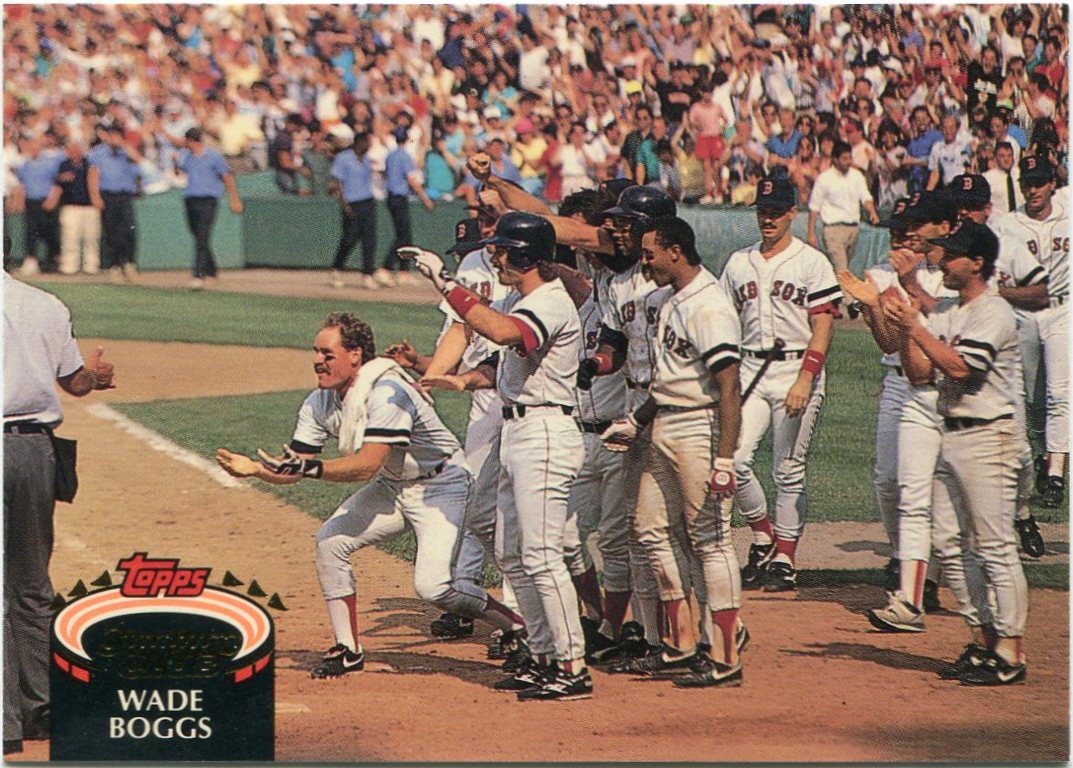
At first, I was ready to chalk the above card up as a "play at the plate" piece. But I can't even be sure a true "PATP" is even in the makings there.

All I have to go on is the somewhat awkward slide of former Expo Shane Andrews and the disembodied legs of both the opposing catcher and umpire. Oh, and don't forget the cap and catcher's mask in the foreground.

Even with all my years in this hobby, that's certainly one of the stranger photo angles I've seen on baseball card.


Mark has taken to adding a few minor league cards within his recent packages.

Even if I have absolutely no idea who the featured player is (as we have with this pair), my collection is always open to a few new minor league cards.

After all, I doubt you'll see a big league team called the "Sultans of Springfield" anytime soon.


Even seven years after its release, I'm still finding things to love about 2006 Upper Deck.

With its massive checklist, it's easy for cards like that Chen to get lost in the mix. Luckily, people like Mark are there to help fill in some of those lost gaps.

Now, Chen and his Panamanian pride will forever be documented in my collection.

As will a terrific knuckleball shot of the great Charlie Hough.

That pitch looked to have a little more force behind it than most knucklers, judging from the photo.


I was waiting for this moment.

Thanks to Mark, I was finally able to receive my first taste of the much-hyped Panini Prizm product. As far as a recap, I'll keep this short.

I'm not much of a fan.

Don't get me wrong, though. I'm always happy to add cards to my many player collections, especially my newer ones as we have with Mr. Rizzo here.

But the chrome-like base and lack of logos just isn't doing it for me here. They're a little too...Finest-y.

And I've never busted a single pack of Finest.


To close things out, Mark even managed to hit one of my longtime needs with this one.

No, Satchel Paige never pitched a single game for the Braves organization. His only experience with the franchise came during a brief coaching tenure in the late '60s.

Had this Swell issue not existed, I'm sure the fact that Paige was a one-time Atlanta coach would've been lost to me.

And many other baseball fanatics, I'm sure.

One of these days, I might have to dig through my archives and find out who I've received cards from on the most different occasions.

In the grand scheme of things, it's not all that important. As much as I try and fight it, though, the list-marking part of me is dying to know.

Yet, as I said earlier, it's safe to assume that Mark is near the top in that department. Not only in quantity, but in quality as well.

He understands this wacky collection of mine.

That's come across in the packages he's sent throughout my blogging tenure.

Tuesday, May 28, 2013

2013 Panini Triple Play: Back in business


Yes, I know I'm a little late with this review.

Okay, I'm way late. This year's edition of Panini Triple Play hit the shelves about a month ago. And I don't have the whole "budget" excuse this time. Loose packs of these were only a buck a piece last year.

Nope, the blame here lies with my local Target. Although they've been fantastic with putting new product on the shelves lately, they've hit a bump recently. It looks as though my Target won't be carrying anything from the Panini brand in 2013.

Luckily, my dad once again came to the rescue. A few days back, he spotted some Triple Play rack packs available at a different Target store. He picked up one of the three-dollar, 28-card packs for me.

Last year's Triple Play release triggered quite the variety of emotions, to say the least. I went from hate, to acceptance, to love within about a two-week span. When I heard that Triple Play would be back in business this year, I couldn't wait to see what they had in store.

If this rack pack is any indication, Panini picked up right where they left off.


While last year's Triple Play design was perfectly acceptable, I'm liking the 2013 version a bit more.

The wood-grain borders look to be an homage to similarly-themed '62 and '87 Topps releases.

Plus, being the color fanatic I am, I was enthralled to see that Panini chose to color-coordinate the pennant flags to each respective team name. This Billy Butler piece is about as blue-themed as any Kansas City Royal card you'll find.

I wish more sets would take a page from Panini's book in that department.


Of course, the main draw of Triple Play are the cartoonish depictions of big-league ballplayers.

Out of all the unlicensed sets I've seen thus far, this one is easily the most creative. Panini's wacky cartoons serve as the perfect way around the whole "no logos" thing.

As you can probably see, they're back in full force for 2013. The pencil-necked Will Middlebrooks is one of the crazier cards in my collection as we speak.

While I think the cartoons are a slight step back from what they were last year, that's not a knock on the product.

They're still utterly fantastic.


Also back for 2013 are the city-themed backdrops.

While not every card as them, the ones that do certainly stand out. I've driven into downtown Chicago  and seen that exact skyline appear on the horizon on many occasions.

The Sears Tower and all the other skyscrapers are perfectly represented on the front of Mr. Soriano's Triple Play base card.

Sorry, I forgot. It's actually called the Willis Tower now.

But no one actually calls it that.


To me, the biggest change between Triple Play's 2012 and 2013 releases were the backs.

All in all, last year's were fairly drab. This year's, however, put a lot of mainstream card backs to shame.

Panini managed to cram a wide deal of information into each and every one while not making them feel claustrophobic in any way.

Even the baseball-diamond backs are color-coordinated to each respective team. Apparently, there's some sort of game that can be played with each card. (Although I doubt many will actually play it.)

The "Debut" feature near the top of each card is a fine touch. I don't think any of my other Prince Fielder cards note his June 13th, 2005, big-league debut.

Nice little bios accompany each individual piece as well. I especially like the little "Knowledge" nuggets just above the stat lines. This Fielder included one of my personal favorites.

"Fielder became a vegetarian -- for three months -- in 2008."

It's hard to believe anyone was large as fielder would ever embrace vegetarianism.


These sticker inserts made a grand return in 2013 Triple Play.

This year, however, both red and blue versions are included within the checklist. I pulled one of each from this rack pack.

From the looks of it, this year's Triple Play release places a heavy emphasis on color.

I couldn't be happier about that.


Last year's puzzle-piece subset is nowhere to be found in 2013.

While it was a nice concept, I'm okay with their retirement for this year's product.

Because each respective piece was technically different, I ended up having to place five or six basically similar cards of Jose Reyes and Orlando Hudson into my binders last year. The "OCD" in me wouldn't allow for just one of each.

A couple of new little subsets in the 2013 edition are the above "All-Star" and "Traditions" pieces. The All-Star one is pretty self-explanatory.

I'm excited to find more of the "Traditions" cards in the future. The eight-card series chronicles a few of many ballpark traditions in the game today.

The one I pulled happens to feature the dreaded "wave" craze that overtook ballparks in the '80s.

I'm starting to see it pop up in ballparks again, for better or worse.

But mostly worse.

If I had to compare the two, I'd say I prefer last year's inaugural Triple Play release over this one. I think part of that is the whole shock factor. Unlike last year, I knew what to expect from the product going in this time around.

Still, that's nothing against 2013 Triple Play. Between the cartoons, card backs, and "Traditions", there's still quite a bit to love about it.

As long as the insanely budget-friendly price tag is still intact, I'll forever be a fan of the product.

All in all, I'd say Panini hit another one out of the park with 2013 Triple Play.

Monday, May 27, 2013

Gems of Junk Wax Bracketology: The Sweet 16 (Pt. 1)


Here we are.

The "Sweet 16".

I have a feeling the coming matchups are going to be pretty tough for some of my fellow readers. The decisions won't be easy. I'd sure have a heck of a time choosing between most of these pairings.

But, hey, that's the fun of this thing. Right?

Before I introduce our initial "Sweet 16" matchups, I should note that voting will close this Thursday, May 30th, at 11:59 PM. Be sure to get your votes in before then!

No matter how tough of a choice it may be.

So, without further ado, here's the first pair of "Sweet 16" matchups.


#9 -- 1991 Topps #170 Carlton Fisk

VS.

#13 -- 1994 Topps #180 George Brett

Neither of these masterpieces faced much of a challenge in the previous rounds.

As a couple of the more iconic cards of the entire overproduction era, though, that's about what I was expecting.

The masterful Fisk is one of three '91 Topps cards still remaining in this tournament. The Brett, as I've said before, is arguably the greatest "sunset" card ever produced.

Now, much to my pleasure, these two treasured pieces of cardboard are facing off against each other.

I don't think either will go down without a fight.


#2 -- 1989 Upper Deck #145 Nolan Ryan

VS.

#6 -- 1989 Fleer #616 Billy Ripken "Rick Face"

At this point in the tournament, I'm seriously running out of things to say about the remaining contestants.

Once again, the Ryan is the first-ever "multiple-exposure" shot in hobby history. And a pretty bad-ass night shot, to boot.

The Ripken, of course, is famous for the obscenity written on the bat handle. I feel bad for anyone who tried tracking down all the different variations of that one.

Whether the flub was intentional or not on Fleer's part is still debated. (I happen to think they knew full well what they were doing by putting it onto the market.)

Either way, it's grown to become one of the faces of the overproduction era.

Well, there's your first "Sweet 16" matchups. 

As you can probably see, I wasn't lying when I said they'd be tough.

Happy voting!

Gems of Junk Wax Bracketology: Victors from the Terrific 32 (Pt. 4)


We have a very special "Gems of Junk Wax Bracketology" day on our hands.

For one thing, we'll be revealing the final group of victors from the "Terrific 32" this afternoon. And, tonight, I'll present the first pair of matchups from the "Sweet 16".

But, more than that, today is a special Memorial Day edition of this tournament. A very extended thanks goes out to all members of this nation's military, past and present.

On that note, let's see who this region will be sending into the "Sweet 16".


#8 seed -- 1987 Topps #653 Kevin Mitchell RC (21 votes)

def.

#1 seed -- 1988 Topps #18 Al Leiter RC ERR (10 votes)

It's official.

There are no #1 seeds left in this tournament. Mr. Leiter was the last of the bunch.

But, remember, the seeding doesn't much matter in this thing. And, besides, I think the voters got this one right. As great as the Leiter "player swap" error is, the Mitchell is one of the more memorable cards of the entire era.

It's well-deserving of a "Sweet 16" nomination.


#5 -- 1992 Topps #40 Cal Ripken Jr. (22 votes)

def.

#4 -- 1994 UD All-Time Heroes #1 Ted Williams OW (10 votes)

My favorite matchup of the region didn't prove to be much of a contest.

As has become the norm in this tournament, the Ripken family pulled out yet another comfortable victory. In fact, three of the remaining 16 cards in this tournament are Ripken-related.

While I would've been inclined to go with "The Splendid Splinter" in this matchup, I can certainly see why "The Iron Man" advanced.

You'd be hard-pressed to find a collector who doesn't like Ripken's '92 Topps issue.


#14 -- 1992 Stadium Club #520 Wade Boggs (17 votes)

def.

#11 -- 1993 Topps #200 Kirby Puckett (15 votes)

This proved to be the closest matchup from the entire "Terrific 32".

For a while, I thought we were going to have another tie on our hands. In the end, though, Mr. Boggs managed to escape with a narrow two-vote margin of victory.

Puckett put up a good fight, but even he couldn't take down one of the best celebration shots in cardboard history.


#2 -- 1989 Upper Deck #755 Jim Abbott RC (22 votes)

def.

#7 -- 1991 Ultra #296 Ozzie Smith (10 votes)

As it turns out, "The Wizard of Oz" just couldn't work his magic for a second time.

The Ultra brand's only entry into this tournament lost pretty handily to Jim Abbott's magnificent '89 UD "multiple-exposure" piece.

Given my long time fandom of Mr. Abbott, I couldn't be happier.

The Ozzie Smith is a fantastic card, don't get me wrong. In the end, though, I personally think my voters got this one right.

I'm excited to see how far Abbott can advance.

Tonight, I'm excited to say, we'll take our first foray into the first two "Sweet 16" matchups of the tournament.

I should warn you, though.

The voting only gets tougher from here on out.

Sunday, May 26, 2013

Into the Sunset, Pt. 18: Vladimir Guerrero


This region's "Gems of Junk Wax" bracket voting ends tonight at 11:59 PM.

We still have a couple close races on our hands, so be sure to get your votes in before the deadline!

Back to the action.

Sometimes, I manage to surprise myself.

I've long known that Vladimir Guerrero is the focus behind my single most expansive player collection. Yet, upon going through and actually counting my cards of his, I was floored.

I own a grand total of 669 different Vlad issues. I knew I had a lot, but I had no idea it was that many.

Unless I suddenly come across 200 new Ichiro cards, Mr. Guerrero will long be my largest player collection. That's a fact.

However, one thing about Vlad's career is far from fact. It's a question I've thrown around in my head on a few occasions.

Is he a Hall of Famer?

Guerrero was a nine-time All-Star during his illustrious 16-year career. He won the 2004 AL MVP award with the Angels. He was easily one of the faces of my generation of ballplayers.

And, if you look at his "Baseball Reference" page, he certainly has some good company with his similarity scores. His top five in that department are Jeff Bagwell, Larry Walker, Jim Rice, Willie Stargell, and Billy Williams.

I personally think he deserves to be in the Hall of Fame. Given my longtime fandom of his, though, I'm understandably a bit biased.

If he were to get in, I'm sure he'd have a tough choice deciding which cap to wear on his HOF plaque. A case could be made for either the Expos or Angels. And, while he only spent one season in Texas, Vlad was an All-Star in his lone Ranger campaign.

As time goes on, however, I think we'll look back on his career and say, "When did he play for the Orioles?"

That's where we pick up this "sunset" review.


In actuality, Vlad's "sunset" season in Baltimore wasn't all that bad.

In 145 games, he sported a .290/13/63 stat line for the O's in 2011. However, his .317 OBP was a far cry from his .379 career mark. As was his .416 slugging percentage. (Vlad slugged .553 for his career.)

Still, as time goes on, I doubt many fans will remember Vlad's tenure in Baltimore. Luckily, the 12 cards (and counting) I have of his in my O's binder will forever serve as a reminder.

Bowman's final tribute to Mr. Guerrero wasn't anything spectacular. Not great, but not awful. It's hard for me to discuss anything Bowman-related at length around here. I haven't done it much on this blog thus far.

And I don't intend to start now.


It's the same with Gypsy Queen.

To me, 2011 was GQ's best overall year of production. Still, given my lackluster attitude towards the product, take that with a grain of salt.

Nevertheless, this is both a perfectly acceptable action shot and a decent photoshop job on the part of Topps.

It's still not enough to make me start liking Gypsy Queen, though.


As a whole, 2011 was filled with perfectly average base sets.

You can add Topps Lineage to that fold. The set's inserts were quite neat, in my opinion. The base cards, on the other hand, didn't quite stand out in any way.

Still, I've always been a sucker for Spring Training shots. And, by my account, this one looks to be just that.

Even if it looks like it was taken at my local Little League field.


I only have two 2012 "sunset" issues of Vlad in my collection.

The first comes from the 1963-themed Topps Heritage release, one of my personal favorites from the past few years of the product.

Judging by the backdrop, I'm guessing this shot was taken in the same shoot as Vlad's aforementioned Topps Lineage piece.

Sure, it may not be the most exciting card he's ever had. But, when it comes to Heritage, photography is pretty much beside the point for me.

I just love the throwback designs.


As far as I'm concerned, Flagship produced Vlad's finest "sunset" issue.

This "Record Breaker" card, one that commemorates his title as the all-time Dominican hits leader, is exactly what I look for in a cardboard send-off.

The rather peaceful wave he's giving makes for quite the heroic "sunset" shot.

When it comes to my baseball life, that's exactly what Vladimir Guerrero has always been.

A hero.

Plus, as far as my collection goes, he's most definitely a first-ballot Hall of Famer.

There's no doubt about that.