Thursday, February 28, 2013

A chance of flurries


Even by Chicago's standards, the weather around here has been fairly bleak lately.

I'm having trouble remembering what the sun even looks like. It seems like "a chance of flurries" has been in the weather reports for the past few weeks.

Apparently, that forecast has carried over to my mailbox as well.

Well, that's not exactly accurate.

It's been more like a blizzard.

Trade packages have been absolutely flooding in from left and right within the past few weeks. Once again, I find myself behind in a number of collecting areas. Scanning, sorting, and organizing.

And, more importantly, trade posts.

So, if you're a trade post kind of person, then you'll be in for a treat over the next couple weeks on this blog. The trade "flurries" will be hitting quite a bit around here.

If you're not a fan of trade posts, well...I don't know what to tell you.

But, come on!

Who doesn't love a good trade post every now and then?

I know I do.

On that note, let's start the "flurries" with a package I received from Jim, a longtime blogger and eagle-eyed collector. You might know him better as "gcrl", the man behind the terrific blog "Garvey Cey Russell Lopes".

When I say "eagle-eyed", I mean it. He found a few cards for my many "mini-collections" that I never could've found.

Take this A.J. Hinch card, for instance.

On the surface, it doesn't look like anything special. A standard Topps base card of a marginal big-league catcher.

But, as Jim noted on the penny sleeve he included with it, Mr. Hinch here is a treasured reverse negative.

The error is indeed noticeable upon closer inspection. The Nike "swoosh" on Hinch's glove hand is backwards. As is that awesome A's patch on his sleeve.

If I had found this card during a dime box dig, though, there's no chance that I would've caught the "flip".

An eagle eye always helps, I guess.


Coooooooool.

A baseball card within a baseball card. Longtime pitcher Ricky Bones appears to be holding a copy of his 1995 Topps issue on his '96 Topps card here.

I might have to start labeling these as the "Cardboard Inception" series.


At first glance, these look like your run-of-the-mill baseball cards, don't they?

Aside from the fact that they feature a few old-time HOFers, nothing about this pair seems all that different from the norm.

Until...


...until you compare the size of Mr. Maranville with a standard quarter.

Not so normal now, are they?

Oddballs in every sense of the word, safe to say.


Jim noted that he tried to include "a little of everything" in the package he sent.

That seems to be a common theme with the cardboard I've received during my time around here. I honestly have no idea what to expect from any of my fellow trade partners anymore.

Besides, there's no wrong way to send a "little of everything" package.

That's the great thing about 'em.

I always manage to find something I need inside each and every one.

As you're about to see, Jim did a truly spectacular job in molding a ragtag group of random cardboard into a treasured trade package.

Little things like David Justice doing his best Superman impression are what trades such a distinct aspect of my collecting life.

It'll certainly have a nice home in my binders.


Here's a pair of bubble gum blowin' and bat bustin' Brewers.

Hey, I like alliteration, okay?


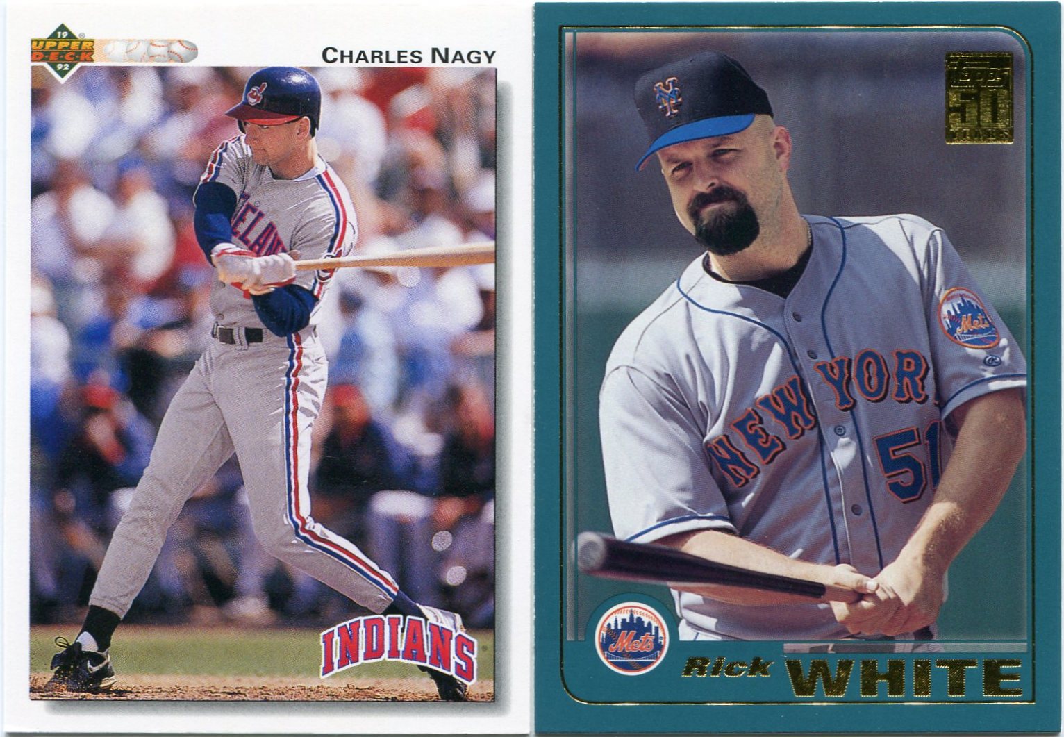
On the one hand, these are both shiny new "pitcher at the plate" cards for my collection.

But, upon closer inspection, they're a whole lot more than that.

Charles Nagy there is a rare specimen. Cards of post-DH/pre-interleague play American League "pitchers at the plate" are tough finds.

The Mets, however, are a National League franchise. Shots of "pitchers at the plate" shouldn't be too rare for them.

May I remind you, though, that Rick White was a relief pitcher for the majority of his career. Another rare find!

Plus, Topps had a little bat barrel action going on there, too.


I must've woken up a pack of Darryl Kile hoarders at some point.

Ever since I made a brief mention of my collection of his in an earlier post, people have been sending me his cards left and right. They've literally shown up in almost every trade package I've received within the past few weeks.

I couldn't be happier about that.

He'll always have a special place in my collection.

For obvious reasons, his cards are among the most powerful pieces in my binders.


Between the tragic figures of Darryl Kile and Doug Million, I realize I'm being a bit of a downer here.

Sorry about that.

This card has been near the top of my "most wanted" list for the past couple months. I just recently welcomed him into my Rockies binder, after all.

To me, it's just my little way of honoring the man's legacy.


But enough with the sadness.

Here's a tremendous action shot of the "Sultan of Swat" for your viewing pleasure.

It certainly puts a smile on my face.


Hopefully, my appreciation for oddballs has come across in my past writings.

But, in case you missed those, I'll say it again.

I love oddballs!

Judging from what I've seen on his blog during my time around here, Jim is a fellow oddball devotee. The amount of odd Dodgers he owns is simply amazing.

Because of that, I guess I should've known that a few oddballs would find their way into the package he sent my way.

Still, they proved to be a complete surprise.

I've actually had a few of these local '83 Thorn Apple Valley pieces in my binders for a while now. They popped up in one of my dime box crusades a few years ago.

Happily, the issues of both the Cubs coaching staff...


...and Hall of Famer Fergie Jenkins were new to me.

But those weren't the last of the oddballs.

Heck, those weren't even the last of the Cubs oddballs.


This Pepsi issue of Mr. Kingman here proved to be my absolute favorite "find" of the package.

In the end, it was actually one of the cards that inspired me to write that "uniformity" post from a couple days ago.

Something about that oddball-appropriate Chicago (NL) designation next to Kingman's name just seems right to me. More than San Francisco (NL) or New York (NL) ever could.

I think you can see how amazing Jim's batch of cardboard was. Between reverse negatives, "micro" cards, and oddballs, it included everything a "low-end" guy like me could ever want.

Still, this was only the start of the recent "mailbox blizzard" that has swept my area.

As far as trade posts go, we've only just begun.

Wednesday, February 27, 2013

The Gems of Junk Wax, Pt. 56: 1992 Score #888 Craig Biggio "Dream Team"


I probably don't have to tell you why I love this card.

Ah, heck. I'll do it anyway.

It's one of those "multiple exposure" cards!

In fact, Mr. Biggio here is the first of his kind in my collection. After all, this is the very first "multiple-exposure" card of a catcher in my binders.

I count a total of six different images of Craig Biggio on this one.

Still, I wouldn't stare at this one for an extended period of time. Your head might start to hurt. Trust me, I speak from experience.

I've admired this card from afar for quite a while now. Yet, for whatever reason, I'd never picked up a copy.

Luckily, good ol' Listia was there to take care of that gaping hole in my collection. I snagged this masterpiece for a mere 157 credits last week.

That place is starting to flourish again, at least as far as cardboard is concerned. The Biggio was just the tip of the iceberg.

I'll have more on that in a future post, though.

As far as I know, this one represents Score's lone foray into the "multiple-image" world. I have yet to see another Score-branded card like it.

And, as if his "Gems of Junk Wax" status wasn't good enough, Mr. Biggio gives me an excuse to show off more of the "multiple exposure" cards I've snapped up over the years.

After all, they're always good for a bit of eye candy.


Topps made a brief entry into the "multiple-image" market during the mid '90s.

Although they're all but forgotten these days, the few Topps did produce are actually pretty neat. I recently received a couple from a fellow blogger, in fact.

This one of Royce Clayton has been a cherished part of my binders for as long as I can remember. 

Pretty trippy, isn't it?


Pinnacle also made a quick venture into the realm of "multiple exposure" cardboard.

Although they tackled the topic in an entirely different manner.

While different from the "progression" theme that most other cards of the sort use, my definition of a "multiple-image" piece is exactly what it sounds like. As far as I'm concerned, any card with more than one photo on the front of the card fits into the category.

I plucked this one from a dime box a couple years ago. While I'm not one to ever pass up anything of Kenny Lofton, I knew this particular piece was a "dime box hero" from first sight.

For some reason, the little spot shadowmakes me think of Lofton as a superhero-like figure.

Given his unbelievable prowess on the basepaths, though, I guess he kind of was.


Still, the unquestioned pioneers of the "multiple-exposure" innovation are the good folks at Upper Deck.

Score, Topps, and Pinnacle were all trying to duplicate UD's success with the tactic. 

But, frankly, all other "multiple-image" specimens pale in comparison to the gems that Upper Deck unleashed onto the market.

This particular masterpiece of Mr. Blyleven could very well warrant its own post in this theme. Still, I chose to give Score their bit of the spotlight for tonight's post.

Besides, I've already featured a trio of UD's other "multiple-exposure" pieces from the overproduction era. (Which are located here, here, and here, if you're interested.)

I just wanted to keep things fair.


It'd be tough for me to pick my absolute favorite "multiple-image" card.

I don't know that I could ever definitively choose a single one.

Forgive me for sounding like an after-school special here, but they are all special pieces in their own right.

Still, if I had to, I'd imagine that this one of Tony Womack would rank right near the top of the list.

Yes, he may be turning a double play against my beloved Cubs. That's never a good thing for this baseball fan.

But at least he's doing it right in Sammy Sosa's fat face.

I can live with that.


Sadly, it looks like the "multiple-exposure" era is all but over.

Upper Deck's cards of the sort became more and more sparse after the mid '90s.

Topps stopped doing it after '97.

Score and Pinnacle were out of the cardboard market by the late 1990's. Neither went much further after their initial "multiple-image" experiments with Biggio and Lofton.

But, given a few more years in the hobby, who knows what those brands may have done?

Perhaps they would've given the "multiple-exposure" field a much-needed revival.

We'll just never know for certain.

This amazing 2010 Upper Deck insert of the "Big Unit" is indeed the last time the hobby has seen anything related to the world of "multiple-image" cardboard.

As we all know, UD left the baseball card realm after their 2010 release.

Topps sure hasn't given any indication of bringing these back in the coming years. While they've done a terrific job with their photography lately, I do wish they'd at least give us a brief taste of these things.

Personally, I think they'd make for a nice change of pace in the hobby.

Until then, all I can do is hope.

1.000


The overarching themes of my collection aren't all that easy to grasp.

Heck, I'm not even sure if I have a full handle on everything around here. I'm still discovering possible new "themes" for the future.

When I professed my love for "bat barrel" and "pitcher at the plate" cards, I honestly didn't expect much if them in the way of trade packages and such. I figured people wouldn't want to take the time to dig through all their cards to find a couple I might need.

And...that was the last time I underestimated the amazing generosity and devotion of the great people around here. I'm still amazed at the amount of "sunset" issues and "behind the camera" cards that have been rolling in lately.

In reality, though, most trade packages include at least a few cards that don't fit into my collection. Whether they be doubles or just pieces I can't find a use for, I've ended up with some extras during my trading days. I'm sure we all have.

However, I constantly find myself adding those doubles or "outcast" cards to my outgoing trade packages. And if that person can't use them, then maybe they'll find their way into another collector's hands. It's a never-ending process.

However, pretty much all of the trade packages I've received have managed to rack up a fairly good "batting average". Most of the "random" mailers that hit my mailbox usually hover close to the .600 mark or so.

Just the other day, I received a four-card PWE from Zach. You might know him better by his alter ego and/or his fantastic blog, "The Underdog Card Collector".

This was pretty much my reaction as I went through each of the four cards in the envelope.

"Cool, I need that one. Need that one, too! WOW! AWESOME!!"

Now, we'll get to what elicited the "WOW!" and "AWESOME!!" exclamations out of me soon enough. 

In the meantime, let's focus on what Zach "hit" with this latest batch.

He went four-for-four. He indeed batted 1.000. A rare feat!

Admittedly, I slightly "enhanced" that average with these first two.

I'd specifically requested the 2013 Topps gold parallels of former Cubbies Geovany Soto...


...and Kyle Farnsworth from Zach a while ago.

I sure hope I don't get handed a 50-day trading ban. That would suck.

While vastly overshadowed by the outstanding blue and red parallels, I do like this year's gold design quite a bit. Even if they are seemingly impossible to pull.

After all was said and done, though, the golds ended up taking second billing to the rest of Zach's PWE.

It's not that I don't like them. Because I really do.

It's just that the other two cards in this thing were that awesome.

And I'd been wanting to add both to my collection for quite a while.


Although I can't find the specific link to it right now, I remember one of Zach's first posts on his blog involved this very card.

At the time, I commented on how much I loved it and how it'd always been a goal of mine to acquire a copy.

Because Zach is a Padres collector and probably treasures this card, I never thought he'd be the one to help me fulfill that longtime void in my collection.

But, alas, he did. I'm sure he picked up a double of it at some point, because I can't imagine any Padres collector would ever let this one out of their sight.

As far as photography goes, Mr. Corrales may be the absolute oddest and greatest from '73 Topps. Anyone familiar with the set knows how big of an honor that is.

But does he beat out the used car-themed Luis Alvarado?

Let me get back to you on that one.

I'm not sure how or where I first saw this one, but the first thing that drew me into its grasp was that overwhelming look of pain and agony on the face of Corrales. I'd never seen anything like that before. I still haven't since.

It took me a while to notice the other amazing quality of this masterpiece.

That's a Cub there, sprawled out on the ground next to Pat Corrales. Right?

Wait, is that an Afro? 

And...is that a #31 on the back of that jersey?

Why, that's Fergie Jenkins!

A pitcher! A Hall-of-Fame pitcher! 

Featured on one of the greatest "action" baserunning shots in baseball card history!

As if that weren't enough, this is also one of those rare pieces of cardboard that can be specifically tracked to a single moment in time.

I'd love to do it, but another member of the blogging brethren beat me to the punch.

Now, after the legendary Corrales fell out of the envelope, I asked myself a question.

"Does it get any better than this?"

Well...


Maybe.

I still can't decide which card I like better. It's a toss-up.

All I know is that I now own a couple of absolute cardboard icons with this pair.

Much like the Corrales, I'm not exactly sure where to start with Mr. Hubbard here.

Well, for one thing, the guy was born on an Air Force base in Germany. The back reads, and I quote, "Born: 9-25-57, Place Hann AFB, Germany".

Not exactly a common sight on the flip side of a baseball card.

While I don't know for certain, I'd bet that Hubbard is one of the first German-born player in my collection. (Further research showed that Ron Gardenhire, Edwin Jackson, and Will Ohman are all German-born as well, for what it's worth.)

Germany aside, though, let's get to the real "meat" of this one.

The front.

With all the craziness going on around him, it's easy to overlook the rather epic facial hair Hubbard is sporting here. Perhaps we already had a "Fear the Beard" candidate all along.

Now, as far as the background goes, I'm completely and utterly lost.

Yes, we have what appears to be an eerily gigantic Phillie Phanatic present. I see what looks to be a Friar-based mascot on the extreme left-hand side of this one as well, although I might be wrong about that.

From there, I see a strange, furry paw-like figure poking on of the right side of Hubbard.

But, of course, all the craziness culminates in the ultimate "draw" of this one.

The snake.

Although I can't say I know much about reptiles, I'm pretty sure that's a boa constrictor draped around the shoulders of Glenn Hubbard.

For that, he sure earns quite a few points in my book. I'd never have the ba...I mean, courage to put that thing around my neck.

Personally, I've never seen a baseball card feature as much "fun" as this one.

In the end, that's what this hobby should be.

Fun.

And, speaking of fun, that was one of the greatest PWEs I've ever received.

Or could ever receive, for that matter.

I'm not sure how or where you found the likes of Corrales and Hubbard, Zach, but you sure knocked it out of the park with this one.

In fact, you hit 1.000.

That's one for the record books right there.

Tuesday, February 26, 2013

Uniformity


Before I start, let me just say this.

I have a tremendous amount of respect and appreciation for players who spent their entire careers with one franchise.

With the way the game is changing these days, it looks as though the Chipper Joneses and (most likely) Mariano Riveras of the world will become an extremely rare breed in the years to come, quite possibly hovering on the brink of extinction.

It feels good to point to my Red Sox binder and say, "That's where all my Carl Yastrzemski cards are."

Or point to my Reds binder and say, "Every single Johnny Bench card I own is in there."

That being said, though, I've long had a fascination with players who jumped around a bit during their big-league tenures.

Because of my team-centric organizational setup, I've become fairly well-versed as to what uniforms my "binder guys" wore throughout the course of their career and when they played for those franchises.

As far as my many player collections go, the jerseys have always been just as important as the stats. I'm probably in the minority with that way of thinking, though.

Now, along with that idea, I've always been interested to hear what teams baseball fans associate with certain players.

Some are no-brainers. Despite his brief stint with the Phillies as a rookie in 1981, Ryne Sandberg is and will always be a Chicago Cub to pretty much every fan out there.

Other "jersey association" cases are fairly easy for me as well, although they do require a slight hint of deliberation. Although he spent quite a few of his later years with the Reds and White Sox, Tom Seaver is a New York Met in my mind.

Some, however, aren't that simple. Many "association" cases have required a great deal of thought over the years.

That's what this post is all about.


The case of Carlton Fisk required quite a bit of consideration on my part.

To kids of the 1970's, I'd imagine that Fisk is a Boston Red Sock, first and foremost.

On the other hand, fans who grew up during the '80s might better remember him as a member of the White Sox above all.

In many cases, these "associations" are a generational thing. Mr. Fisk here is a great example.

Trouble is, I wasn't a part of either of those generations of the game. I was one when Fisk retired in 1993. As a result, I like to think that I'm tackling this situation in an unbiased way.

Given my Chicago ties, I'm inclined to go with the hometown club on many of these decisions.

Fisk is a rare exception. Although I appreciate his years with the South Siders, my mind can't help but picture Fisk in a Red Sox cap.

I like to think my love for '70s baseball cards played a role in that.

Fisk was one of the more "cardogenic" players of the decade.


Like Fisk, I have to go against my hometown bias with "Goose" Gossage.

Although he'd pitch for nine teams throughout the course of his career, the White Sox and Yankees are probably the most well-known of the bunch. I guess you could throw his tenure with the Padres into the mix, too.

Gossage did indeed break into the bigs with the White Sox in 1972. Due to his pivotal role with those dynasty Yankee teams of the late '70s, though, I've always associated Gossage with the Bronx Bombers more than any other franchise.

Something about those pinstripes just suited him well.


Although he enjoyed a 16-year career, Dave Kingman never spent more than four consecutive seasons with one franchise.

He enjoyed two separate stints with the Mets. On top of that, he also famously played for four different teams in 1977 alone.

Kingman traveled quite a bit after the Mets dealt him early in June of '77. I'm still waiting for a company to create cards of him both as a Padre and an Angel. I have the Yankees one covered, though.

Obviously, his constant switching from city to city makes Kingman's case a daunting task.

Many fans probably picture him as a San Francisco Giant. At the same time, I'd bet quite a few others see him as a Met.

Personally, I see him as a Chicago Cub.

I guess my hometown bias showed with this one.


Perhaps the toughest "association" case I've come across thus far has involved none other than Dave Winfield.

While he enjoyed solid years later in his career with clubs like the Angels and Blue Jays, it all boils down to two teams for me.

The Padres and Yankees.

In terms of sheer tenure, they're nearly identical. Winfield spent eight years in San Diego, followed by eight and a part of a ninth (split with the Angels in 1990) with the Yankees.

He broke in and made a name for himself with the Padres, but likely achieved "superstar" status in the Bronx.

So, which to choose?

It's basically a toss up.

For me, the Padres just edge out the Yankees.

Again, I think the baseball cards had something to do with that decision, though.


For better or worse, the topic of "uniformity" is alive and well in baseball's recent history.

Much like Nolan Ryan (someone who I may have to feature in a possible sequel to this post), Randy Johnson was an unquestioned "ace" in the bigs for a long, long time.

Despite brief stints with the Expos, Astros, and Giants at various points in his career, the association issue with the "Big Unit" pretty much comes down to either the Mariners or Diamondbacks.

His Arizona accolades are nothing short of amazing.

He captured a mind-boggling four straight Cy Young awards from 1998 to '01. He won his only championship in Arizona, sharing co-World Series MVP honors with Curt Schilling in the process. Let's not forget that perfect game against the Braves in '04, either.

Still, some of my earliest baseball memories involve seeing highlights of the "Big Unit" mowing hitters down in a Mariners uniform. That's what made him such a "hero" to me as a young fan of the game.

Because of that, he's a Mariner in my book.


Although I own over 600 cards of the guy, I'm still not entirely sure which uniform fits Vlad Guerrero the best.

For now, it's the Expos. Again, some of my earliest traces of baseball fandom come from Vlad's days in Montreal.

Yet, other times, I find myself picturing him in Angels garb. 

I still can't decide.


I'm not ready to determine a surefire "association" with most of today's players just yet.

To me, Mark Teixeira is still a Texas Ranger. That may well change after his "big market" tenure with the Yankees is over, though.

The case of Roy Halladay seems to get more and more interesting with each passing day. While I still currently picture him as a Blue Jay, that Phillies jersey is starting to become a bit more ingrained into my memory.

Who knows?

Maybe people like me will be telling our kids, "That's Roy Halladay. He used to pitch for the Phillies, you know."

At this point, though, it's still up in the air.

Still, one thing is for certain.


I will never associate Dale Murphy with the Colorado Rockies.

But that's another topic for another day.

Monday, February 25, 2013

"The Dime Boxes Top 100": Cards 5-1


I've been looking forward to writing this post for a long, long time.

Tonight, it will be my great pleasure to finally reveal my five favorite cards from the "modern era" of collecting.

Yes, I'm a little sad that these posts will be over after this. They've been an absolute blast to write over the past few months.

However, I'm planning to launch my "Top 100 Vintage Countdown" sometime this summer, so I guess there is a light at the end of the tunnel.

Well, before we dig into the final five cards from the countdown, both myself and Carl Everett here would like to thank you, the reader, for coming along for the ride. 

I hope you've enjoyed it.

On that note, let's dive right into this thing.

Here are my "Top Five" cards of the modern era.


#5 -- 2005 SP Legendary Cuts #5 Eddie Gaedel

Baseball can be a crazy game sometimes.

Between one-armed outfielders and 15 year-old rookies, the sport has certainly seen its share of odd moments throughout its history.

For me, though, no single event was crazier than Eddie Gaedel's lone major league at-bat. Sporting the jersey number 1/8, the three-foot, seven-inch "rookie" walked in his "debut" against the Tigers on August 19, 1951.

Most baseball fans have seem the immortal photo of Gaedel on a multitude of occasions.

Although I've heard hints of others in existence, this is currently the only card of his in my collection. 

Now, any card of Eddie Gaedel probably would've ranked pretty high in my countdown, without a doubt. 

However, what put this one into the top five was the fact that it featured a different photo than the one we've witnessed a million times before. In fact, I'd never seen this particular shot of Gaedel prior to acquiring it.

It's almost like he's specifically tipping his cap to every single owner of this card. 

The feeling is mutual, Mr. Gaedel.

We tip our caps to you.


#4 -- 2010 Topps National Chicle #302 Ichiro Suzuki SP

While I love the National Chicle brand, the thought of anything from the set appearing on this countdown seemed a bit farfetched to me at first.

That is, until I remembered this one.

As evidenced by its short-print status, this was not an easy card to track down in 2010. It took me quite a while to add it to my collection.

But, I guarantee you, it was worth the wait. 

Granted, the folks at Topps didn't get their history entirely right. Despite their Seattle bases, the Pilots did not become the Mariners after their lone year of existence. They actually moved to Milwaukee and became the Brewers in 1970.

Factual accuracy aside, though, this card is nothing short of perfection.

Ichiro has long been one of my favorite players in the current game. At the same time, I've always had a deeply-rooted interest in the Pilots franchise as well.

To see Ichiro in arguably the greatest "throwback" jersey of them all is a sight to see, my friends.

While there are a boatload of terrific Ichiro cards out there, this would be the one I'd recommend to an aspiring collector. 

This is the one I'd start with, bar none.


#3 -- 1999 SI Greats of the Game #88 Mark Fidrych

Yes, you can say I'm looking forward to attending the National this year.

Barring any unexpected mishaps, I should be there to dig through all the dime boxes I can. 

If any of you are wondering about what exactly "National dime boxes" hold, I'll just point you to this one.

I snagged it from a 12/$1 at the last National here a couple years ago. 

Quite a bit of time has passed since then, obviously. Yet I still can't seem to get over the fact that this card only cost about eight cents.

The "Top 20" in this countdown has already featured two of these '99 SI Greats cards with Ed Kranepool and Bill Lee.

"The Bird" is the wor...I mean, the third.

Obviously, I probably don't have to tell you how much I love and appreciate Mr. Fidrych. I've mentioned it quite a bit throughout this blog's history.

I probably don't need to explain his quirky mound-grooming habits of Mark Fidrych, either. Chances are you know about them already.

Because of its legendary nature, I'm a little surprised that this is the only card I have of "The Bird" that features him on his hands and knees, in obvious "grooming mode". 

Through all my baseball and collecting travels, I have never heard a single person say a bad word about Mark Fidrych.

I think this card pretty much tells you why.

The man was the greatest "face" the game could ever have.


#2 -- 2001 Topps "Combos" #TC-8 Vladimir Guerrero/Roberto Clemente

This card is infinitely special for a couple reasons.

For one thing, I've had it for as long as I can remember. It was no doubt one of the cards that first sucked me into the whole collecting business. So, I guess you could say that I have this card to thank for the existence of this blog, in a way.

More importantly, though, it features my two favorite players of the last couple generations of baseball.

I grew up admiring Vladimir Guerrero. I even tried duplicating his quirky batting stance a few times in Little League, although the results weren't all that great.

The only real competition he's received in recent years has come from Ichiro. Still, I think "Vlad" slightly beats him out in my mind.

And, of course, we have the other side of this card.

Roberto Clemente has always been my all-time favorite player in the history of the game. Both his on-field play and off-field demeanor spoke to me as a young fan of baseball. They still do, actually.

Needless to say, the joining of those two "forces" from my baseball fandom has the makings for one truly epic baseball card.

Unfortunately, Vlad and Clemente never had the chance to meet in real life. 

However, that sense of the "impossible" is what makes this such a standout piece. 

Okay, folks. 

The time has come.

It is now my great honor to reveal the single greatest card from the "modern era" of the hobby.

Number one is...


#1 -- 2007 UD Masterpieces #20 Ty Cobb

...the "Georgia Peach" himself, Ty Cobb!

I guess it's appropriate that a Masterpieces card would earn the top slot in this countdown. It has certainly made its presence known throughout the earlier stages of my rankings.

More than anyone else in the history of baseball, Ty Cobb treated the game of baseball as a "war". He saw the opposition as his unquestioned enemy, something that has been well-documented in the past.

This card does an absolutely staggering job of showcasing that very fact.

His "spikes up" leap into the unfortunate catcher here tells you everything you need to know about Ty Cobb.

I have a deep appreciation for "play at the plate" cards, but none of the other ones I've seen can or will ever come even remotely close to this one.

A true "masterpiece" in every sense of the word.

And more.

It is my absolute favorite card of the "modern era".

There it is, my friends.

Number one.

I hope you've enjoyed the ride.

2013 Topps: Blogger packs edition


Barring any unforeseen circumstances, I've opened my last packs of 2013 Topps Series One.

Since I pretty much have all my base needs taken care of by now, the justification for dropping a couple bucks on a pack of the stuff just isn't there.

Plus, the people of the blogosphere have been nothing short of fantastic in helping me knock out my insert and parallel needs from Flagship.

I've recently had a few fellow members of the blogosphere volunteer to send me some of my Topps needs. They've been arriving on my doorstep all week. Almost inadvertently, those mailers have introduced me to a new type of "pack" from 2013 Topps.

Lately, I've been calling them "blogger packs".

So, what exactly are these "blogger pack" thingies?

Well, they're trade packages that are pretty much Topps-centric...but with an added hint of surprise.

As has become par for the course in the blogosphere, many of the recent mailers I've received have contained an extra little bit of extravagance.

Still, the contents this first package was one hundred percent centered around 2013 Topps. Yet it still had that element of surprise that has become commonplace during my blogging travels.

How is that possible, you ask?

We'll get to that later.

The above Clemente comes courtesy of a trade I made with Brian, author of the famous blog "Play at the Plate".

Needless to say, I think we're all happy that Brian is back and blogging at a semi-regular basis these days. I'm always excited to see him pop up in my blogroll.

I pulled the foil version of this "Chasing History" insert of Mr. Clemente in a standard retail of 2013 Topps a few weeks ago. Now, thanks to a terrific "blogger pack", the regular "base insert" version now sits happily in my binders as well.

No, I'm still not a fan of the unnecessary variations with these things.

I just find it hard to pass up anything of Roberto Clemente.

It's that simple.


The rest of Brian's "blogger pack" consisted of a few beautiful blue parallels I'd requested in the past.

From what I've seen, it seems like every other blogger besides myself lives within walking distance of a Wal-Mart. As a result, these blue-bordered beauties have become fairly plentiful around here in the blogosphere.

I've been snapping them up at a blistering pace lately. I just can't help myself.

Although Will Middlebrooks isn't that high on the list of my many player collections these days, I absolutely had to have the blue-bordered variation of his "Web Gem" 2013 Topps card.

A stunning piece of work.


In my opinion, these blue-bordered parallels work best with teams whose primary colors involve a shade of blue.

Clubs like the Dodgers, Blue Jays, Rangers, etc.

And, of course, the Cubs.

The blue frame works extremely well with Mr. Rizzo here.

So, what was it that made this "blogger pack" so special to me?

Well, to give a brief history lesson, Brian's blog was one of the ones that introduced me to the blogosphere. His posts helped inspire me to start writing stuff of my own.

Trouble was, until this package arrived on my doorstep, I'd somehow never traded with the guy.

Now, I can finally say that I have completed a swap with one of the "legends" who convinced me to join this wonderful community.

Hopefully, it's the first trade of many.


Brian's "blogger pack" proved to be my initial "break" from this past week.

I recently participated in an always-welcome "reader trade" that netted me a few of my 2013 Topps needs.

Jeff, an avid blogosphere reader and fellow Cubs fan, recently contacted me about a possible swap. If you're reading this, Jeff, I'll have your cards in the mail soon.

It was fun to dig through all my extra North Side material. Strangely enough, I hadn't made a trade with any of the Cubs collectors in the blogosphere until Jeff contacted me.

Much like Roberto Clemente, I'm not one to turn down anything of Reggie Jackson for my collection. Even it involved these "Chasing History" things.

From what I can tell, this is my first piece of the "Gold Foil" variety. If anyone out there cares about the needless variations, these come exclusive with retail hanger packs.

Me, I'm just happy with the one.


Slowly but surely, my insert needs are being whittled down by fellow members of the blogosphere.

Bloggers and readers alike.

Jeff noted that the Stargell was "a great looking card" in the email he sent me. At that point, I hadn't yet seen what all the fuss was about.

After seeing it in person, well...

I definitely concur with Jeff's statement.

You'll just have to get one for yourself if you don't believe me.


While the inserts are all fine and dandy, the real meat of the package from Jeff consisted of more awesome blue-paralleled goodness.

Although they totaled eleven in all, these were easily my two favorites.

Remember what I said about blue-bordered parallels of teams with blue-centric colors?

Yeah.

That's pretty much why these were my personal favorites from the bunch.

Still, while die-cut inserts and blue borders may be terrific pulls from any "blogger pack", Jeff slid a very special "insert" into his.


I am always looking to build up my oddball collection.

While it's a dream that will probably never come true, one of my pipe dreams is to acquire at least one card from every oddball set ever released.

Of course, I'm a long, long ways away from that right now.

Still, this neat Squirt issue helped me move closer to that unreachable goal. Before Jeff came along, I'd never seen or heard about these before.

Apparently, Topps issued these by way of the Squirt brand back in 1982. This magnificent card of "The Hawk" is a bit smaller than your everyday baseball card.

Now that I think of it, I can't even remember the last time I drank anything related to Squirt. It had to have been at least eight or nine years ago.

I rarely even see it around these parks.

In fact, I kind of want one now.

Well, I guess that method of product placement sure worked.

I'm not sure what the odds of pulling one of these Squirt cards in a "blogger pack" are, but I'm certainly happy with the results.

Thanks, Jeff!


The last and final "blogger pack" I'll be featuring today comes from Mark, the mind behind the terrific blog "This Way to the Clubhouse...".

As an unquestioned "friend of the blog", Mark's name has been popping up in my trade posts at a blistering rate lately.

According to him, Mark sent this latest batch of cards as a little "birthday gift" to me.

Here I was thinking that by birthday "goods" were all but done with.

Guess not.

In his "blogger pack", I found a few 2013 Topps cards I'd recently requested from Mark.

From he's written lately, it sounds like both Mark and I have the same crap luck when it comes to pulling these emerald parallels of guys we collect.

Luckily for me, Mark keeps getting ones of guys I like to collect, like Mr. Isringhausen here.

"Izzy" has long warranted a spot in my binders. Because of that, I couldn't pass up an opportunity to snap up a parallel of what may go down as his "sunset" card.


At the same time, I just had to have the Aaron Hill emerald parallel that Mark recently pulled.

I'm still on the fence about whether I should slap the "double play" label onto it.

All the makings of a double dip are there. The sliding runner. The shortstop in the background. The feeble attempt by the fielder to get out of the way.

Through all of that, though, the ball is still in Aaron Hill's hand here. I'm not sure that could ever make it a true double play shot.

During the process of opening Mark's mailer, I knew there was a pretty good chance I'd see the emerald Hill inside.

The blue parallel, on the other hand, caught me completely off-guard. I'll now be able to place this pair and the base card next to each other in my Diamondbacks binder, a true moment in the sun for any binder-centric collector.

And, while the topic of blue parallels are fresh in my mind, I'd like to remind everyone out there that Mark is on a quest to build the 2013 Topps Wal-Mart set.

Hop on over to his blog and see if you can help him out with anything, will ya?


I promise you.

By no means did I search or feel or do anything to improve my odds of getting something good inside of this one.

I guess I just got a "hot pack" or something.

Because, as has become the norm with anything from Mark around here, the awesome "inserts" sure were plentiful.

Here, we have Charlie Hayes lending further credence to my "underrated" claim for 1994 Topps.

Somehow, Topps managed to turn an otherwise bleak shot of a frowning ballplayer into an absolute classic.

I don't know how, but they did.


Some people might take up a claim with "quality control" on this one.

After all, a good chunk of the cards Mark sent me were made up of a random assortment of minor league issues.

But not me. I absolutely love 'em.

The minimalist quality of most minor league cards I've seen over the years actually makes them stand out, in a way.

Often times, they feature cities that have never been mentioned on a big-league baseball card.

Besides, I am absolutely ecstatic to have a Niagara Falls-themed card in my collection. For whatever reason, I can't help but think of the old Three Stooges bit whenever I hear about Niagara Falls.

NIAGARA FALLS!

No matter what, that otherwise innocent card of career minor-leaguer Joshua Neese will always remind me of the Three Stooges.

And, if you need another reason to love minor league cards, they feature some of the greatest names you'll ever see.

If I hadn't have held the card in person, you'd have a tough time trying to convince me of Dusty Wrightsman's existence.

What the heck kind of a name is that?

Only in the minor leagues.


Again, I can't tell you what these "bespectacled ballplayer" or "pitcher at the plate" inserts are seeded at in "blogger packs".

I've had fairly good luck with pulling them recently, though.

I hear that Henke is a part of the special "psychedelic" variation series.


A few years ago, Topps featured a "Cards Your Mom Threw Out" insert set.

From what I understand, these 2013 "blogger packs" include pieces from the "Cards Your Idiot Teenager Self Traded Away" series.

I know for a fact that I had this card in my collection during my middle school years. I remember showing it off to my lone card-collecting friend at the time.

Neither of us had ever seen a card that showed a guy getting hit by a pitch before. Much less a record-setting plunking like this one.

Still, for whatever reason, I must've dealt it in one of my many forum trades back in the day. I'd assume the swap came during my brief memorabilia-crazed years, because my more recent self wouldn't have ever dreamt of letting this one go.

Thankfully, Mark allowed me to reclaim a lost part of my collection with Mr. Biggio.

He's here to stay this time.

Between the "blogger packs" from Brian, Jeff, and Mark, I'd say I did pretty well with my breaks.

The "base" 2013 cards sure were sweet, but they certainly delivered on the surprise "insert" side of things as well.

So, for all my fellow traders out there, keep an eye out for these blogosphere-exclusive "blogger packs" in the future.

They're coming to a mailbox near you.