
My binders are home to a variety of different sets.
They're home to everything from Flagship's 62-year run to forgotten "one and done" issues such as Fleer's ill-fated Game Time release back in '01.
It's a melting pot, of sorts.
Because of that, I feel that I've become fairly well-versed as far as set knowledge goes. I don't claim to be anything close to an "expert" or anything, but I like to think I've built up a decent "cardboard encyclopedia" over the years.
I can tell you which sets I loved at first sight. Releases like '81 Topps and '93 Upper Deck fall into that category.
While fewer in number, I'm also quick to note of the few sets I've disliked since day one. Need I remind you of the 1997 Pinnacle "Xpress" massacre?
Some sets, however, haven't been as easy to categorize.
I've wavered back and forth in my feelings towards a few releases in the past.
Even though 1982 Fleer will be celebrating its 31st anniversary this year, I'm still "stuck in the middle" with it.
The design is clean enough. Nothing too flashy, yet nothing so complex that it takes away from their overall feel.
Now, the photography, on the other hand, is a different story.
The amateurish off-center, oddly-angled, and horrifyingly out-of-focus photos are were pretty much the norm for Fleer in '82.
Although it might not look all that bad in the scan, I assure you. This former dime box outcast of Jody Davis is one of the worst "out-of-focus" offenders in my collection.
Given how big of a role photography plays in my love for a given set, I should probably despise '82 Fleer.
But, still, a little part of me can't help but appreciate the art school dropout-like quality shots. In their own strange way, they might actually be kind of lovable.
Or are they?
I don't know.
I still can't decide.

Back during my early collecting days, my stance on 1988 Topps was pretty firm.
I didn't like it.
At all.
The cards just seemed boring to me, for lack of a better term.
Then again, that was basically my attitude towards the overproduction era as a whole back then. And we all know how much I've changed in that regard.
As a result, I've softened my feelings towards '88 Topps. The little color-coded ribbon name-plates are a nice innovation. They give each card a kind of "scrapbook" feel.
And, although I'm not sure what the color blue has to do with the Padres, the team names are pretty striking in their own right.
However, this nice "gem" of Mr. Gossage is probably the exception to the rule, at least as far as photography goes. 1988 Topps didn't have a lot to offer in that department.
One minute, I'm fascinated by the likes of Gossage in the '88 set. The next, I'm scoffing in disgust at Rick Honeycutt.
I just can't figure out where I stand.
You'll have to give me some time.

As far as individual sets go, I'm perhaps most stuck in the middle with the likes of Topps Laser.
That constant "back and forth" presence has been around for as long as I can remember.
The fact that these don't look to great in binders is a major sticking point for me. It can be a daunting task to slide these in and out of nine-pocket pages, let me tell you.
Since I was only four when these were released, the gimmicky "laser etching" technology just seems massively outdated to me.
Still, I'll hand it to Topps. At least they tried something new.
I can't help but stare anytime I come across one of these in a dime box. They've always had that effect on me.
Trouble is, I can't decide whether that's a good or bad thing.

When we're talking about individual brands, I pretty much know where my devotions lie.
Yes, I'm a "Topps guy". You could probably label me as a Pinnacle and Fleer "guy", too, if you want.
For a long time, I was sure that I'd never become a "Studio guy".
I've long had a distaste for boring studio shots. Since the entire Studio brand was based around that very concept, it seemed like a no-brainer at the time.
These days, I'm not so sure.
True, most of the photography in Studio remains its same old boring self to me. And I'm still not a huge fan of the facsimile autographs.
However, I've only recently come to realize some of the set's redeeming qualities.
The gigantic team patches on the backgrounds of '93 Studio certainly make for some stand-out pieces.
While this shot of Andres Galarraga might not be all that innovative, the backdrop is enough to make this one a head-turner in my binders.
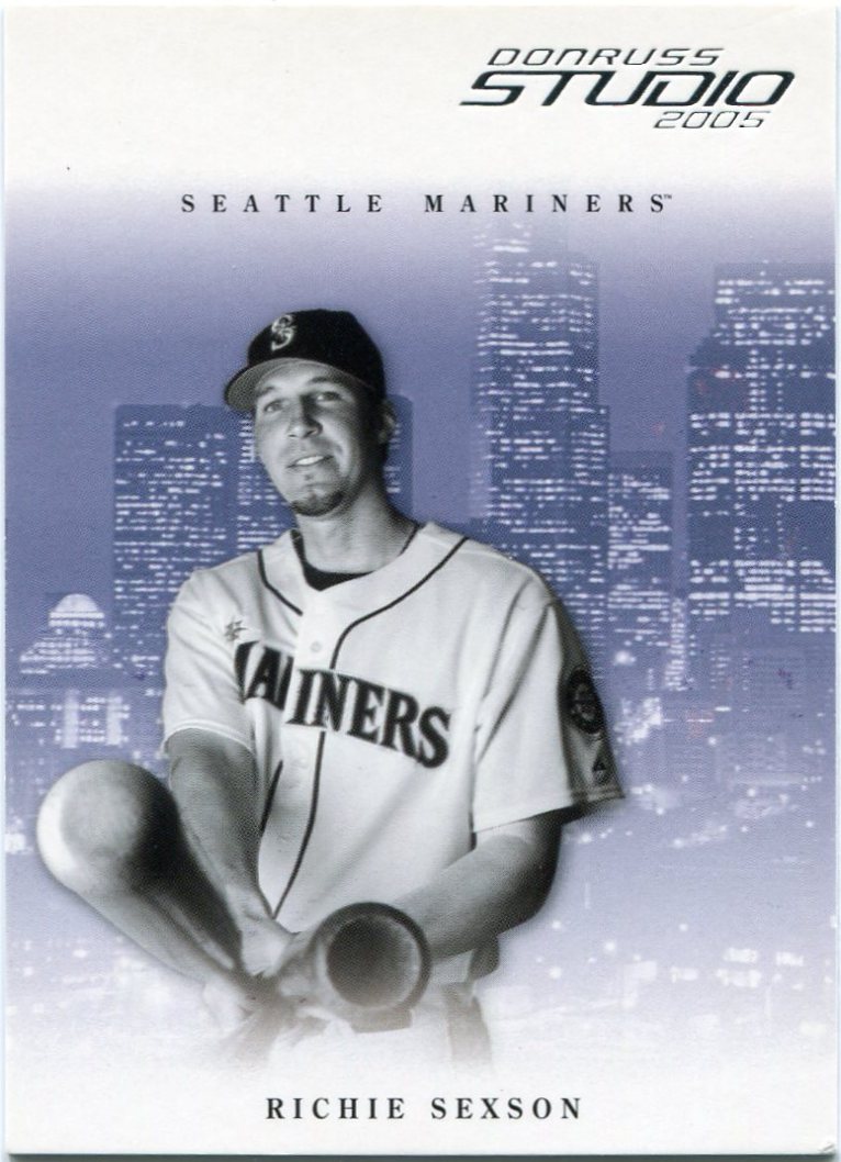
While dormant for much of the mid '90s and early 2000's, Studio did make a brief reappearance a few years ago.
Unsurprisingly, neither their '04 or '05 sets are all that remembered these days.
After taking a closer look, though, I'm starting to think that these might deserve a bit more recognition.
While I never much cared for it at the time of their release, the "city skyline" theme has started to grow on me recently.
They're quite reminiscent of the widely-revered '93 Leaf backs, if I do say so myself.
Plus, can I really be that angry at a set that produced a double bat barrel card?
As far as I know, this one of Richie Sexson is the only one around.
In the end, though, many of my set loyalties are driven by photography. And, double bat barrels aside, Studio didn't provide much excitement there.
Then again, shouldn't the terrific backdrops take precedence over the studio shots?
Beats me.
As you can probably tell, that undecidedness is pretty much how I feel about every set I've featured here.
I don't know whether to applaud or throw tomatoes.
2 comments:
I was 11 years old, just before my peak of childhood collecting, when 1988 Topps came out and I was never the biggest fan of it either. I think it was mostly to do with the fact that I loved 1987 Topps so much that it was kind of disappointing that it was so plain. Looking back now, 88 isn't nearly as bad as 89 or 90. However, I still have the "1988 is a bad set" mentality whenever I think about it.
As far as the rest, 1982 Fleer is currently the oldest complete set I own so I like it quite a bit. It's kind of bad, but it's in the "so bad it's good" category for me.
I've also liked Studio ever since the red bordered black and white set came out (1991 maybe?). It is somewhat hit or miss, but I still like it overall.
As a kid, I always thought that Studio was the lamest set. Not only horrible, non-action photos, but no stats on the back either! Only boring stuff like what their favorite movies and books were.
Looking back, I kinda like 92 Studio, and I can appreciate the unintentional humor of a guy who says his favorites were The Bible and Silence of the Lambs. The later ones with the city skyline look sharp, though, if not a little cheesy
Post a Comment