
We're back with another edition of my All-Time Topps Countdown for Sy.
I can honestly say that I like each of the sets from here on out. The only variables are exactly how much I like each one. Sure, almost all of the remaining 30 sets on this list have their flaws, but there will be more positive than negative in the posts to come.
Without further ado, let's boot up the countdown machine once again.
#30 -- 1953 Topps


UPS -- Each card features a beautiful, hand-painted portrait on the front. I love the prominence of the team logos. That old Cubbie Bear cracks me up.
DOWNS -- Not the most stand-out design in Topps history, although that might be a testament to how great the rest of the '50s sets looked. The facsimile signatures on the backs are distracting.
My two cents...
This is the first Topps set from the 1950s to show up on this countdown.
With the exception of the terrific baseball-themed card numbers, the backs aren't among my favorites. That said, Topps was still finding its niche at this point in time, so I can give them a pass there.
Granted, the design might not be one for the ages, but the portraits sure are. Each card from '53 Topps features a special, hand-painted work of art on the front. Now that's putting some serious care into your product.
Like most of the sets from the '50s, I get the feeling I'm holding a true work of art whenever I hold a card from 1953 Topps.
#29 -- 2004 Topps


UPS -- I enjoy the big, prominent team names on the front. The addition of the traced shadow figures in the bottom-left might well be my favorite Topps innovation in recent memory.
DOWNS -- Large borders make the photos feel a little claustrophobic. Positions/player names should be more eye-catching. Backs are a bit cluttered.
My two cents...
I don't know that a lot of people would rank 2004 Topps as high as I did.
I'll come right out and say that without one seemingly simple innovation, this set would probably be about ten slots lower on this list.
Perhaps I'm putting a little too much stock in them, but I really, really love the little shadow figures. They're obviously a nod to '76 Topps, but, as opposed to the generic tracings from the '76 design, these actually go a step further by featuring an actual mini-replica of the larger shot on the front of every card.
Some work better than others (although I sure as heck give Topps credit for trying with this Piazza), but, overall, the shadow shots give a sense of care and effort from Topps.
It's a nice departure from the rather ho-hum attitudes that a lot of recent Flagship designs seem to give off.
#28 -- 2013 Topps


UPS -- Got to love the sea turtles. Nice, clean photography. Great positioning of team logos.
DOWNS -- No positions on the front. Topps really needs to cool it with the backs. Info overload much?
My two cents...
There's nothing ho-hum about 2013 Topps.
It's hard to rank relatively recent sets, but I knew from day one that this set would be in the upper echelon of the Topps catalog. The design is solid all-around, and the photography is action-centric without having too much of the "game face" bias we saw in 2014.
And, of course, there's no ignoring the sea turtles. They'll be the defining element of 2013 Topps for years down the road. In fact, I can't even see the psychedelic baseball field that Topps originally intended anymore.
All I see are sea turtles.
#27 -- 1964 Topps


UPS -- Probably the most prominently-featured team names in Topps history. The different colored nameplates are terrific. I love how some of the photos pop out of the frame. Scratch-off trivia!
DOWNS -- The light text on the white background makes the backs nearly impossible to read.
My two cents...
This is one of those sets that I constantly seem to go back and forth with.
I remember not thinking much of 1964 Topps back when I first started to get into vintage. Then, I slowly started enjoying it more and more. After that, however, the fail that was 2013 Topps Heritage kind of made me shy away again.
Here in 2015, though, I'm back on the '64 Topps bandwagon. I think I'm here to stay this time. The backs are forgettable, but there's no mistaking the fronts. The team names practically scream out at you, although they manage to do so without detracting from the rest of the design.
If you didn't know Matty Alou played for the GIANTS, you sure will after seeing this card.
#26 -- 1954 Topps


UPS -- Easily one of the most colorful sets in the Topps catalog. The first to use two images on the front, providing a nice action/portrait clash. Backs are some of the most elegant in Topps history.
DOWNS -- I could do without the facsimile signatures. Some of the player name/background color combos don't match up all that well.
My two cents...
Topps strayed away from the portrait route and went with real, actual photos in 1954.
In fact, Topps gave collectors two shots on the front, unheard of for the time. I'm not sure that there were any dual-image designs prior to this one. Some, like the Preacher Roe, have that funny angel/devil effect with the little photo standing on the shoulder of the larger one.
The backs are easily among the most iconic in Topps history. The comic strip-esque cartoons on the back really show how much Topps geared their product towards kids back in the days.
Adults weren't even a glimmer in anyone's eyes at the time.
#25 -- 1974 Topps
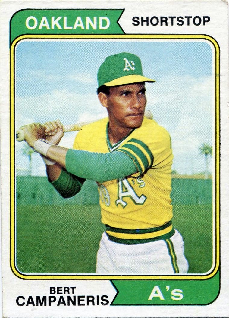

UPS -- The fronts give you everything you need to know in a very economical way. Banner-centric designs are almost always a good idea. As is color-coordination.
DOWNS -- This sounds nitpicky, but I would've liked to have seen a different font for the positions and player names on the front.
My two cents...
I don't have many bones to pick with 1974 Topps.
It may not a surefire stand-out set, but, after taking a good look at the design, there's very little to dislike. The color-coded banner design is brilliant, and the photos have that muted greatness that define so many sets of the '70s. Also, '74 Topps featured the last horizontals we'd see for nearly two decades.
The backs give you what you need and not a whole lot more. I know I'm beating a dead horse by now, but Topps really needs to bring back those cartoons.
They help spice up even the most average of card backs.
#24 -- 2003 Topps


UPS -- Blue borders, blue borders, BLUE BORDERS!!!! Love the dual images on the front. Backs are nice and colorful.
DOWNS -- Not a terrible use of foil, but it still seems rather unnecessary. It's almost like a treasure hunt to find the card numbers on the back.
My two cents...
The fact that 2003 Topps is so high on this list can be explained by one reason and one reason only.
Blue borders!
Though it'll probably change once 2015 Topps hits the shelves, 2003 marked the last time I was genuinely excited over border choice in Flagship. The fact that blue just so happens to be my favorite color probably helped things a bit.
Topps had been going with non-white borders in the early 2000s, but they were mostly of the gray or burnt orange variety. Not exactly the cream of the crop. That all changed with 2003 Topps.
There are other things to like about this set, but nothing beats the blue borders.
#23 -- 1955 Topps


UPS -- The first all-horizontal set in Topps history. The design keeps up with the colorfulness established the year prior. More terrific dual images.
DOWNS -- Backs could use a little retooling.
My two cents...
I can't help but wonder how much 1955 Topps is hurt by the fact that it preceded one of the most beautiful sets in history.
On its own, this design is beautiful. Sure, the dual images can give off a "bad family photo" vibe at times, but it still captures the vivacity of Topps's early days.
I tried my best to limit external factors in creating this list, but it might've gotten in the way here a little bit. From what I've seen, 1955 Topps is almost always overshadowed by the unmistakable elegance of what Topps unleashed onto the world in '56.
If the '55 design had popped up, say, two or three years earlier, would it be more well-regarded here in 2015?
I think so.
#22 -- 1995 Topps


UPS -- Take note, present-day Topps. This is how you make foil work. The ripped-paper borders are genius. Some of the most informative bios you'll ever find. Bring back Diamond Vision!
DOWNS -- The dual photos on the back seem superfluous. As does the big Topps watermark.
My two cents...
I don't know how many of you will agree with this ranking, but I've always had a deep appreciation for 1995 Topps.
Most of the card community seems apathetic towards this design, at best. In terms of popular opinion, I think 1995 Topps was simply in the wrong place at the wrong time. That's my theory, anyways.
Looking at it historically, this set hit the shelves while the ugly baseball strike was still going on, a strike that led to a horrific bust in the card industry. On top of that, Topps released a string of dud designs in the mid '90s. Unfortunately, I think '95 Topps tends to get lumped in with that mold.
And, yes, 1995 Topps began the long streak of Topps's fascination with foil. But I myself don't blame this design for that. When used right, foil can be great. And this is a prime example. The photography is terrific, and the ripped paper look around the images is terrific.
Please, people, give 1995 Topps another look.
It deserves our appreciation.
#21 -- 2011 Topps


UPS -- The design is beautiful while letting the photos do most of the talking. Love the incorporation of the team-logo baseball at the end of the "nameplate rainbow" on the front. Well-structured backs.
DOWNS -- I wouldn't mind seeing the positions be a little more noted on the front.
My two cents...
It just so happens that 2015 marks the ten-year anniversary of my return to baseball cards.
There have been quite a few ups and downs over that span. Still, as far as Flagship goes, I have to say that 2011 was the absolute peak of the last ten years.
It's hard to generate an eye-grabbing design while not encroaching on the photography, but this set does it. I'll go on record and say that 2011 Topps has some of the best photography of any Flagship checklist in the last twenty years.
Oh, and remember what I was saying about there being a good way to use foil?
Yeah. This is it. With the possible exception of the hidden positions, everything is crisp and easy to read here.
I think it'll be a long time before we see a set that can top 2011 Topps.
That said, there's still twenty more Topps designs to get to on this countdown. We'll start digging into the top twenty next week.
Thanks for tuning in this evening.
6 comments:
I love this series you're doing Nick!
'53 at #30? What are you smoking, bro? To rank at least 20 sets in front of that is criminal.
As much as I try, I can't get behind the '95 set. It's bottom ten for me, sorry.
I really like the 2011 set. Simple, and well done. I hoping it would make the top Ten, but #21 isn't bad considering all the vintage that will surely reside before it.
I always liked the 2003 set for some reason. Guess that blue just seems inviting.
I really enjoy these, Nick. You put a lot of work into your rankings and it certainly shows.
I hadn't read/heard the sea turtle comparison re: 2013 before, but...yeah, I definitely see it. And I won't be able to un-see it now! Thanks...LOL.
HAVEN'T HEARD THE SEA TURTLE COMPARISON BEFORE???????
My blog is open 24 hours a day.
Post a Comment