
I picked up a blaster of the brand-spankin' new 2012 Topps Series 2 this afternoon, in case you missed my teaser post.
Again, I have to thank my local Target. They've been awesome about putting the new releases on the shelves right away this year. I've barely seen any Series 2 posts thus far.
This is my sixth blaster of 2012. I've already tripled my total from last year. (I didn't have a whole lot of extra cash available for pack busts in 2011, a year which was a bit of a rough patch for me.)
I'd say the reaction of Series 1 amongst the blogosphere was mixed. Some liked it, some despised it.
I imagine the same will be said for Series 2. As you'll soon see, Topps didn't change much. But I've always thought that was a good thing, at least as far as flagship is concerned. Topps can mess around with the "Five Star Club" or Gypsy Queen or whatever.
All I ask is that they keep the flagship set the same throughout the year. And that they did.
Let's start with the base cards, my favorite part.
From the cards I pulled, I'd say the photography is a slight step backward from Series 1, but the photos in Series 2 are still top-notch.
I don't collect Kerry Wood, but I'll be hanging onto this one as a personal keepsake. While the man made me yell at the TV quite a few times over the course of his career, it saddened me to see him retire last month.
I have to imagine that this will be one of his final cards.
If so, it would be a great way to go out.

I was hoping Kershaw's Opening Day issue was a preview of his Series 2 base card.
Thankfully, it was. Easily the best shot of the phenom in my collection of his. You've got to love the scoreboard backdrop.
I have a feeling Topps recycled an image of Pena during his first tenure for the Rays for his 2012 issue. Most of the other "transaction" players have airbrushed uniforms in the set.
In this case, I prefer recycling to airbrushing anyways.

Topps continued the "celebration" theme with Series 2.
Although between Kerry Wood and "K-Rod", it looks like the slant is towards pitchers this time around. I like that. I don't have too many cards of pitchers in celebration mode, now that I think of it.
I've had a knack for pulling cards of Pujols so far in 2012. This is already the fifth or sixth card this year.
That's not the last you'll see of "King Albert" in this post, though.

At first, I glossed over this card when I was sorting through my pulls.
It took a second view to notice how great it is, though. Just one of the benefits of the blogosphere, I guess.
I don't collect "The Captain", but how many other cards feature a great shot of both the Yankee dugout and the elegance of Yankee Stadium?
Not to mention that I always love a good "dugout steps" card.
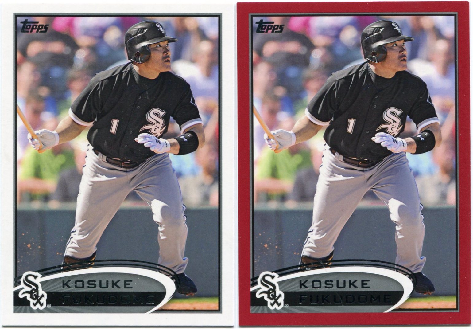
This was one of the cards I was most looking forward to in Series 2.
Not only did I pull the base card, but I added the Target red border for good measure.
Fukudome was a bit of a disappointment for the Cubs, but I still can't get used to him in a South Side uniform. I've seen him on quite a few occasions so far this year, but it just never looks right to me.
Baseball is funny that way.

I'm not sure if it was some sort of collation issue or pure dumb luck, but I pulled both the base and red bordered copy of six or seven different cards in the blaster.
I've been looking forward to Pierre's first Phillies issue anyways, so I'm not complaining in the slightest.
Plus, that's Wrigley Field ivy in the background, which is always a plus.

Moving on...now for a look at the inserts.
Thankfully, Topps brought back the popular 1987 minis in Series 2.
These were probably my favorite thing about Series 1. I don't think that's changed for Series 2. Topps picked up right where they left off with these.
The Spahn was probably my favorite pull from the blaster.
How could anyone not like that card?

I like these Gold Standard inserts, which probably puts me in the minority amongst those in the blogosphere.
People didn't seem to like these very much.
I'm glad they're back, though.

I don't think anybody liked these...

...or these.
But they're both back for Series 2. The Golden Moments inserts are easily among my least favorite of the year. Way too plain and boring.
I'm not much into "prospects", so I don't really care about the Gold Futures insert set.
You can't like them all, I guess.

Also returning is Topps' Golden Giveaway promotion.
Talk about a swing and a miss. I don't remember reading a single positive review about these. No one wants those virtual coins.
That being said, I've got two codes available if anyone is interested in them.

The Gold Sparkle parallels are also making a return in Series 2.
While I don't like them as much as last year's Diamond Anniversary parallels, these are still nice.
This is the right way to make gold-themed inserts, in my opinion.

Topps did try a few new things this time around, such as the "A Cut Above" inserts.
It might be tough to tell from the scan, but these are a bit oddly-shaped. You might be able to notice the grooves at the top-right and bottom-left portions of the card.
I want to like these, but I just can't. They remind me too much of the Upper Deck X parallels, which I despise.

Another new appearance in Series 2 are the "Career Day" inserts.
I always love getting a new Stan Musial card, but as far as the design is concerned, these are awful. (Even worse than "A Cut Above", in my opinion.)
First off, I wish Topps would make some inserts that aren't obviously geared towards the game-used versions. It results in too much empty space, which severely diminishes the overall look of the card. I would've loved to see a bigger picture of Musial. Instead, he's relegated to about a quarter of the card.
Secondly, there's a huge black bar running through the "Career Day" portion of the card. Even with all that empty space, Topps still felt the need to squeeze something like that in.
A huge miss on Topps' part, I'm sorry to say.

The final new addition to Series 2 are the "Mound Dominance" inserts.
Foil lettering aside, I think these are pretty nice. The "K-Zone" image on the right-hand portion of the card is something new. I don't think anyone's ever done anything like that before.
The bright-to-dark contrast on either side of these is a big reason why I like them.
You did good with these, Topps. Just lose that annoying foil lettering and they'd be perfect.

Every Series 2 blaster comes with a special pack containing an exclusive manu-patch.
Since I'm not a fan of these, I was just hoping to get a tradeable one.
I think I succeeded with that. In fact, the Pujols is the one they advertise on the side of the blaster.
I guess repeatedly pulling Albert Pujols cards does have its benefits. It's for trade if anyone wants it, by the way.
Overall, I think Series 1 is slightly better than Topps' Series 2 offering. But that's not taking anything away from this release.
With flagship, I don't really care about the inserts. Any cool-looking ones are just a bonus. The base set is the focal point for me. I just like seeing cards of guys like Juan Pierre or Kosuke Fukudome. Guys who probably won't have any other cards issued this year.
In that department, Series 2 is a resounding success.
4 comments:
That Musial card is horrendous. It's hard to tell that even says "career day" and look at all that red! So much wasted space.
Picked up some 7 packs at my Target. This years set has grown on me. The photography is great, a nice clean design front and back. Got that Woods card as well, nice way to go out. I like the minis as well and got three of those Cut Aboves, Schmidt, Aaron and Griffey.
I'd agree with Lost Collector, seriously, they didn't have a sharper pic of Stan? My Bob Gibson mini was that way, not a sharp image.
I'll take the codes off your hands.
Who is the joker at Topps that decided the Red Sox were under represented and that Dawson should be shown as one? I get that he got his 400th home run with them but also, not to diminish his achievements, is 400 HR really a "gold standard" now?
Post a Comment