
When Panini made their first major foray into the baseball card industry last year, I wasn't expecting much.
Of course, thanks to the dreaded Topps monopoly, they weren't able to use logos on their product. That, coupled with Panini's relative inexperience with baseball cards, led me to believe that their stay in the hobby would be a short and uninspiring one.
I guess the egg is on my face with that assumption. While Topps might be the only logo-branded name in town, Panini has been like a breath of fresh air.
Last year's cartoonish Triple Play release was a brilliant way around the logo-less restrictions. And their HOF-centric Cooperstown effort was the all-retired set I'd been waiting for.
True, not everyone liked Triple Play and/or Cooperstown. But, thanks in large part to their creativity, they certainly grabbed the attention of many people around the hobby.
Much more than the distant and rather high-and-mighty Topps, I truly think Panini is more in touch with the everyday collector these days.
Their recent revival of the Pinnacle brand was a further indicator of that.
While its tenure was fairly short, Pinnacle managed to make a minor splash in the hobby between 1992 and '98.
I've labeled it as the most underrated brand in cardboard history more than once before on this blog, which was why I was more than excited to see its grand return in 2013.
Still, while I wholeheartedly appreciated the effort by Panini, I wasn't all that excited with my first looks at the Pinnacle's revival on other blogs.
Given that my local Target has been slow on the draw with Panini products this year (they still don't have any 2013 Triple Play), I was quite surprised to see a shiny new box of Pinnacle on display last week.
I wasn't planning on buying any at that point, but my dad insisted on treating me to a pack. (Have I mentioned how cool he is?)
I still think three bucks for an eight-card pack is pushing the envelope. Especially for an unlicensed set. But I excitedly tore into the pack nevertheless.
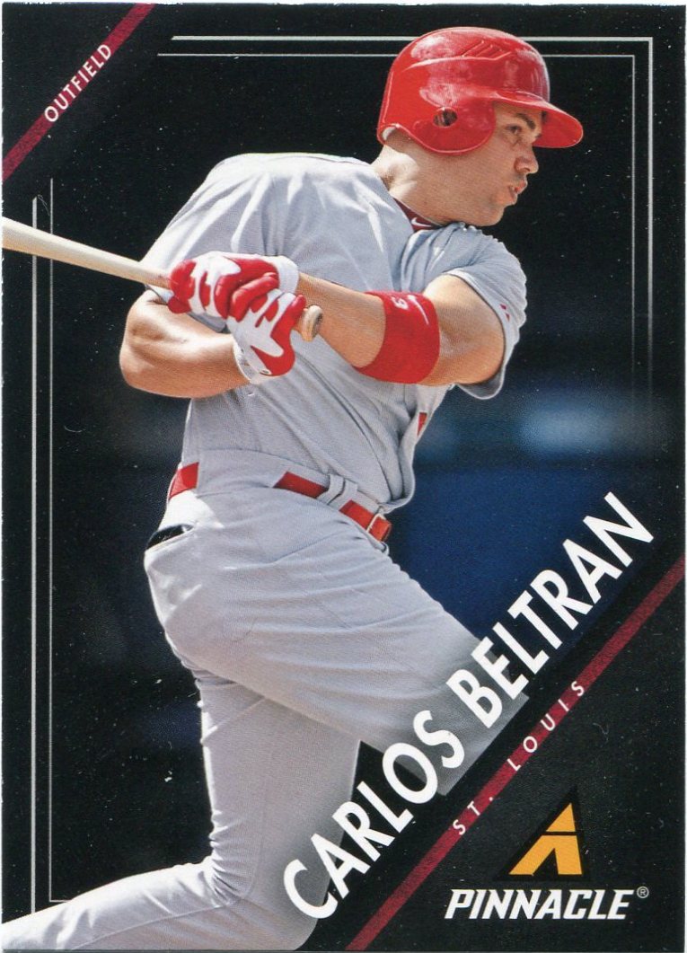
So after netting new adds to my Carlos Beltran...

...and Buster Posey player collections with the first two cards in the pack, did my otherwise apathetic opinions towards 2013 Pinnacle change at all?
Well...no.
It's not a bad set or anything. And I certainly see the influence of '92 Pinnacle (one of the greatest designs ever, by the way) on this year's revival.
But these just aren't doing it for me.
The design is a bit claustrophobic. I see a lot of wasted space on the bottom-right portion of these things.
Still, shots of backstops in their "tools of ignorance" are a great way around the logo-less restrictions.
I doubt any airbrushing was even needed on Mr. Posey here.

It's a little more obvious on other cards, though.
Here's one rather dubious way of getting around the whole "no logos" thing. The "ass shots", as I like to call them.
New binder inductee Wil Myers was rewarded (or punished?) with one of those in this year's Pinnacle.
By snapping a photo of a player's backside, almost no photoshopping is needed. Still, logos or not, I want to see the guy's face on the front of his baseball card.
Not his ass.

This is at least the fourth or fifth Jurickson Profar card I've pulled this year.
Looks like I might have a new cardboard stalker on my hands.

"The Big Hurt" was my lone insert pull of the pack.
Apparently, Pinnacle's "Awaiting the Call" series is centered around future Cooperstown hopefuls. Names like Tim Raines, Fred McGriff, and Alan Trammell make up the rest of this set's checklist.
If Frank Thomas doesn't get into Cooperstown, then I'll seriously have to question the sanity of the Hall of Fame voters.

An Astro?
In a 2013 product?
I guess pigs can fly.

Aesthetically speaking, this was easily the best card I pulled from my lone pack of Pinnacle.
I absolutely love the "clash of black" this Konerko offers. Black borders. Black batting helmet. Black jersey.
It's one of the darkest cards I own.
I mean that in a good way.

Closing things out was "The Flyin' Hawaiian" in his new Boston duds.
Overall, this pack didn't do much to change my opinions on the Pinnacle revival in one way or the other.
In a year that's been full of 'em, it's yet another "meh" set.
I may pick up a few more packs here and there, but I'm not planning to break the bank on these.
Still, I think the message of Panini's resurrection of the Pinnacle brand is the most important thing here. While we've been pleading with Topps to put a bit more "oomph" into their product, Panini hasn't been slacking in the effort department.
You can tell the folks over there put quite a bit of thought into everything they release. And, even though it might miss on a few levels, I think that's evident with 2013 Pinnacle.
Oh, and if you're planning to revive any other long-lost brands, Panini, I'd like to throw Collector's Choice into the hat. Now that's a set I'd love to see again.
In the meantime, I'll be eagerly awaiting to see what else Panini has in store for the hobby.
I can't wait to see what's next.
4 comments:
Yeah, a fun diversion but nothing more. I didn't know about the "Awaiting the Call" inserts. I like the idea. Purposely stopped reading the names so I might be surprised if/when I run across one. I suppose enough time has passed to give up hope and interest for Hershiser to show up. Curious if there are any "oldtimers" in there, like Gil Hodges or Dick Allen or somesuch, but probably not.
Panini owns the old Donruss brand, which bought out the old Score brand, which is where the Pinnacle brand comes from. Collector's Choice was/is and Upper Deck brand, so it is highly unlikely Panini would bring those back. UD might if they get their license back.
Despite not being able to use MLB Logos, panini has not done too bad a job. My favorites Panini set has been their Prism line, with images that pop right out of the card. I'm actually looking forward to this year's Prism set. As for the Pinnacele, I can take it or leave it. It's just an ok set
Wow! It sure looks like Pinnacle alright. Very interesting!!
Post a Comment