
I start school on Monday.
On the one hand, I'm looking forward to it. Since I'll be starting at a new school, it's almost like one giant college do-over. New people, new teachers, new classes. New everything.
But, then again, it's school. Although my schedule probably won't be too taxing, it still means less time for other things, like my collection.
One of the downsides of the school year is that I don't usually get the time to soak in many of the new cards I get. That's especially true when it comes to trade packages.
During the summer, I can pretty much dig through my new cards as much as I want. Over the past few months, I've spent a good deal of time simply glossing over new cardboard I've received in the mail.
One such doozy of a trade package came a few weeks ago from Adam, author of the great blog "The Topps Baseball Fanatic". He's been hoarding Topps cards since '92. (His words, not mine.)
Oddly enough, though, one of the cards Adam sent came from a UD-branded set with the above Collector's Choice Jordan, a former "Dime Box Dozen" need of mine.
I'm an avid collector of any baseball pieces of "MJ". What makes this particular shot so interesting. however, is the fact that it actually features a photo of someone taking a photo of Jordan. Strange.
Plus, I don't think I've ever seen a briefcase on a baseball card before.

As great as the Jordan is, though, the vast majority of the other cards Adam sent helped knock out a bunch of my 2013 needs.
I love getting more recent cardboard because...
a) They're a blast to go through.
b) It saves me money, and...
c) It saves me money.
So, since school is starting soon, (and the fact that I'm running out of things to say about 2013 products), I've decided to grade some of Topps' efforts so far this year. (The aforementioned Jordan receives an A+, by the way.)
On its own, this Series 2 Brian Roberts certainly warrants an A. He seems rather shocked at the umpire's call on (what I assume was) a Bryce Harper stolen base attempt.
But how does the rest of Series 2 stack up?

Adam ended up sending over about 30 Series 2 cards I needed.
In keeping with Topps' Flagship theme so far in 2013, it was just one great photo after another. I'm loving the Helton celebration shot and the "double dip" Alexei Ramirez. Oh, and let's not forget the magnificent PATP/throwback combo on the Quentin.
Topps did a nice job with the player selection in this set as well, which is a lot more than I can say about most of their other releases.
Guys like Jose Molina deserve recognition in this hobby just like everyone else. According to my binders, he's had exactly three cards issued in the last three years. And they've all come from Flagship checklists.
Overall, Series 2 is a great effort on the part of Topps.
Final grade:
A

As I've said time and time again, the concept for Archives is a great one.
I wish someone would tell Topps that, though. They don't seem to give two you-know-whats about it. Reused photos, subpar designs, and ugly trademarks are some of this set's major flaws. I'm still not quite sure why Topps chose to honor the 1990 design this year.
Nevertheless, Archives does show flashes of greatness at times, a signal of what it one day could be. The McCutchen is superb. And I love the sky blue-yellow color combo for the Rays on the '85 design. It's very '80s, if you ask me.
Still, if I were grading a set like this, I'd have to give it a "Needs Work!" note at the top of the page.
In big, thick red ink.
Final grade:
B-

On to Gypsy Queen we go.
I especially like getting GQ cards in trade packages because I don't plan on buying anymore of these things. While I'm not a huge fan, I do still need quite a few GQs for my myriad of player collections.
Trades and the occasional card shows are my only hope.
If you ask me, the design is probably the worst of any current product. And, as far as recent guys go, the player selection isn't much to write home about, either. With guys like Hamilton and Fielder, it's basically still the common suspects.
I do like the selection of retired players Topps incorporated into this set, though. You don't see Don Sutton in too many checklists these days.
Unfortunately, the retirees are about the only thing Gypsy Queen has going for it, which isn't too great considering it's, you know, a current set.
Final grade:
C

Adam knocked out my last six Heritage base needs with his trade package.
He also whittled my Opening Day wants to a mere few with the three you see at the bottom of this page.
While I didn't like the 2013 edition as much as past releases, this year's Heritage was still a mighty fine set. I think it might've helped me warm up to the original '64 design a little bit, too.
As far as the base cards go, Opening Day is more of the same. A nice set with wasted potential, in that most of the photos are simply reused in Series 1 and/or Series 2.
If anything, Topps should maybe consider releasing Opening Day before the actual baseball season starts.
Final grades:
2013 Topps Heritage: B+
2013 Topps Opening Day: B

Adam was nice enough to send a budding stack of 2013 inserts along as well.
While I like the original '72 design much better than the '87s, I enjoy 2012's '87 minis better than this year's '72s.
I'm not quite sure why.
Maybe it's because Topps is oversaturating the mini market these days. Or maybe it's because Topps, for whatever reason, chose to repeat the '72 design in this year's Archives.
Probably a little of both.
Final grade:
B+

The inserts in Gypsy Queen are way better than the base cards.
Even if the design itself is a bit bland, the "No-Hitters" series is a decent concept. Once again, though, the effort seems to be lacking on the part of Topps.
The "Dealing Aces" cards, however, are easily the best things GQ has going for it. It's easily one of the better insert series we've seen so far in 2013.
Plus, that throwback Tigers jersey on Mr. Verlander is mighty fine.
Final grades:
"No-Hitters": B-
"Dealing Aces": A

I happen to be in the pro-World Baseball Classic camp.
It's tough to get a real feel for how the rest of the baseball community feels about the WBC, but it seems quite divided. I sure had a blast rooting for Team Italia this year.
At the very least, I'm glad Topps gave the event its own insert checklist in Series 2. Even if the design isn't all that great and that gosh-darn foil is nonexistent on my scans, it's still nice to see a Team Venezuela jersey on a baseball card.
Call me crazy, but I think this year's "Ballpark Fun" inserts from Opening Day might be my sleeper pick for "Insert Set of the Year". They're a great break from all the standard "action" shots we're used to seeing by now.
If only, if only.
Final grades:
"World Baseball Classic": B
...
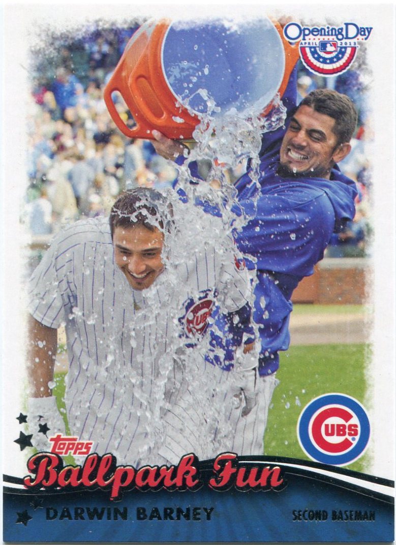
"Ballpark Fun": A+
Hey, my beloved Cubbies don't get many chances to celebrate these days.
It's good to see guys like Matt Garza and Darwin Barney basking in the joy of a rare win.
If you total it up, Topps' GPA for 2013 thus far is probably somewhere in the B range, which isn't too bad. They haven't been perfect this year by any means, but Topps is still doing a decent job.
I honestly don't know how my grades would compare with those of other collectors. I bet GQ is a solid D to many. Or maybe even an A to others.
Still, since I'm planning to pursue a teaching degree in the coming years, I guess I might as well get the hang of this grading thing now.
1 comment:
GQ probably gets an "A" from me in terms of the set - but a giant "F" in terms of a box break. I don't think I've ever opened a worse box (especially considering what you have to pay to get a box). Terrible.
Post a Comment