
Even with my efforts to keep tabs on the current hobby, some juicy developments still manage to completely pass me by.
Last week, I saw a post on Twitter that said something along the lines of Look for 2017 Topps Fire at your Target today! And my first reaction was, honestly: What the hell is Topps Fire?!
Topps Fire is, as I quickly learned, a new Topps set, and the first (as far as I can remember) sold exclusively in Target stores. It's an extension of last year's Topps Update insert series of the same name -- the only example I can recall of an entire brand blossoming from a past insert set -- and carries a $5.99 price tag for a 12-card rack pack.
Despite the hefty price and my relative apathy for images I'd seen around the 'net, I still found myself purchasing a couple rack packs and a blaster of Topps Fire this weekend.

It's a good thing I did, because from the looks of it, Topps Fire seems to have, well...caught fire.
I had to make a Target run today, in fact, and found that they'd completely sold out of the product in the three days since my original purchase. Standard blasters are selling for $10-15 more than their $20 retail price online, and even the standard base/inserts are commanding inflated prices.
All this makes me glad I pulled an Aaron Judge from my packs, because I seriously doubt I'd be able to reel one in at anything near an affordable price otherwise.

It's been three days since I originally bought these packs, flipped through the cards within those packs at least half-dozen times by now -- and I still don't know how I feel about them.
I can't remember having such a back-and-forth feeling with a product before. On the one hand, they are colorful, and the ones I've placed in my binders provide a spectacular pop to a nine-pocket page. I'm not sure the scans do them justice -- it's a design that needs to be seen in-hand to be fully appreciated, I think.
On the other hand, man are these things loud: the photos are yawners, the backgrounds are obliterated, and every card seems to seemingly depict a player trying to escape a natural disaster.

And try as I might, I can't find any kind of cohesion to the subdesigns apart from semi-team coordinated color schemes: the lightning bolts, octagonal frames, bolded names, etc. seem to be thrown around at random.
But although the big-name legends are the same as you'll see in most other sets (though the Tony Perez sighting is a nice change of pace), Topps Fire does provide a different, modern look at some of these overdone stars.

But the backs suck.
But the parallels are so darn awesome!
This, in a nutshell, is how I feel about Topps Fire. This is cool! But I don't like that. But how great is THIS?! But that doesn't seem right. And this, but that.
Perpetually.

But seriously, the parallels: wow do they pop and sizzle, and what I said before about the cards needing to be seen in-hand goes double for these.
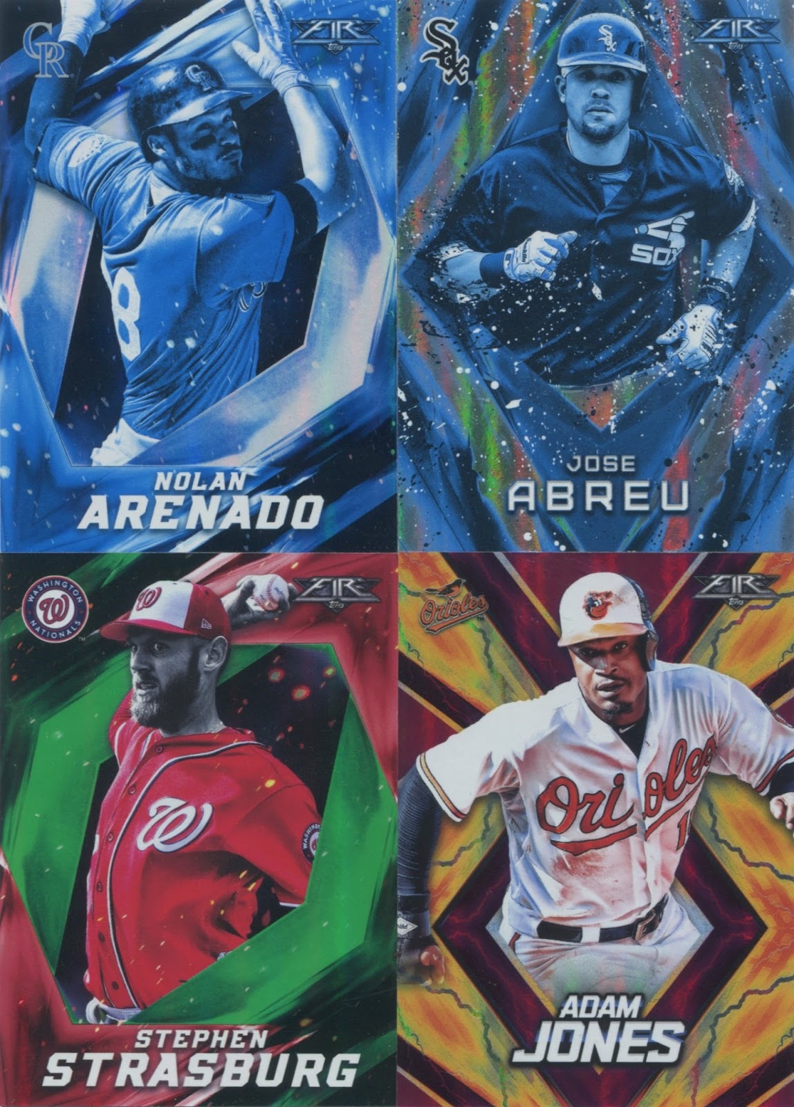
But again, the negative: there's just so many of them to the point where I don't even know what I have. And that just has the feeling of overkill. The Strasburg (numbered to 199) and Jones (/25) were the only numbered cards I received in my breaks, and I think those are emerald and magenta parallels, respectively.
The Heyward was the only notable name I pulled from my blaster-exclusive pack of four Gold Minted parallels. I'm guessing the Arenado and Abreu are Blue Chip parallels, found only in rack packs. And the Schwarber appears to be your standard Flame parallel.
Whew.

And then there's the inserts, which themselves have parallel variations.
The theme of the Golden Grabs series pretty much speaks for itself, and my blue parallel of this insert -- does it get more modern than pulling a parallel of an insert? -- makes Andrew Benintendi look vaguely like an evolving Pokemon.

Now these I like: the Monikers series features famous nicknames on a graffitied background, and I pulled two of the greatest with "The Wizard" and "Mr. October."
And better yet, The Spaceman(!) earned a place in this set, and I already went ahead and purchased a copy, of course.

Last but not least are the Walk It Off inserts, another design I like due to the comic-book-esque vibe I seem to get from them.
Though I don't know if Topps Fire is completely necessary -- it almost strikes me as a more expensive version of Topps Bunt -- I do appreciate Topps giving us something new and at least kinda original. And while I'm not sure how I feel about cards being exclusive to certain retail chains in the first place, it makes me feel lucky to have something like this around when I live right across the street from a Target.
And there we go again with the and/but thing -- god, even the peripheral details here make me all conflicted and mixed-up inside. I feel like examining this set any closer will lead down a dark path that ends with me questioning my life choices.
So tell me how to feel about Topps Fire.
9 comments:
Topps released a FIRE football set in 2014.
I like that it's a small-ish checklist with about 25% retired players.
The designs are okay. My favorite is the yellow with the lightning by far.
You're dead on about the backs. They suck. But I don't usually collect a set for the backs.
The parallels are phenomenal and make the base designs succeed where they otherwise fail.
Sorry to hear you bought the Spaceman already. I had mine starting a new stack of cards for you.
If you can part with any of your base, please check out my want list that I just posted tonight! Thanks!
This doesn't seem like my type of set at all, and I haven't found any in my local Target, but your comment about how they look much better in-hand might get me to pull the trigger.
Topps Gold Label was an insert before a base set- and it used the exact same design.
I'm not sure what I think about these, but I don't think I like them. I like parallels, but not when they turn the people themselves blue, or pink, or whatever. Bright colors are good, too, but it's just another set of a player cutout in a digital backdrop...how many times have we seen that over the years?
I saw a pair of blasters last night and I left them for another collector. They're a little too busy for me, but I can see where collectors like them. They're very colorful.
I won't pull punches.
That set is total shit. And "shit" in the bad way.
i wouldn't mind having a few for PCs but these cards do nothing for me. Numbered parallels are nice but the blue chips and golds are hideous. I do think any and all dupes should be sent to Jedi Jeff.
I don't think I'll miss it if I never end up with one of these. But it would be interesting to see one in person.
Someone at TOPPS got a new Photoshop update and lost him/herself in it..It's one of those times you would say to TOPPS: please..just sit and do not move.
Post a Comment