
Think of a baseball card.
Any baseball card.
Maybe it's your absolute favorite card. Or perhaps it's one of your big "acquisitions" from a few days ago. Or maybe it's your very first card, if you're lucky enough to remember what it was.
If you were to ask a thousand different collectors to picture a specific card, I'm sure you'd get a thousand different answers.
That's part of what I love about this hobby.
However, in a situation like that, I'm sure all of them would involve at least one common factor.
Of those thousand collectors, I'm sure each one would think of the front of the card in question.
I'd be inclined to do so as well. After all, the front is basically the "meat" of every baseball card.
Still, that doesn't mean the backs should be ignored altogether.
Far from it, actually.
They should be celebrated.
True, my collection doesn't necessarily emphasize the backs of my cards. By using both the front and back of each of my nine-pocket pages, I'm able to store eighteen cards in each.
While it is a lot more efficient (both storage and money-wise), it takes away from the beauty that the backs of some cards can hold.
It's one of the few pitfalls of my organizational system.
Lately, I've been on a quest to find some of the "hidden greatness" that lie on the backs of cardboard.
In the past, I'd tend to just "ooh" and "aah" at the fronts of each card that I'd bring home from a successful flea market venture or card show.
These days, I do my best to carefully examine both sides of all my new "pickups".
As I've found, there's a lot of that "hidden greatness" just waiting to be discovered.
Because of how inherently awesome the front of Vida Blue's 1973 Topps issue is, it took me a while to flip it over.
Just when I thought this card couldn't get any better, the back suggested otherwise.

Of all the vintage card backs in existence, I'd rate '73 Topps as my favorite.
For one thing, the black-yellow color combination really stands out. I've also found myself fascinated with what words Topps capitalizes in the player bios. (Since when is "Save" a proper noun?)
But, most of all, the little fun facts are what put these over the top in my view.
Without them, I wouldn't know that Paul Blair was the scoring leader on the Orioles' basketball team. Or that Fergie Jenkins was named Canada's "Athlete of the Year" in 1971.
Few of the tidbits can better the one Topps provided for Vida Blue's card. The odd fact that he was vice-president of a plumbing company speaks to the overall "fun" that collecting should be.
It also probably speaks to the salaries of early '70s ballplayers.

Sometimes, I think I take technology for granted.
I've never lived through a time where computers or cell phones weren't readily accessible.
If I wanted to, I could find Honus Wagner's career statistics within seconds. I've never had to rely on baseball cards for stats.
However, to someone growing up in 1976, I'm sure these "All-Time Greats" cards were quite the innovation. (My dad often mentions how much he loved them as a kid.)
If you wanted know what Wagner's career batting average was, it was right there. If you wanted to know how many homers he hit in 1908, it was right there. If you wanted to know when he was elected to the Hall of Fame, it was right there.
Given that I didn't grow up during the era, I don't know that I could ever fully comprehend how great the "career stats" portions of card backs were back in the day.
I can only speculate.

As far as card backs go, having full career stats is easily my first preference.
However, some card brands have managed to spice up the flip sides in other ways.
Take Stadium Club, for instance.
The comprehensive "BARS Chart" stats were something that I'm sure intrigued and confused a lot of collectors in 1992. They look like an early form of sabermetrics to me.
However, what I really like about early Stadium Club sets is the fact that they included a small picture of each player's rookie card on the back. It's one of the more truly unique approaches I've seen to cardboard, as I've never seen a company attempt to replicate it since.
With grizzled veterans such as "Goose" Gossage, the rookies can date back to decades prior. While a lot of things changed from 1973 to 1992, one constant was seeing the "Goose" on a big-league mound.
Stadium Club did a great job of capturing that.
For better or worse, Upper Deck changed the hobby in a lot of ways.
Even though they played a major role in the overall craziness of the overproduction era, I have to give UD a tremendous amount of credit on at least one front.
They single-handedly revolutionized the backs of baseball cards.
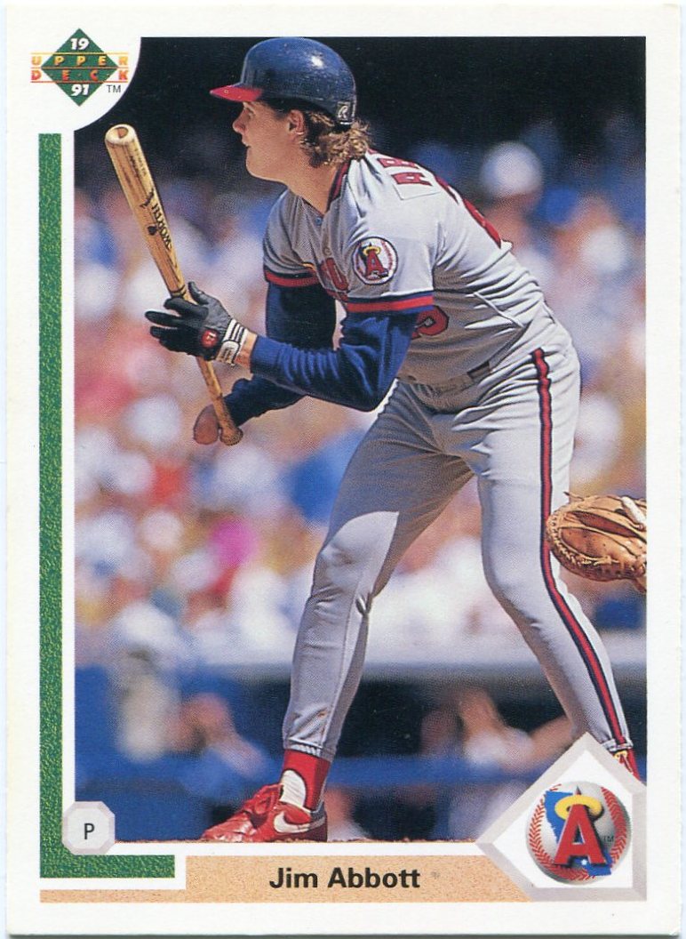
If Jim Abbott's 1991 UD issue is any indication, the company was always near the top in terms of photography.
In their competition with the other card companies at the time, they managed to take that to a whole other level.

As far as I know, Upper Deck was the first company to give the collector a full color photo on the back of every card.
For me, the front of this Jim Abbott card would've been more than enough. I love any cards of "pitchers at the plate", much less a pre-interleague play American Leaguer with Abbott.
The back just tops it all off, in my opinion.
These "continuity" backs are among my favorites.
I'd have to believe that the shot of Abbott on first base was taken directly after the photo used on the front of the card.
Is it the single greatest card back in my collection?
Quite possibly.
Still, Upper Deck had a lot more to offer in that department.

In some cases, the backs of cards are even better than the fronts.
On the surface, Roger McDowell's 1992 Upper Deck issue doesn't seem all that exciting. (Unless mullets are your thing.)
Until you flip it over, anyways.
From what I know, McDowell was a well-known "prankster" during his days in the game. Upper Deck certainly managed to convey that on this one.
On what I have to assume was a hot, muggy day in Chicago, UD managed to capture McDowell in the process of dousing the Wrigley Field faithful with a nice helping of water from what looks to be a fire hose.
How's that for a "unique" glimpse at the game of baseball?

Thanks to the backs of baseball cards, I'm still learning new things about my collection.
Up until a few weeks ago, I never thought to flip over Mickey Hatcher's goofy 1991 Upper Deck card.
That is, until it made Night Owl's "100 Best Dodger Cards" countdown, coming in at number 83.
Since Hatcher isn't in my binders, I'd stored it away in one of the many "extras" boxes around my room after I pulled it last year. (A part of the first "new" card purchases I ever displayed on this blog.)
After seeing it on Night Owl's blog, I scrambled to try and find it amongst all the other cardboard "rubble" in my room. After a little digging, I finally found it.
While the front of the card is awesome, I couldn't wait to flip it over.
I have to believe that this is the first and only instance of a guy putting out a fire on a baseball card, something that was likely the result of a dreaded "hotfoot" prank. (Note the card number 666 as well.)
I can't wait to see what other "hidden greatness" is sitting out there, begging to be unearthed.
Don't get me wrong. It's always a treat to gaze at the fronts of baseball cards.
Still, something should be said for the "hidden greatness" that backs can hold as well.
After all, there's two sides to every baseball card.
1 comment:
I keep my cards in pages too only I only put 9 cards in a page, it is just what I have always done. Oddly enough except to look at a number I never (and I mean never) look at the backs of cards. If they only put a number on the back of a card that would be fine with me.
Post a Comment