Tuesday, June 25, 2013

Turning over a new Leaf


An epiphany is a special thing.

I know I've had quite a few when it comes to the wonderful world of baseball cards. I remember my sudden realization of "bat barreled" awesomeness like it was yesterday.

A while ago, I found myself reveling in yet another rare cardboard epiphany. Trouble is, I hadn't gotten around to writing about it until now.

By and large, I've noticed that the Leaf brand doesn't get a whole lot of recognition in this hobby. For a long time, I thought that was probably for the better. I never thought it was a brand that deserved to be recognized all that much.

But, in recent months, I've shifted my feelings on that topic.

In my mind, Leaf is most certainly a brand that warrants our appreciation. While it may not have ever been at the top of the collecting universe, the folks at Leaf managed to continuously fly under most collectors' radar.

While the brand's beginnings can be traced to a little-known 1948-49 checklist, the oldest Leaf card in my collection is the above Felipe Alou, one that hails from their largely inauspicious 1960 release.

While I'm glad to have picked it up a card show last year (along with a Hoyt Wilhelm that another blogger graciously sent me), it's not a particularly standout piece in my vintage collection.

Still, like most brands, it took a while for Leaf to hit their stride.


For a long time, the brand merely served as a Canadian "stunt double" of sorts to their Donruss compatriots.

From 1985 to '88, Leaf's checklists consisted of basically the exact same cards as each year's Donruss release. All that separated the two was the special Leaf logo on the fronts and a bit of French text on the backs.

The few Donruss/Leaf combos I own certainly look nice in binders, but it wasn't a particularly Earth-shattering time for the Leaf brand.


Thankfully, Leaf finally had a checklist all to themselves in 1990.

For the first time since the '60s, the brand wasn't merely an offshoot of whatever Donruss was up to that year. And, compared to the awfulness that is 1990 Donruss, Leaf absolutely kicked the tar out of their counterparts with their first real checklist.

From what I know, '90 Leaf was one of the first sets to be classified as "high-end". Although they don't look like anything special these days, I'm sure they were quite the rage back then.

Interestingly, I had to do quite a bit of digging through my binders to find an example of a 1990 Leaf card. This Orosco is one of probably only four or five I own at the moment.

Nevertheless, the nice clean borders and good photography are certainly easy on the eyes.

Still, Leaf was just getting started.


After a couple of fairly subpar releases in '91 and '92, Leaf unleashed what would become their most memorable release onto the market in 1993.

This Candy Maldonado is a personal favorite of mine for a few reasons.

For one thing, it's currently the only card of his in my collection that features him as a Chicago Cub.

But, getting back to the point of this post, I enjoy this piece because of the affinity I've always had for '93 Leaf.

The little "Leaf ribbon" on each card is a nice touch. Plus, color-coordination, as we have with the bottom-right corners of '93 Leaf, is always a huge plus for me.

Still, the things that make this set so particularly legendary...


...are the backs.

Each individual card back features a skyline shot of the particular team's hometown. In this case, it's the skyscraper-lined city of Chicago, one that I know all too well. I can't help but think of Ferris Bueller's Day Off every time I see it.

Most collectors I've talked to seem to enjoy the skyline feature, and for good reason.

To me, it remains one of the more innovative card designs ever unleashed upon the cardboard universe.


Leaf gave us another stellar set the following year in '94.

By this time, Leaf had established itself as an entirely separate entity from Donruss. And, in most years since their initial "break" in 1990, they'd outperformed Donruss with their checklists.

That trend continued in 1994.

That year, Leaf used another nice design and more clean photography, factors that contributed to yet another terrific set in '94.

Trouble is, I hardly see it get any love around most collecting circles.


Oddly, I've never been that big on Leaf's 1995 release.

Other collectors seem to like it a bit more than I do.

Nevertheless, I can certainly see the charm that many others see in it. While intrusive, the neat foil-based team name on the left sides was yet another daring concept that Leaf presented to the hobby.

And, although the design isn't one of my favorites, the handful of '95 Leaf issues in my binders all feature splendid photography.

As you probably know, I'll forever be a sucker for Wrigley shots on cardboard.


After a couple more decent releases in '96 and '97, Leaf transitioned into (what was then) their swan song in 1998.

Much like their past efforts, I almost never see these get any recognition. Yet, aside from the distracting Leaf banner near the bottom, it's a perfectly nice set.

I rather like the whole "picture frame" theme that they pulled off in '98. It gives each individual card a rather fancy feel.

After that, though, Donruss mysteriously left the baseball card market. Which, unfortunately, also meant that Leaf was on the outs as well.

That is...


...until 2002 came around.

Donruss reentered the cardboard market early in the decade, bringing the Leaf brand back with it.

Still, I can't help but think that they would've been better off letting the glorious mid-'90s Leaf releases serve as the final chapters in the brand's history.

Had that indeed happened, Leaf certainly would've gone out with a bang. Instead, however, the brand trudged on for another four uninspiring years.

Now, I don't have any huge problems with their latter releases, mind you. More fairly clean designs, and more nice photography. The cornerstones of past Leaf greatness was still intact.

Still, from 2002 to 2005, every single set...


...looked...


...exactly...


...the same.

With the possible exception of 2005, I often get confused in distinguishing the last years of Leaf cards apart from one another.

While unlicensed Leaf sets still pop up from time to time today, '05 was the last we'd see of the real thing.

Neat Carlos Lee throwback aside, it's a shame that they had to go out in such an otherwise unspectacular way.

Unfortunately, I think this is the Leaf that a lot of collectors tend to remember. The boring, uninspiring 2000's Leaf.

Trouble is, that wasn't the real Leaf. At least not in my mind, anyways.

Their run in the mid-1990's was better than some of the premier brands of the day. Donruss, Score, maybe Upper Deck. And, dare I say, perhaps even Topps.

I'm not saying Leaf should be considered the greatest brand ever or anything. Let's be realistic here.

Still, while Leaf produced a number of nice sets, they're pretty much forgotten in the present day. All I'm saying is that maybe we should start giving the brand a little credit.

Leaf deserves our respect.

Monday, June 24, 2013

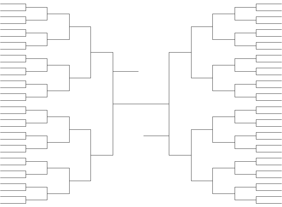
Gems of Junk Wax Bracketology: The Final Four


Well, here we are.

The Final Four.

Our original field of 64 has been trimmed down to the four best of them all. I know I'd have an insanely difficult time if I were in on the voting in this tournament.

Instead of splitting them up, I've decided to present both of our "Final Four" matchups together on the blog tonight. The two victors from these pairings will meet in the championship.

Voting on the "Final Four" will close this Thursday, June 27th, at 11:59 PM.

Here are our last men standing.


#8 -- 1987 Topps #170 Bo Jackson RC

VS.

#9 -- 1991 Topps #170 Carlton Fisk

Now that's a coincidence.

What are the odds that two different cards with the #170 would meet in the "Final Four"?

As far as overproduction era cardboard goes, it has to be the ultimate hero number. Two of the most iconic pieces in Topps history were granted that very spot in checklists just four years apart.

The Jackson is more remembered for what it represents. The wood-grain '87 design is near and dear to the hearts of a lot of today's collectors.

Plus, that was the year "Bo" mania really started to erupt, which makes this "Future Stars" piece such a desired card around most hobby circles.

The Fisk, on the other hand, is more known for the awesome action shot featured on its front. In so many words, it's simply a piece of photography gold.

It's obvious that both of these magnificent pieces of cardboard have strong followings in this hobby.

Needless to say, I'm excited to see who emerges victorious in this "Final Four" matchup.


#8 -- 1987 Topps #653 Kevin Mitchell RC

VS.

#12 -- 1991 Topps #760 Benito Santiago

In a strange twist of fate, both of our "Final Four" pairings pit '87 and '91 Topps pieces against each other.

Like many great shots in this hobby's history, both of these revolve around home plate. 

In one of the more recognizable shots of the entire overproduction era, a cloud of dust covers the base and all its surroundings on Kevin Mitchell's 1987 Topps masterpiece. 

And, in one of the better posed shots ever, a Topps photographer captured a beautiful bird's-eye image of Mr. Santiago popping out of his crouch behind the plate. It's a card that has long been a centerpiece of my collection.

So, what'll it be?

Could we perhaps have an all-1991 Topps championship on our hands? Or perhaps an all-'87 final matchup?

That's up to you. I'm sure quite a few tough decisions will have to be made with these two matchups. Let the agonizing begin!

The polls are now on the sidebar.

Happy voting!

Gems of Junk Wax Bracketology: Victors from the Elite Eight (Pt. 2)


Thanks to your votes, our "Final Four" is finally set.

In the first half of "Elite Eight" polling, a pair of '91 Topps masterpieces emerged victorious. These latter matchups provided a bit of deja vu in that regard, as both of these victors hail from the very same checklist as well.

So, without further ado, let's see who'll be competing in this tournament's "Final Four".


#8 -- 1987 Topps #170 Bo Jackson (24 votes)

def.

#11 -- 1991 Upper Deck #175 Fernando Valenzuela (6 votes)

Pretty much as expected, Mr. Jackson took down "Fernando" fairly easily in this matchup.

His 18-vote margin of victory was easily the biggest blowout from the "Elite Eight". Sadly, Mr. Valenzuela's cinderella story had to end sometime.

Given its overall popularity, I pretty much knew the Jackson would survive deep into this tournament. Of the 64 cards that kicked things off, "Bo" is one of the lucky four remaining.

He'll face the famous '91 Topps Carlton Fisk in the "Final Four".

I'm betting it'll be one monster of a matchup.


#8 -- 1987 Topps #653 Kevin Mitchell RC (20 votes)

def.

#14 -- 1992 Stadium Club #520 Wade Boggs (10 votes)

Personally, I'm sad to see the Boggs go.

He was one of my favorites in this tournament. Still, he certainly lost out to a worthy competitor in Kevin Mitchell.

Of course, Mr. Mitchell is one of the more memorable cards from the '87 Topps checklist. His dirt-inspired magic has gotten him a long ways in this tournament.

And, with that, the last ticket to the "Final Four" has been punched.

Mitchell will face the '91 Topps Benito Santiago in the next round of voting.

Speaking of which, I'll be opening up the polls on both "Final Four" matchups later tonight. I'm sure a lot of you will have to make some tough decisions this time around.

I'm sure it'll be a lot of fun.

Sunday, June 23, 2013

Into the Sunset, Pt. 19: Johnny Bench


In terms of pure photo quality, I've often wondered who had the all-time best baseball cards.

There are over 600 different pieces in my Vladimir Guerrero collection. Still, a decent percentage of those cards are fairly bland, not really standing out in any way.

I've started to discover more and more Mike Schmidt pieces in recent months. Shockingly, only a small handful are what I'd deem "quality" pieces of cardboard. For whatever reason, card companies didn't seem to put a lot of effort into producing cards of Mr. Schmidt.

I'd put guys like Carlton Fisk and Reggie Jackson on the other end of the spectrum. They were lucky to receive a staggering percentage of jaw-dropping cardboard over the years.

In my mind, though, the overall "king" of that department is Mr. Johnny Bench. I think his '76 Topps issue is a perfect example of that.

Although Bench had quite a few awesome cards released during his career, this one has to take the cake.

All that dirt swirling around his feet gives it a very "Old West" type of feel, one that is very appropriate with Bench's "gunslinger" type of play behind the plate. It's easily my favorite card from the '76 checklist.

Heck, it's one of the better cards from the 1970's, period.


Bench even managed to turn otherwise uninspiring cards into surefire gold.

Although his better years were behind him by the time his "sunset" issues rolled around, his knack for great cardboard was still as good as ever.

This very same type of mugshot has been repeated over and over again throughout the history of the hobby. Still, there's just something about him that makes this '83 Donruss piece stand out.

To clear things up, I don't consider his combo 1984 Donruss issue (with fellow retiree Carl Yastrzemski) as an official "sunset" card. As a result, this is the Donruss send-off to Mr. Bench in my collection.

For any other player, it might've seemed like an underwhelming final tribute.

But not Johnny Bench.


I just recently completed my "sunset" collection of Mr. Bench.

A recent trip to the flea market allowed me to capture his long-lost '83 Topps card for my binders.

One peculiar thing I've noticed about Bench's later issues are the position designations on the fronts. Like most longtime catchers, Bench was forced to find a new position as he aged.

In fact, he only caught five games during his "sunset" season of '83. His aforementioned Donruss issue lists him as a first baseman, a common landing spot for former catchers.

However, Bench was appropriately noted as a third baseman on his 1983 Topps issue. He'd play more games there (42) than any other position that year.

That being said, it doesn't make the "Johnny Bench -- 3rd Base" designation any more familiar.

No matter how you slice it, it's just plain odd.


Still, I've always felt that Fleer granted Mr. Bench the greatest cardboard send-off.

For one thing, they were the only company to give him a solo card in 1984, one that features his complete career stats on the back. That's always a plus when it comes to "sunsets".

And, of course, this is a coveted "interview" shot, complete with an awesome throwback ESPN logo in the bottom-right. To me, 1984 was Fleer's greatest effort. This is, without a doubt, one of my favorite pieces from their checklist that year.

How often do you see "interviews" and "sunsets" rolled into one?

It's a rare feat.

Then again, the hobby hasn't quite seen many people like Johnny Bench enter its reign. I don't think we've seen anyone like him since.

The man was a cardboard god, plain and simple.

Saturday, June 22, 2013

The dime box frankenset, Page 2: Numbers 10-18


I'm fully on the frankenset bandwagon now.

This little project of mine has been a ton of fun thus far. Thanks to a few trade packages that recently arrived on my doorstep, I've already had to make a few tough decisions on whether or not certain cards make the cut.

Such competition is what I like to call a "frankenset war", although I'll be elaborating a little further on those in a future post.

For now, I've decided to try and tackle at least one of these posts per week on the blog. Tonight, we'll be taking a look at the second page in what will become my frankenset binder, once I can get my hands on some more pages.

Here's what page #2 looks like.

Completion status: 9/9...completed page!

Numbers needed: None. (Although future "upgrades" are never out of the question.)


The card: 1989 TCMA Pacific Coast League #10 Les Straker

Why it made the cut...

I'm having a hard time finding any specific info on this one.

The "bio" I just listed is my best guess on what exactly we have here. All I know is that it has a #10 on the back, which is good enough for me.

So, just why did this seemingly ordinary minor league issue make the cut?

Because of the team name, of course. Call me immature, but I still can't believe there was ever a professional club called the Beavers.

Tee-hee.


The card: 1995 Stadium Club #11 Carlos Garcia

Why it made the cut...

Such awesome action shots are fairly indicative of Stadium Club's early work.

From what I've seen, the hallowed baserunner/fielder/umpire combo always seems to make for nice cardboard.


The card: 1998 Score #12 Chuck McElroy

Why it made the cut...

I've always had an unexplained weakness for these "behind the camera" shots.

As one of the newer additions to my frankenset, Mr. McElroy was part of the terrific flea market pickup that my mom scoped out a few weeks ago.

Frankenset finds can literally come from anywhere.


The card: 1997 Upper Deck #13 Mark Lemke

Why it made the cut...

I don't know if "interview card" is enough to describe this one.

As the front notes, it's more like a full-on "media" shot. One that features a rather pleasing Dodger Stadium shot, I might add.

Thanks to a nice nugget of information on the back, it should be said that Lemke went on to play an 18-inning contest against the Dodgers after this shot was taken.

Such a great factoid makes me love this piece all the more.


The card: 1993 Topps #14 Greg Briley

Why it made the cut...

Double dip!

And, although I didn't notice it until just now, it sure looks like that Royals baserunner is copping a feel of Briley's thigh.


The card: 2009 Upper Deck O-Pee-Chee #15 Nate McLouth

Why it made the cut...

Because of the bat barrel, of course!

In my brief frankenset travels thus far, I've noticed that "bat barrel" shots were quite common in the '09 OPC checklist.

As if I needed another reason to love an already-terrific brand.


The card: 1994 Topps #16 Doug Henry

Why it made the cut...

Autograph shot!

As you'll see in upcoming posts, these are quite a common theme with this frankenset.


The card: 1995 Topps #17 Dave Nilsson

Why it made the cut...

This particular page is doing a superb job of featuring my many different mini-collections.

Mr. Nilsson here is the subject of one of my all-time favorite "multiple exposure" shots. I've found that '95 Topps had quite the psychedelic take on these types of awesome multi-image issues.

It's almost like baseball cards on acid.


The card: 2013 Topps Opening Day #18 Jemile Weeks

Why it made the cut...

Simply an awesome celebration shot here.

Topps has featured some terrific photography in its Flagship and Opening Day releases thus far. This one of the younger Weeks brother continues the trend.

Plus, it features a cameo from one of my rising favorites in today's game with Mr. Cespedes.

This fun little frankenset quest has opened me up to yet another newfound victory amongst collectors.

I now know just how awesome it feels to have a completed page on my hands.

Friday, June 21, 2013

2013 Topps Archives: Wasted potential


At its base, the concept behind Topps Archives is a good one.

A great deal of collectors seem to enjoy seeing recent stars on old-time designs. Whether it's due to a love for vintage, nostalgia, or whatever else, it's certainly a popular concept in the world of cardboard. I know I've always been on board with it.

When it's executed correctly, that is.

Sadly, this year's Archives looks to be a prime example of a good idea gone wrong. From the looks of it, Topps just doesn't seem to want to put too much effort into many of their non-Flagship brands this year.

Save for perhaps Opening Day, Archives probably represents the pinnacle of wasted potential in today's hobby.

And, although I'd seen enough from other blogs to know it'd be a "meh" set for me, the familiar pack-busting urge got the better of me during a recent Target visit. As a result, I grabbed a rack pack off the shelves. Mr. Morneau was one of the first cards to greet me.

The oldest design Topps chose to feature in this year's Archives release is their iconic '72 "psychedelic tombstone" set. Personally, it's my third-favorite Topps design, right after 1965 and '75.

Still, Topps already quenched my '72 Topps thirst with their similarly-designed minis in 2013 Flagship. While I love the set, I really didn't need to see it repeated in Archives.

Topps is hovering quite close to killing one of my all-time favorite sets. So, please Topps, don't do it.

For all our sakes.


I was disappointed in the rest of Topps' set choices for this year's Archives release.

Next to 1989, '82 is most likely my least favorite Topps design of the 1980's. As I've mentioned before, the "hockey sticks" don't do it for me.

And, just like with the original '82s, the facsimile signature takes away from the look, rather than adding on to it. On top of that, there's another huge problem I have with this particular card, but we'll get to that later.

Nevertheless, I was quite happy to land a card of fellow February 19th "birthday boy" Josh Reddick in my rack pack. Thankfully, I've had pretty good luck at pulling his cards from packs thus far in 2013.

Let's hope that trend continues.


After '89 and '82, 1985 is probably my third-least favorite Topps set of the '80s.

Still, it's not an atrocious one by any means. And, yes, it had the misfortune of being sandwiched between a few stellar Topps designs in '83, '84, '86, and '87. 

Why Topps chose this design for Archives, I'll never know. It's not a particularly memorable one to many collectors, at least from what I've heard.

I'll give Topps some credit here, though. The red-blue White Sox color combo is a nice nod to their '70s and '80s uniforms.

Such a choice is fitting for a throwback set like Archives.


To me, the 1990 design just doesn't work in this year's Archives.

It's not one of my favorites, to say the least. It'd probably rank in the bottom five all-time Topps sets if I had to make a list.

I know other collectors have nostalgic childhood ties to it. That's great. I also have such feelings towards 2002 Topps, a set which most collectors seem to hate quite a bit.

Still, I wasn't even born yet when 1990 Topps hit the streets. And, despite their colorfulness, the design simply never struck a chord with me.

Action shots were few and far between in the original 1990 checklist. At least Topps chose to mix in a few nice action-filled photos this time around.

Design aside, this is a perfectly nice Wrigley Field shot of Mr. Castro.


Now, let's get on with the biggest gripe I have with 2013 Archives.

It's one you've probably already heard a million times before, so I'll try to keep it short.

During my fairly brief rack pack bust last week, I had quite a few feelings of deja vu. Over and over again, I kept asking myself...

"Haven't I seen this shot before?"

As it turns out, I pretty much had. McCann's Archives issue features a shot that's virtually identical to his 2013 Heritage issue. And that nice "throwback" shot of Arroyo is the exact same one that was featured on his Flagship card.

Oh, and that '82-themed Reddick I featured earlier? That again features the exact same shot that we saw on his '72 mini insert from Flagship.

This is where the whole "wasted potential" idea really starts to come into play.

There have to be hundreds (if not thousands) of different shots of today's players available to Topps. Yet they still feel the need to recycle photos across various 2013 products.

I just don't get it.


Still, let's not end things on a bad note here.

I did pull one jaw-dropping card from my rack pack with Mr. Bench here.

Last year, I raved about the insert selection that Archives offered. As it happens, I'm saying the same in 2013.

These '83 All-Star inserts are spectacular. As are the "Tall Boy" and "Gallery of Heroes" cards that I've seen on other blogs so far. (I wasn't lucky enough to pull either of those from my rack pack.)

In the end, I can't justify buying many more three-dollar loose packs of five-buck rack packs if I'm not crazy about the base designs.

Still, I'll be chasing down these inserts with all my might.

Plus, I'm sure the base cards I need for player collections and such will soon wind up in dime boxes anyways.

So, while Archives isn't a terrible set by any stretch of the imagination, it's not one that I can get too excited about. I certainly want to, though. There's no question about that.

There's definitely some potential in the Archives brand. I think the inserts are a good indication of that. If Topps can somehow tidy up the base designs (and not use recycled photos), then I think they'd really have something.

Until then, though, it's just another "meh" set to me.

Thursday, June 20, 2013

Sooner or later


I've often thought about starting another blog.

A few card-related ideas have swept through my head in the past. I've kicked around the thought of starting one entirely devoted to my non-baseball collection, featuring A&G's quirky subjects or cards from my American Heritage complete sets.

Still, the idea that keeps coming back to me is starting a blog about music. My two true passions are, in fact, baseball and music. It's something I've mentioned many times in the past around here.

But, as of right now, that idea hasn't come to fruition. I just don't know if I could handle writing for two different blogs. I imagine it'd be quite the time crunch.

So, although I try best I can to mix them with cardboard, you'll have to hear some of my musical ramblings on this blog every now and then. In fact, that's exactly what we have with tonight's post.

I've noticed something throughout my music-loving years. For whatever reason, I almost always seem to like the earlier efforts of bands over their later recordings. I'd say it's true with about 95 percent of the groups I listen to on a regular basis.

I'm actually having a hard time thinking of any group who doesn't fit into that category. Perhaps local natives Cheap Trick would be in there. I'm drawing a blank on any others.

Don't get me wrong, though. I'm not saying I don't like any later material of my favorite bands. It's just that, in most cases, I enjoy their earlier stuff that much more.

The Ramones are a good example. Tied for my all-time favorite band (with a group I'll mention in a bit), their first three albums completely blow away anything they did afterwards. It's not much of a contest.

Their first album is most likely my all-time favorite in the history of music.


Oh, and remember when I mentioned that The Ramones were tied for my favorite band?

I'll bet you've heard of the other group.


I think I'm in the minority with this one.

Most people I've talked to seem to enjoy the later Beatles more than their "moptop" days. And I completely see why.

Their innovations in the recording studio were certainly more technical and advanced as their careers progressed.

I still find it amazing that they could get the kind of sound they did on "A Day in the Life" or "Strawberry Fields Forever" without the kind of recording equipment we take for granted these days.

Truthfully, it's a tough call for me. The Beatles are probably the most consistent band ever. You can't go wrong with any of their material.

Still, there's just something about their earlier days that I like. Most of the time, I'm just a sucker for catchy tunes.

I guess that's why the "moptop" period has always struck such a powerful chord with me.


R.E.M. is easily my favorite band from the '80s.

As far as the mainstream is concerned, they hit their peak right around the later part of the decade. "Losing My Religion" remains arguably their biggest hit.

But, if you ask me, they topped out a few years before that. I'd probably draw a lot of flack from R.E.M. fans for this, but I've never liked "Losing My Religion" or "Everybody Hurts".

Although other later hits, such as "Man on the Moon" and "It's the End of the World (As We Know It)" are two of my favorite songs ever, I've always preferred their earlier material.

"Gardening At Night" is probably my single favorite R.E.M. track, although "(Don't Go Back To) Rockville" is starting to nip at its heels.

Plus, guitarist Peter Buck is probably the coolest person in music history.

Just thought I'd mention that.


So, in relation to my music tastes, I asked myself the same question about my cardboard.

Do I like certain players' early cards more than their later material?

In the case of Dave Concepcion, yes. From what I can tell, he hit his cardboard peak earlier on in his career.

His '74 Topps issue is easily one of the single greatest cards from that year's checklist.


Again, I'm not saying Concepcion didn't have any good later cards.

These two are pretty awesome. (As is his '87 Topps issue, which is currently a gaping hole in my collection and a "Dime Box Dozen" need.)

But, by and large, most of them simply can't measure up to his early "hits".


Upon digging through my binders over the last couple days, however, I discovered something interesting.

Guys like Mr. Concepcion are exceptions to the rule.

For the most part, I seem to prefer players' later cardboard to their earlier ones. Personally, I think it's because most stars take a few years to break into the "mainstream" of baseball.

And, as you probably know, most lesser-name players aren't granted many exciting cards in this hobby. Until they hit the mainstream, that is.

Dennis Eckersley had a perfectly acceptable 1976 season, going 13-12 with a 3.43 ERA with the Tribe that year. Yet, as far as the photo goes, his '77 Topps issue isn't really a standout piece. (Save for perhaps those awful "Bloody Mary" Indians jerseys.)

It wasn't until later that "Eck" started to hit his cardboard stride.


While he had a terrific career as a starter early on, Eckersley is a HOFer because of his later days as a closer.

Many of his post-starter cards are things of beauty.

At least when he wasn't making the "Eck face", that is.


This was a tough call for me.

Harmon Killebrew was like The Beatles when it came to cardboard. He always seemed to produce stellar cards throughout the course of his career.

I'm extremely honored to have such a beautiful (and well-loved) 1958 Topps piece in my collection. I seem to look at this particular card almost every day.

But...


I have to give the nod to later cards of "Killer".

Heck, his last three cards may have been his three greatest.

Above is his monstrous '73 Topps issue, my personal favorite. His '74 features a terrific action hitting shot. And his '75 "sunset" issue shows him signing autographs for a few lucky fans, something that is always a plus in my book.

Those alone are enough to give his later cardboard the edge.


While it's a bit harder to gauge for more recent players, I've found that the same is true for current stars as well.

Even in today's hobby, I find myself enjoying later issues more.

Case in point, Ichiro. He was indeed featured on quite a few cool cards during his first five (or so) years in the bigs.

Ichiro's 2005 Topps issue is one of his better moments in cardboard.


Still, while he may not be the player he once was nowadays, his cardboard seems to be rising in quality.

His 2012 Topps issue was one of the better cards of the previous year, if you ask me. One of the better "at the wall" cards in my collection, no doubt.

Curiously, he hasn't had any cards issued in 2013 thus far. I sure hope Topps didn't screw something up with that.

If the last few years have been any indication, he still has quite a few prime years of cardboard to go.

So, although my two passions in life do parallel each other in a lot of different facets, this isn't one of them.

Later material gets the nod with cardboard. Recent digs through my binders made that painfully obvious to me.

Now, if you'll excuse me, I'm off to listen to some early R.E.M. Perhaps a little "So. Central Rain" will do the trick.

When it comes to music, earlier is better.

At least to me, anyways.