
It seems like every time I look up another Topps set is getting pushed further and further back into the calendar, which I suppose explains why I was more excited than usual to see that 2021 Archives did the impossible and actually came out recently.
Archives, for me, is in that weird middle ground of sets that probably don't have much reason to exist, but one I'm still glad exists anyways. Topps has lived on its own designs for several lifetimes by now, and Archives is nothing but a "Topps's Greatest Hits" remix. And it's even more pronounced this year - Topps decided to cram a whopping eight designs into this year's 300-card checklist (one from all seven decades + 1 weird one I'll get to later).
All this seems like a recipe for disaster, but the truth is I think I kinda like 2021 Archives a little more than usual - if nothing else, the rash of different designs provided for a more interesting set this year. No, I haven't seen any on retail shelves (shocker), but I did manage to scoop up a good 95 percent of the base I needed on Sportlots recently for under the cost of two blasters (why wasn't I doing this years ago?).
And to further feed my addiction to ranking things, I've decided to rank the eight(!) designs Topps used in 2021 Archives based on the very arbitrary factors of how well I think Topps pulled off the look and/or how much the cards grabbed me.

#8 -- 1983 Topps
I always feel like I'm about to be banished to blogger purgatory for saying that while I've always liked '83 Topps, I don't love it.
It's probably a Top 20 Topps design for me, but it wouldn't sniff my Top 10. The fact that Topps has used it to death in the years since hasn't helped the cause - it already showed up in Archives a few years ago, as well as about a million other insert sets, and yet here it is again in 2021.
I don't know whether it's the endless regurgitation or simply a dull group of cards, or a little of both, but for me the '83 portion of this year's Archives doesn't bring a whole lot to the table.

Favorite card -- Ron Santo
Seeing Ron Santo in a 2021 set warms my heart.

#7 -- 1957 Topps
Conversely with '83, 1957 Topps is a set I absolutely admire that almost always gets pushed to the sidelines in favor of other '50s Topps stalwarts.
The problem here is that the beauty of the original '57s is a tough thing to replicate, and that's shown in the times Topps has tried to attack it. The '57s in this year's Archives are almost all close-up mugshots that blend together after the fourth or fifth one. That Reggie is cool, and I like the Buxton in a weird quirky way, but overall there's very little of the true spirit of '57 Topps here.
(But I'm not a good enough writer to put whatever that true spirit is into words.)

Favorite card -- Anthony Rizzo
In another chapter of the Topps bizarro world, it's obvious that Archives had a later printing-press deadline than Update, because a lot of Update's glaring omissions are prominently displayed in Archives.
See: Anthony Rizzo on the Yankees.
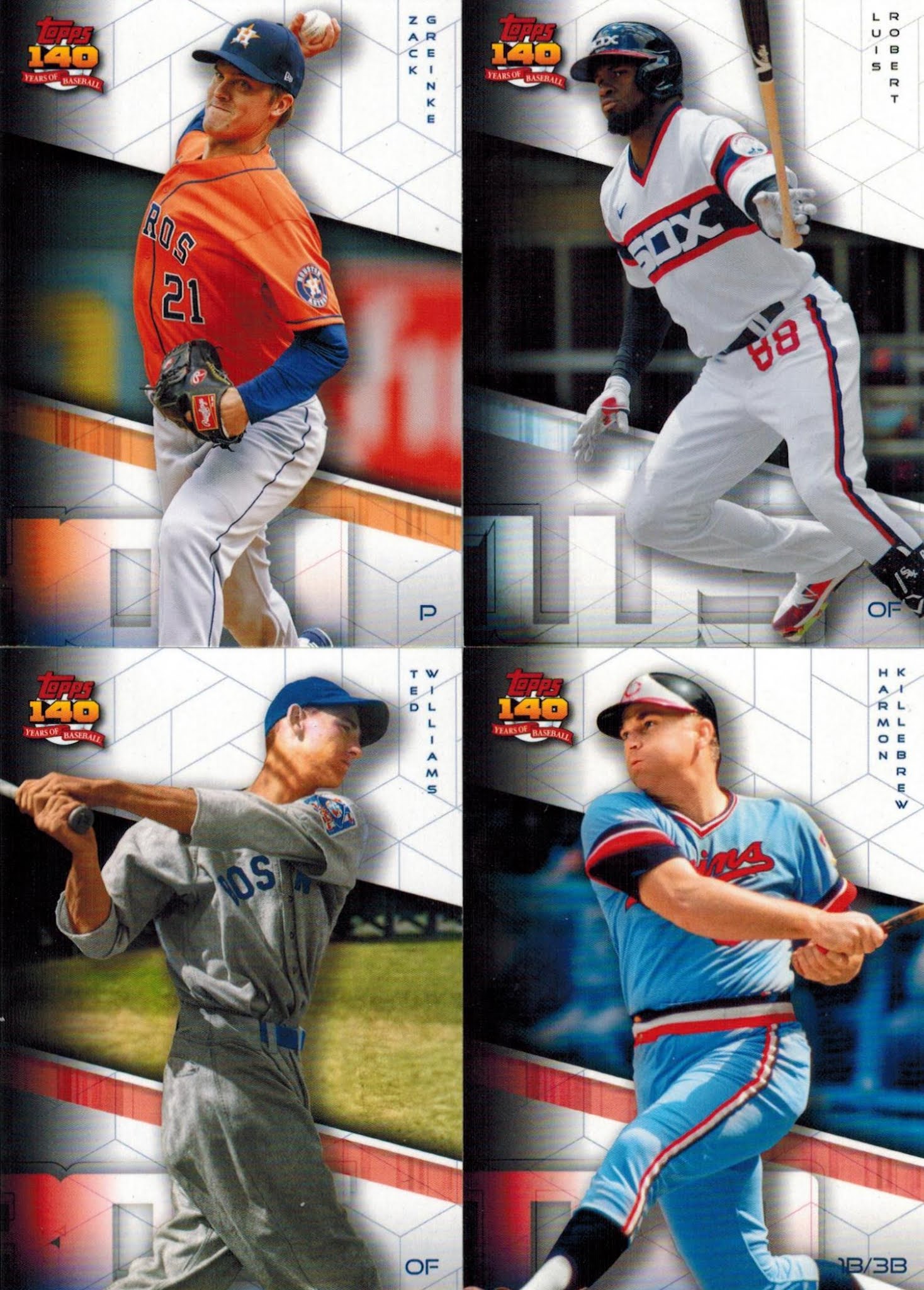
#6 -- 2091 Topps(?!)
The reason there's eight designs in 2021 Archives instead of seven is the weird decision to cram a futuristic 2091 Topps series into the very end of this year's checklist ("140 Years of Topps Baseball").
The Fanatics takeover is definitely an elephant in the room with these, but I won't talk about that for now. What I will talk about is that, while I don't like the look of these at all (yes, let's make the player names EVEN SMALLER!) I admire Topps's to try something out of left field here. So much of what we're seeing these days is spoon-fed rehashings and "safe" generic designs that impress no one.
Here's a rare case of Topps going a bit off the rails, and although the look isn't great, I love the effort.

Favorite card -- Don Drysdale
Because the world needs more Don Drysdale cards.

#5 -- 1973 Topps
Here's the surprise inclusion in 2021 Archives, because '73 Topps is slated to be featured in Archives next year.
And if these are a preview of what's gonna come in 2022 Heritage, I'm fully prepared to be disappointed - there's almost none of the strange action photos or general roguishness that make '73 Topps so special.

Favorite card -- Ken Griffey Jr.
A nice candid shot that reminds me a lot of the '73 Jimmy Wynn, one of my favorites.

#4 -- 2001 Topps
A paradox: I don't like 2001 Topps at all (does anybody?) but in a weird way, I'm glad to see it in 2021 Archives because of how how little it's remembered these days.
I still get a kick out of seeing legends on designs that span generations into the future, and don't sleep on my first card of Dime Boxedonia favorite Kyle Schwarber on the Red Sox. Add it all up, and the 2001 portion of this year's Archives is an unexpected source of joy within so many better designs.
This begs the question: what's better, an endless rehashing of a great design, or a rare nod to a forgotten look?

Favorite card(s) - Vida Blue & Dick Allen
These are by far my favorite cards in this year's Archives & please don't make me pick between them.

#3 -- 1962 Topps
This is the case of me excited about a design I've always been kind of meh about, sheerly because of how well Topps managed to pull off a proper homage.
I could see a lot of these cards popping up in the original '62 checklist, and for a set like Archives that's really the ultimate compliment.

Favorite card -- Max Scherzer
My first Dodger card of Mad Max + an excellent photo = one of my favorite cards of the year.

#2 -- 2011 Topps
It's scary to think 2011 Topps is already being treated as a "classic" design - I vividly remember opening packs of these, for god's sake.
And while I think at least some of this is due to the hallowed Trout Rookie, a lot of it is because it's just a fabulous baseball card look, easily one of the best of my lifetime. I think Topps did a fine job here, and they're darn near indistinguishable from the originals - I imagine reprinting contemporary designs is a lot easier than going back into the '50s and '60s.
Sure, it pains me to think of something from ten years ago as "classic," but Topps did in preserving the aura of this "classic" (ugh) design here.

Favorite card -- George Springer
All the Archives 2011s are solid baseball cards, but this one speaks to me for some reason.

#1 -- 1991 Topps
At this exact moment, 1991 Topps exists in the perfect storm: it's a design I love that Topps executes shockingly well and hasn't shoved down our throats (yet).
We saw it in Archives a few years ago, but apart from that there aren't a lot of '91 Topps homages out there, which makes any nod to it even more exciting. Someone at Topps must know this set backwards and front, because they've done a great job reproducing it on those rare occasions - the photos breaking into the "fourth wall" outside the border is especially well done.
It's been a few years since I did a comprehensive ranking of Topps designs, and I think '91 Topps came in at around #15 last time - my gut tells me it might creep into the Top 5 if I ever do an update of that list.

Favorite card - Ichiro
I love all Ichiro cards, so maybe I'm a bit biased, but to me this is just a wonderful card of a perennial favorite.
There's a lot to unpack in 2021 Archives, and I can see the arguments for and against shoving eight different looks into a single checklist. It's a lot. Does a design buffet like this one make a set feel more fractured, or more virtuous? Normally, I'd say the former - but in this case I'm leaning towards the latter.
I will say this: over the years, I've come to think the overall quality of a set can be gauged by how fun of a blog post it makes for the writer - and at least as far as I can remember I've never enjoyed writing an Archives post more.
13 comments:
I am anxiously awaiting the Big League release. Archives used way too many designs this year for me (I actually am not a fan any year). I am waiting on my Braves to arrive though.
I really like Archives in general...and I'm about to peek in the blaster I snagged you right now!
Ranking posts are my favorite posts. That Ichiro is awesome! Love the Bench, Clemente, and Santo too.
I haven't decided how much I'm going to chase Archives, but getting individual cards online for less than $40 sounds like a sound plan.
I'm thinking that by 2091 we'll all have cybernetic eyeballs or Geordi LaForge visors that can read tiny print on baseball cards
WHERE IS BIG LEAGUE???
I'm over Archives and way more designs than the 3 or 4 it used in the past isn't helping. Too many repeats (which makes designs like '62 and '11 -- both of which I just saw in 2011 -- "interesting"). There isn't even a design that I am interested in collecting "just that," like '75 and '79 in past years.
Cool post.
I think the Brock and the Vida are my favorites.
Great list. I agree that the 73 design won't be as fun without the accompanying quirkiness.
I think 1991, 2001, and 2011 look the best. The old designs always look wrong.
I really like the Brock and Munson photos. '57 and '73 are classics because of the photography in those set, not the design. Putting "meh" photos in those designs for archives does not do those sets justice. Amazing how Topps can find such boring photos of guys like Nolan Ryan and Reggie Jackson.
So, if Topps gets cards in 2091 they're going to rehash insert designs from the mid-2010s? That actually sounds about right.
Great to see Dick Allen return to Topps cards.
Thanks for showing off the cards! If they were gonna cram 7 designs into the set, they would have mixed in some of the designs they haven't touched yet.
These "57's" would rank last for me, they look absolutely nothing like the originals.
I love 1983 Topps but Topps has been mailing it in with their remakes. Instead of having half the cards with the photo on the right they're all the same template. And by adding the TM to the team name the screw up the text justification. The action photos are also almost always too zoomed in and the result ends up ruining the crispness of the original.
Post a Comment