Even though it's the middle of January here in 2016, I still want to sneak in my Sets of the Year countdown for 2015 on the blog.
The rules here are simple: In order for a set to qualify for this list, I had to have bought at least one pack of the brand and/or picked up an ample amount of singles elsewhere. While I may have snagged a small amount of cards from sets like Museum Collection and High Tek, I don't really have enough to form any kind of opinion on them. So they won't appear here.
Also, in the interest of time and space, I've consolidated most of the offshoot brands (Bowman/Bowman Chrome, Heritage/High Numbers, Flagship/Opening Day, etc.) into one entry on this list.
In the end, ten different sets qualified for the countdown, and we start, once again, with the three-time reigning Worst Set of the Year.
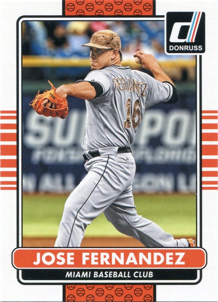

#10 -- Donruss
No.


#9 -- Bowman/Bowman Chrome
As far as just Bowman is concerned, this actually isn't a half-bad design.
But even a fair Bowman set is still a subpar offering in the grand scheme of things. As usual, there's unnecessary foil and unreadable nameplates. As usual, the design isn't much of a standout. And, as usual, the singles seemed to flock to the dime boxes the day after the set hit the shelves.
It's not like anyone buys Bowman for the veterans anyways.


#8 -- Finest
I've still never actually opened a pack of Topps Finest, but I do seem to find them in the discount bins fairly easily.
The last two years of designs for the brand were surprisingly impressive, but 2015 was a big letdown as far as I'm concerned. I think Topps was trying to go for some kind of shattered glass effect, but I don't think the final product ever quite got there.
It reminds me of that weird, futuristic room in Bill and Ted's Excellent Adventure.


#7 -- Gypsy Queen
Gypsy Queen remains the one set I just can't wrap my head around.
A lot of other collectors seem to rave about this brand, but I've never seen it. I will grant that the 2015 edition was probably my favorite since the debut 2011 design, but, like Bowman, that doesn't mean a whole lot.
Though it was prone to sparse amounts of greatness -- like this Mike Leake (what is that in his pocket, anyways?) -- Gypsy Queen still struck me as a rather bland (especially the backs) and uninspired effort in 2015.
I always thought I'd come around on GQ one day, but, at this point, I don't think that day's ever going to come.


#6 -- Diamond Kings
Here's the only debut brand that qualified for this list.
I didn't buy a single pack of Panini product in 2015, but they hit the discount bins by the bucketload. That was especially true with Diamond Kings, which I found odd since a lot of people seemed to like this brand.
To tell you the truth, I'm still not 100-percent certain how I feel about these. I was never a big fan of the '80s Diamond Kings, but I do enjoy the canvas-like feel with the 2015 edition. And I've been awestruck by a select few singles I've found, like this dandelion-yellow Paul Waner.
But, for whatever reason, the singles seemed to run together after a while for me. I don't know if it was the lack of logos or whatever, but I tired of the design pretty quickly. But I'm not sure if that's a comment on my brain or the cards themselves.
Like I said, I'm still working out my thoughts here...in ample time, this set could move either up or down on my list.


#5 -- Allen & Ginter
I don't have much to say about 2015 A&G.
It was a step down from last year's surprisingly nice design, but still an average effort overall. I think 2015 was the first time I didn't buy a single pack of the stuff in the brand's ten-year history (though, like so many other sets, I found scores of them in dime boxes).
For what it's worth, A&G wins the Most Average Set of 2015 award for me.


#4 -- Archives
Last year was, for me, comprised of The Big Four.
The most surprising member of The Big For was Archives, a set that, admittedly, was met by lukewarm reviews by Dime Boxedonia upon its release early on in 2015.
But then a funny thing started to happen. Like that AHA! moment of realization in a movie romance, I began to realize...holy cow, I think I'm actually starting to LIKE these after I began to dig up more and more from the dime boxes. I began to ask myself just why I was so meh about Archives in the first place and I couldn't come up with a good answer.
I'm always crying for more old-time posed shots...and Archives has nostalgic old-time posed shots (the '57s were especially well-done). I'm always crying for more reincarnations of my favorite designs...and this year's Archives featured three of my favorites with 1957, 1976, and 1983 (all of which made the Top 20 of my Topps set countdown). It's all there.
I just want to take a moment to apologize to Archives for all the bad things I said.


#3 -- Heritage/High Numbers
Heritage has the most at stake when it's featuring a design I'm not all that wild about.
There was no pressure in 2014. I knew I'd like Heritage then because it was featuring my all-time favorite Topps design ('65). Last year was a different story, because I've never considered '66 Topps to be anything more than average.
I'm happy to report that Heritage passed with flying colors in 2015. They even earned themselves a few bonus points by reintroducing High Numbers to retail shelves. There were many points in 2015 in which I went back and viewed some of the real '66 Topps cards in my collection because of how well I thought Topps pulled it off last year.
That's really all I can ask out of Heritage.


#2 -- Topps Flagship/Opening Day/Chrome
Many years from now, we could be looking at 2015 Topps as the set that changed it all.
Last year's Flagship was the first that dared to stride away from the annoying overuse of foil that Topps -- for whatever reason -- has been adamant about giving us. In fact, 2015 featured the first non-foil nameplate in a Flagship set since 1994.
The lack of foil was a breath of fresh air, and I absolutely loved the color-coded borders. They gave a sleek, new look to Topps. It's a modern design that's not trying to be too self-consciously futuristic. And that's not even mentioning the expanded checklist. (There were 1,100 cards spread out between the three Flagship checklists this year. 1,100!)
We already know that 2016 Topps will also be another non-foil set, so maybe 2015 will indeed be the year that ushered in a new era for Topps Flagship.


#1 -- Stadium Club
Was there ever any doubt?
By unanimous decision, Stadium Club captured its second straight Set of the Year crown in 2015. Last year's edition was even better than the 2014 release, which I honestly didn't think was possible going into 2015.
I'd say the 2015 Stadium Club theme was "Even Better." Even better mix of legends and current stars. Even better player selections -- fan-favorite-types like Ron Gant and John Olerud made appearances, to name a few. And, most importantly, even better photography. You know it's good when this drool-worthy George Springer couldn't even crack the Top Ten.
Perhaps the best thing about Stadium Club is that it's indeed a high-end set at a fairly low-end price. I had almost no trouble finding singles for loose change in 2015, and it's still cheap enough that I can buy a retail pack of the stuff on impulse here and there if I so choose.
O almighty Stadium Club, we collectors bow down to you.
10 comments:
Yea - I'd say you hit the nail on the head here. especially the "ho-hum" sentiments towards Gypsy Queen and the surprising appeal of Archives. Although, I might switch Flagship and SC... is that sacrilege?
I'd have to say for me, 2015 Stadium club is the best set released in several years, maybe even decades! It blew me away, much the same as the 1999 Ovation did. The same for A & G's first year, but I tired of that one quickly (they all really look the same to me). Great list, thanks Nick.
I am more of a Gypsy Queen fan than you are, but a lot of that may be attributed to the fact that the cards look awesome signed. Stadium Club easily took the cake for me, and most of the rest of your list is accurate to mine. Nice job, good to see you back!
I think I'm more of a Gypsy Queen fan instead of Ginter, mainly because Gypsy Queen doesn't have annoying non-baseball content. I also kinda like Donruss, despite the fact that they seem to recycle the same design every year. I think has to do with the fact I had a lot of Donruss cards as a kid. Bowman is ok, not really my thing but I will grab some singles if I happen to come across some I like. I really, really liked Archives, Heritage, and Flagship this year but my favorites by far were Diamond Kings and Stadium Club.
Great list, Nick! Not surprisingly, I would make a total of zero changes in my top ten.
I think 2015 was the year that proved one long-held suspicion : Topps people read and listen to (to an extent) the blogging community!
They know we all loved Total. Flagship expands to 1100 cards.
They know we love great photos. Stadium Club delivers the best.
They know we got sick of all the foil. Foil Topps logo only.
And, as you said, Heritage High numbers went back to retail.
It might just be a coincidence, but I have noticed a LOT of little changes over the last few years that makes me think that they are listening.
They would be silly if they didn't - the bloggers are more passionate than anyone else about cards.
Sorry for the long post, I will go away now. :)
Nick J.
I agree about Finest. The 2014 set was so much nicer.
I liked Diamond Kings more than most. Some of this stems from the value the set provides more than the look but considering the license issue I thought it came out well. I'm a sucker for canvas cards.
Heritage would be my fave...as we talked about,the whole "full bleed" thing seems to throw me a bit,since I'm old and compare everything to 70s cards!...ha-ha!
I have similar feelings about GQ. I like some of the subsets and I like the inclusion of retired greats but I've never liked the Photoshop effect they use. If they were truly painted images I'd be all in. I've had the worst luck with Stadium Club this year. I opened six or seven packs and seem to have found all the most humdrum cards.
Stadium Club and Diamond Kings won it in 2015. I've never cared for A&G. GQ never caught my eye til this year. I was willing to spend a little money on it. Flagship - so so. I tend to be a purist when it comes to the white borders. That said, I bash Topps regularly. They can't do much to please me. Bowman, don't bother. Here we are in 2016 and already many of us are over Topps. Donruss is coming soon and it will be another boring release. But I'll buy it because it's loaded with autos and inserts. Diamond Kings is out next month too but looks much the same. I'm counting on Stadium Club!!
I want to testify of this great death spell caster. This great man helped me cast a death spell on my wicked step father and just within 48hours the wicked man had a motor crash and died. All thanks to this great death spell caster called instant death spell. You too can contact him now for an urgent death spell cast on anyone, droselumen@gmail.com call or add him on whatsapp +2348054265852.
Post a Comment