Monday, February 4, 2013

Dressed for success


I've never been one for fashion.

In my four years of high school, it often seemed like I was one of the few people who thought along those lines.

It's not that I didn't want to look snazzy or anything. I guess I just didn't see the point of dropping hundreds of dollars on simple clothes. 

On top of that, I'd often see a few people sport a shirt once and never wear it again. I mean, I've basically had the same wardrobe since my freshman year of high school.

I guess while all my fellow teenage friends were blowing their money on name-brand shirts and designer jeans, I was off buying baseball cards.

I think I made the right choice.

Plus, as far as fashion goes, most cards are about the same. It suits my overall indifference towards the topic just fine.

Sure, the color or logo on the uniforms might change over time. But, when you get down to it, all my baseball cards logically feature a baseball uniform in some way, shape, or form.

Well, almost all of them, anyways.

Overall, I'd say about 99.9 percent of my cardboard features players sporting your standard, everyday jersey.

Still, despite my overall indifference towards the topic of fashion, I can't help but be fascinated by that other fraction of a percent.

I'm still on the fence on deciding how to classify Mr. Garvey's 1983 Fleer issue.

True, he is wearing the famous Dodger blue. However, this card gives the collector a candid peek into his locker room wardrobe as well.

Knowing what I know about Garvey and his eye for fashion, I'd guess that this would be one of his personal favorite pieces of cardboard.

It's funny, in a way.

Steve Garvey has about as many shirts in his locker than I do in my entire closet.


Some ballplayers managed to pull off the whole "no uniform" thing rather well, if I may say so.

Baseball pioneer Al Spalding certainly looks spiffy on this one. His keen fashion sense made this one of my favorite cards from the recent Panini Cooperstown release.

I think bowler hats are due for a comeback.


For better or worse, we haven't seen much fashion out of the hobby recently.

Most shots of current players seem to follow a strict "baseball uniform only" policy.

Still, a small number have managed to slip through the cracks during the past few years.

Take Ichiro, for instance. Upper Deck captured a suit-and-tied shot of the 2007 All-Star Game MVP himself for their '08 release.

I'm still torn on how I feel about this one.

It's definitely a quirky card. No doubt about that. And since a good chunk of my collection is based on that "quirkiness" factor, I guess I should like it.

At the same time, though, I'd rather UD used a shot of Ichiro in his Mariners uniform during the All-Star Game.

It could go either way.

However, there's no denying my feelings on this next batch of cardboard.


No.

Just...no.

Judging from his surroundings, I'd guess that type of attire is about par for the course at the local country club.

Either way, Derek Lowe is definitely not dressed for success.

That's for sure.


And neither is Mr. Embree, for that matter.

This particular card is a former dime box find of mine. The vendor who I bought it from quizzically wondered as to why anyone would actually want it.

With a shirt like that, it's a fair question.

In the end, I collect Alan Embree. Which means that my goal is to acquire as many cards of his as possible.

Like it or not, my fandom of Embree wouldn't allow me to pass this one up for a dime.

Even so, I'm not sure these are even the worst culprits from '92 Bowman, a grouping that could very well be labeled as the "horrifying shirt" set.

Just ask Chipper.

Or Mariano.


I still think this one has them all beat, though.

No, my friends, I haven't a clue as to what possessed me to welcome this card into my collection.

I do collect Todd Hollandsworth, but not as rabidly as guys like Garvey or Embree. My saner self probably would've convinced me to simply pass it up.

But, after all was said and done, the insane side of me won out.

And now it's in my binders. The equivalent to a bad 1980's yearbook photo now occupies a slot in one of my many nine-pocket pages.

In an odd way, though, I've begun to warm up to it in recent years.

This card is so bad, in fact, that it's actually, well...kind of good.

Am I going crazy?

I hope not.

And, yes, I am aware of the variety of odd fashion in a recent Goodwin Champions release. Aside from a few old-timey stars, I've purposefully avoided acquiring those thus far.

At some point, though, I'm sure a few will force their way into my collection, whether I like it or not.

Still, I guess one motto does carry an underlying tone to this whole fashion thing.


Even a bad shirt is better than no shirt at all.

Right?

Sunday, February 3, 2013

Into the Sunset, Pt. 14: Bo Jackson


Well, unless you've been hiding under a rock, you probably know what today is.

Super Bowl Sunday!

Or, rather, the day of the "big game", as the commercials call it. The actually NFL trademarked the, um...bowl term long ago.

I hope I don't get into any trouble for using it here.

Still, try as I might, I just can't force myself to get that excited over it.

Don't get me wrong. I can appreciate football as much as the next person. And I've spent many a Sunday plopped on the couch watching the sport over the years.

But, even though the Ravens are my favorite non-Chicago football team, I'll probably have a passing interest in the "festivities" this year.

At most.

However, in keeping with the overall "theme" of the blogosphere this evening, I'll be tying tonight's post in with football as much as I can.

And, since I was due for a "sunset" post anyways, I figured I'd might as well feature arguably the greatest two-sport star the world has ever seen.

Mr. Bo Jackson.

I have absolutely no idea how that "custom" card at the top of the post came into my possession. Yet, although it's not my favorite Bo Jackson card, I felt it was the most appropriate given the overall tone of the evening.

Besides, it's a pretty awesome piece either way.

Is it not?

However, like almost every player who retired during the mid-to-late '90s, I can't say that I own Jackson's complete "sunset" collection.

Still, though, I feel I have enough to fill a post.

And, luckily for me, "Bo" closed out his career in a fairly unfamiliar uniform as well.

All the more reason to collect his "sunset" cards.


After five famous seasons in Kansas City and two mediocre years with the White Sox, Jackson would finish up his career as a California Angel in '94.

Although the strike-shortened year limited him to just 75 games, he'd actually post the best single-season batting average of his career with a .279 mark.

Unfortunately, he did so with a 47-68 team, one of the many dreadful seasons the Angels would endure during the early '90s.

They missed it by a lot more than "that much", Bo.

Unlike most of my "sunset" subjects thus far, none of Jackson's final cards were all that subpar.

Given its fairly interesting photo choice, Upper Deck did a decent job with their tribute to "Bo".

In this case, though, I guess it's just "the worst of the best".

Sorry, Upper Deck.


Even Sportflix managed to get in on the "sunset" action.

Although they scan like absolute you-know-what, I've always been a bit of a sucker for these "double-image" 3-D cards. 

I just wish my readers could actually see the "double-image" side of this one. It's actually pretty cool.

And, although I may be in the minority here, I'd like to see Topps revive them one of these days.

I'd definitely chase something like that.


Ever since I noted the lack of Collector's Choice in my household a few days ago, I've had a couple people tell me differently from their experiences.

Apparently, people all across the country are sitting on thousands of these things.

Either way, though, I just can't seem to find much around these parks. I guess that's what made one of my previous dime box adventures so memorable.

Still, I have managed to get my hands on some Collector's Choice over the years.

I'm particularly proud to have this particular "sunset" piece in my collection. Action shots of "Bo" at the plate always make for beautiful baseball cards.

Even so, this wasn't even their best work.


This was.

For a short time, the people at Upper Deck released two different Collector's Choice brands during the season.

One was your standard Collector's Choice set. 

The other, however, was the seemingly coveted "Special Edition" version of the checklist, containing blue borders and different pictures than the regular release.

Although they're not really much more "special" than the standard set, this particular card of Jackson does edge out the other Collector's Choice issue.

By 1994, "Bo" obviously wasn't the player he was during his prime.

Still, you'd never know it from those biceps.


Yes, I know I just showed this card on the blog yesterday.

It was a part of my latest "big box o' cards".

I said it then, and I'll say it again.

This may just be the most psychedelic "sunset" card I own.


I seem to enjoy Topps' 1995 design more and more with each passing day.

Although I recently gave it runner-up honors, I'm starting to think that it may indeed be the most underrated Topps set in history.

Between the lovable white borders, clean design, and stellar photography, it's hard to find many flaws with it.

The people at Topps certainly gave Jackson a nice send-off with this one.

Still, the six "sunset" cards I've shown thus far will never, ever sniff the top slot in this countdown.

In the wide world of this little collection of mine, Bo Jackson may very well own the most bad-ass final card in the history of this hobby.

Why?


That's why.

Both literally and figuratively, Pinnacle certainly went "outside the box" with this one.

I mean, it's Bo Jackson and a U.S. Navy plane.

Need I say more?

Well, there's my obligatory pigskin-related post for the day.

Bo Jackson is certainly a stand-out figure as far as both baseball and football goes. I've had a blast collecting his cards over the years.

I hope all you football fans out there enjoy the "big game". I'll probably be tuning in at some point.

Still, I can't help but have one question.

Is spring training here yet?

Product placement


As a whole, this hobby is fairly private.

For better or worse, that's been true on a personal level over the past few years.

Not a lot of people know about my devotion to this hobby. And, outside of my parents, almost no one knows about the existence of this blog.

It's not that I try to keep it a secret or anything.

The topic of baseball cards just doesn't come up a whole lot with my friends.

Even on a more widespread level, the hobby is still a fairly unknown quantity.

I almost never see it get any publicity on TV or anything. The few times I've seen cardboard pop up on Pawn Stars or Storage Wars is about it.

Now, a few days ago, I found myself on the couch, watching Intentional Talk on MLB Network for the umpteenth time.

Interestingly, though, one particular segment of this show peaked my interest.

Why?

Because they talked about baseball cards. They actually talked about baseball cards. On TV.

But, thankfully, it wasn't the high-dollar, rich people cardboard that seem to get the tiny amount of hobby-based national attention.

Nope, they were talking about 2013 Topps.

Baseball cards that I can actually own!

On the MLB Network!

Although I'm sure it was a product placement on the part of Topps, I didn't care one bit.

And, frankly enough, it worked. Because of that segment, I found myself with an itch to buy more 2013 Topps.

As fate would have it, I found myself inside of a Target on Friday afternoon with my dad, on the hunt for more cards.

Even though I probably would've bought a pack or two with my own cash, "pops" was nice enough to treat me to a pair of rack packs.

He knows the drill.

If he buys 'em, he gets to pick 'em.

Just not the front pack. It's a little policy of mine.

The first pack he grabbed was second from the front. The other was the absolute last rack pack on the hanger. A bit of a new tactic this time.

I like it.

And, as far as I can tell, it worked.

One of the first cards that fell out of the initial rack pack was one that I'd been coveting.

Number 331 himself, Mr. Jose Reyes.

Fittingly, it was one of the cards featured during the blurb on MLB Network. Even they noticed the oddity of airbrushing Jose Reyes into a Toronto uniform while leaving guys like Josh Johnson un-photoshopped.

Still, this will forever be known as the very first card of Jose Reyes as a Blue Jay in my collection.

Probably the first of many, if I had to guess.


Still, not every player is cut out for the national spotlight.

Some just do their jobs day after day, often not getting the recognition they deserve.

Granted, Jamey Carroll is no Jose Reyes, but he gets the job done. And at just 5'11" and 175 pounds, he perfectly personifies the type of "underdog" player I can't help but root for in the game of baseball.

That in itself instantly makes Carroll one of my favorite guys to collect.

Luckily, his spectacular 2013 Topps card fell out of one of those fateful rack packs.

Thanks, Mr. Carroll, for doing what you do.

You'll always have a special place in my collection.


I see Michael.

And Ryan.

And Bryce.

And another unidentified National.

Yes, folks, you just heard a twenty year-old make a Romper Room reference. For the first and probably last time.

Although Morse isn't yet a part of my binders, I'll definitely be hanging onto this one as a "keepsake". It does a great job of continuing the "celebration" theme that Topps has been running over the past couple years.

Plus, I've always been partial to "long hair" cards. I might even start another little mini-collection of those in the future.

Actually, never mind.

I think I have more than enough mini-collections going right now.


Throwbacks!

More beautiful, beautiful throwbacks.

These may well be the best of all.


In a couple ways, these couple rack packs were a bit like an "inversion" of my first introduction to 2013 Topps.

I pulled Nyjer Morgan's regular base card from my three-blaster break earlier this week. I landed his striking Target red parallel this time around.

On the other hand, my red-paralleled Derek Lowe was a lonely piece of cardboard earlier this week. Luckily, his regular ol' base card fell out of the initial rack pack.

And they lived happily ever after in my binders.


I usually have crap luck in terms of pulling parallels of guys I collect.

I'd have to check, but I think I went about one-for-eight with the emerald parallels during Tuesday's breaks.

Thankfully, though, I went two-for-two with this pair of rack packs. Both Wilson and Granderson are prime subjects of their respective binders.

My dad certainly knows how to pick 'em.


This new addition to my HOF collection actually came during Tuesday's Topps breaks.

Until now, though, I didn't really feel the need to feature it.

Why, you ask?


Because I happened to pull the foil variation of "Robbie" from one of my trusty rack packs.

Now I own both of them.

Woo.

Sorry, Topps, but this is one of the few gripes I have with your 2013 set.

I wasn't a huge fan of these "Chasing History" inserts to begin with. Finding out that each insert has a rack pack-exclusive parallel variation to go along with the original makes me like them even less.

While I do love displaying these sorts of "combos" in my binders, I just can't get excited over this particular one.


This, however, is a different story.

Stupid parallel or not, pulling anything of Roberto Clemente will always excite me.

No matter what.


After Tuesday's breaks, I couldn't convince myself on whether or not I liked these "Calling Card" inserts.

Well, I've come to a final decision.

I like 'em.

I don't love them, but they are one of the "winners" for 2013 Topps, as far as I'm concerned. This one of the "cover boy" himself swayed me in the right direction.

In the end, I guess I'm just a sucker for anything with an "old-timey" feel to it.


The initial rack pack I busted ended having a bit of a "theme" to it.

I unofficially dubbed it "The Rizzo Rack Pack".

As most fellow rack pack aficionados probably know, most of the inserts are clumped together in one particular section of each.

Once I reached that part of the pack, the first thing I saw was the familiar face of Anthony Rizzo.

Although I'm not big on these "Chasing the Dream" inserts, the blue seems to work fairly well with the overall design, for some reason.

Still, the very next card in the rack pack managed to trump this one about a hundred times over.


Since Rizzo is my newest "binder inductee", I could not be happier to have this one in my collection right now.

Thus far, I've managed to pull his Target red parallel, his "Chasing the Dream" insert, and this '72 mini from my 2013 Topps breaks.

But still not his base card.

I'm still on the hunt for that one. If anyone has it (or any of my other 2013 Topps needs listed in my "set needs" link), please feel free to shoot me an email.

Still, even Mr. Rizzo was merely the runner-up when it came to handing out the unofficial "Best of the Rack Pack" awards.

The top slot was never much in doubt.


Unfortunately, I've found that my scanner doesn't do a great job with these.

Those of you who own one of these beauties know how awesome they are, though.

And this one features the Sultan of Swat himself!

The King of Crash!

The Colossus of Clout!

The Great Bambino!

Not "The Great Bambi", though. Not that wimpy deer.

Anyways, while I wasn't off quoting my all-time favorite movie these past few days, I've been out admiring this spectacular piece of Mr. Ruth.

As "gimmicky" as the shiny and die-cut qualities might be, I can't help but adore these.

Between Reyes, Rizzo, and "The Babe", I think it's safe to say that my dad picked a couple of winning rack packs here. Good thing, too, because I've pretty much blown the cash I rationed for 2013 Topps.

Please, MLB Network.

While I appreciate the effort, please try not to show any more 2013 Topps ads in the next couple weeks.

With my modest budget, I won't be able to afford it.

Saturday, February 2, 2013

Once, twice, three times


I've got a question for you people.

Have I really done that much to warrant all the amazing generosity I've received during my time as a blogger?

I sure don't think so.

All I do is write about some goofy cards from my goofy collection. A collection which doesn't even have a tangible center, mind you.

Nevertheless, I guess some people out there have enjoyed it, which I wholeheartedly appreciate.

And, even better, some of you have helped me to add to this thing I call a "collection". Lately, a few of you have been doing so in about the most awesome way possible.

By sending me a big box o' cards.

Yes, my friends, I received another gigantic array of cardboard in the mail yesterday. This is already the third time this has happened in the past three weeks. 

First, Marcus. Then, Ted.

Now, blogger Thomas has chosen to bestow a mind-blowing group of cardboard onto me.

He's the mind behind one of the better new blogs out there. You can call him "The Junior Junkie", if you want.

During my eight-year "forum life", I might have received three of these types of boxes. 

Although I'm always up for digging through a box of cardboard, I knew exactly what would be in each one during my forum days.

Here in the blogosphere, I've gotten three boxes in the last friggin' three weeks.

And I had absolutely no idea as to what was inside of any of them.

That element of surprise made the three boxes from fellow bloggers about a zillion times more fun to open. 

I uncovered a staggering amount of "gems" digging through the previous two "blogger boxes".

As you'll soon see, this latest one continued the trend.

It revealed a ton of awesome cardboard for this "goofy collector".


For now, though, we'll start off with some not-so-goofy preferences of mine.

Take Conlon Collection, for instance.

Nothing goofy about those.

Just some good ol' baseball history.

Thomas included quite a few of these in the generous box he sent me. Although I'd already had most of them, they certainly brought back a slew of memories.

The first baseball card box I ever opened was one from the '91 Conlon series. I was just starting to get back into the baseball side of the hobby and figured it would make for a nice re-introduction to things.

And, at about twenty bucks, it proved to be a very affordable one as well.

Needless to say, busting that box proved that I'd definitely made the right choice in getting back into baseball cards.

Between the forgotten tales of Gavvy Cravath and Lefty O'Doul, I learned more about the game from Conlon than any set that had come before.

Since then, I've always had a deep appreciation and love for anything of the Conlon variety.

And, although it'd pretty much be impossible to judge such a thing, it might well be my absolute favorite baseball card set.

That's how special they are to me.


I doubt anyone ever called Bob Gibson "goofy".

He probably would've tried to kill anyone who did.

No, Mr. Gibson belongs to one of my more rational collections, that of Hall of Famers.

Over the years, these "Million Dollar Moments" inserts have provided some terrific additions to that aspect of my binders. This "ferocious" Bob Gibson piece is a fine example of that.

Funny thing is, they were actually meant as "filler" cards back when they were released by Fleer in '97. Each one has an ad for some stupid sweepstakes promotion on the back.

But, man, are the fronts something else.

I'm only now starting to realize the movie theater-like qualities of these. The black borders and widescreen pictures give the feel of an old newsreel clip. Especially with the horizontal ones.

My tiny, tiny set builder voice has often tried to convince me to go after this insert set.

I just may have to cave in one of these days.


Hey, look!

More non-goofy Hall of Famers!

If any of you are sitting on some old TCMA cards, I beg you to send them my way. As much as I love these, I've had a difficult time finding any over the years.

Save for one quarter box, anyways.

Still, TCMA or not, Bob Feller is a fairly common suspect in my Indians binder.

Ralph Kiner, not so much. His lone year with Cleveland came in 1955, the "sunset" season of his Hall of Fame career. 

That instantly makes it a coveted piece for my collection.


I had a feeling this would happen.

I make a brief comment about recently picking up more Rickey Henderson dime cards, and people start sending me his cards.

Oh, well. I guess I have no choice.

I'll probably have to actually start collecting him now.

I'm fine with that, though.

I've kind of been "subconsciously collecting" his cards for a while, anyways.

This is basically just a formality.


Between Hall of Famers and "Rickey", I do somehow find time to collect more recent guys as well.

Nothing goofy about that, is there?

I'm sure many collectors out there hoard cards of Vlad and Mr. Lofton. Combined, I probably own over 800 cards of the pair.

Now that might be a little goofy.

And kind of scary, too.

Ah, who am I kidding? I love the fact that I have so many cards of guys like Vlad and Lofton. They're a testament to just how plentiful dime boxes can be.

Even so, Thomas managed to find a few cards of theirs that the dime boxes had previously missed.

By the way, is is just me, or does "Knothole Gang" sound like the name of a bad '90s punk band?

"Now introducing, KNOTHOLE GANG!"

Seems plausible.

Well, if you're not into the whole "goofy" side of the hobby, you may want to stop reading here.

Because Thomas sent me an amazing array of samples from the crazier side of collecting.

Don't believe me?


Hey, I warned you.

Okay.

Perhaps we won't get this goofy in the remaining portion of this post.

But it's not that far off.

I think an offhand comment about disliking rap in an earlier write-up led these to be included in the box.

I really have to think before I type sometimes.

And, as my dad informed me yesterday, this MTV Raps Dr. Dre is actually a different person than the famous Dr. Dre.

Wow. That's way more rap than I ever wanted to discuss around here.

Let's move on.

For my sake.


Oh, hey, 1995 Fleer.

It's you again.

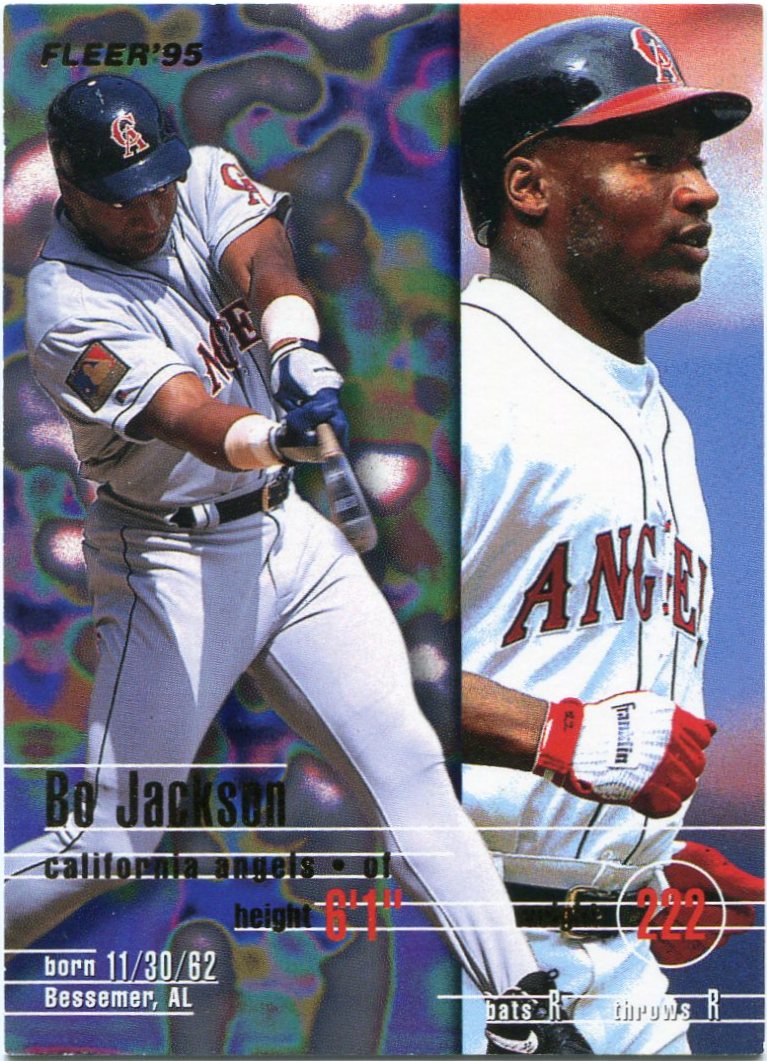
Thanks to his array of mid '90s cardboard, Thomas was able to include quite a few of these LSD-inspired pieces in the "blogger box" he sent my way.

This Bo Jackson may well be the most psychedelic "sunset" card ever produced.

Now, I probably know your reactions upon seeing anything from '95 Fleer.


It probably looks a little something like this.

Am I wrong?

To contrast, here's my '95 Fleer face.


All smiles.

You can call me a '95 Fleer "fanboy" if you want.

Like I said, I'm pretty goofy anyways. My adoration for LSD-inspired cardboard is basically icing on the cake.

Mr. Isringhausen kind of leads me into another aspect of my "goofy" cardboard personality.

Specifically, my absolute weakness for "behind the camera" shots.

Sadly, you don't see too much of these anymore.

They were kind of a mid '90s fad in the hobby.


Even Craig Biggio got in on the fun.

I really do wish someone would send me a box of Collector's Choice one of these days. (Hint, hint.)

Although others have said they have mounds of extras from the set, I've had an awfully tough time finding any of them around here.

Then again, that's pretty much been the case with anything from the mid '90s.

I'd love to find an all 1990's dime box one of these days.

Now that would be awesome.


Man.

Thomas really does have an eagle eye.

Last month, I wrote a post that involved the possibility of chasing "stretch" cards. I'm not sure why, but I've always had a fascination with them.

Over the next few weeks, I pretty much forgot about it.

Lo and behold, guess what wound up in this latest box o' cards?

Stretching ballplayers.

Here's blogosphere legend Bip Roberts partaking in a pregame stretch.

After all, staying fit is an important part of becoming an athlete.


That's right, Mr. Nagy.

You've got the idea.

Use that stair machine to your advantage. Whatever helps you stay fit.

I guess Mr. Spiegel's prophetic words in the comments of last month's "themes of cardboard" post did come to fruition, after all.

"You will probably start chasing these themes. People will just start sending them your way and you will have no choice but to place them in a binder."

How true.

And I'm sure this isn't the last of it.


Here we go again.

More goofy cards for my goofy collection.

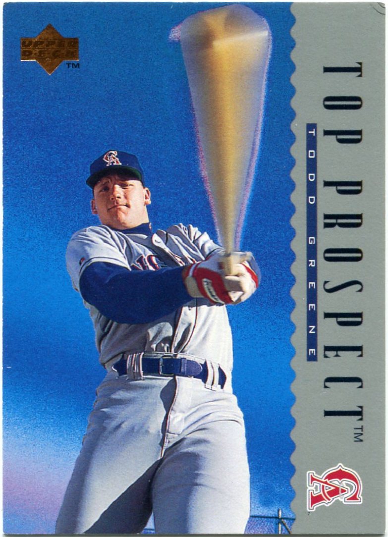
This time, we have one of the "bat barrel" variety.

Many fellow bloggers have responded well to this latest "chase" of mine. I've received quite a few in trade packages over the last month.

Even so, I'm not exactly sure that Todd Greene is wielding a bat in this photo.

It looks a little more like a lightsaber.


More bat-barrelled awesomeness.

I can't believe it took me so long to discover these things.


Uh-oh.

Looks like karaoke night at Tiger Stadium is in full swing here.

Travis Fryman certainly looks into it. He might make for a good addition to "The Cardboard Band", now that I think of it.

Still, with Fryman's swaying action and flailing arms, I can't help but think of the "Carlton dance".

I hope it's not just me.


Wow.

Look at the jugs on this one.

The JUGS-brand radar gun, of course.

Why, what did you think I meant?

Kidding aside, this has to be one of the strangest cards I've ever seen.

I'm not sure many believed Upper Deck's "Top Prospect" labeling of Daron Kirkreit back in the day.

If he was such a "hot commodity", why did UD use a shot like this for his hallowed rookie card? And why were the Indians having him time pitches in street clothes in the first place?

Isn't that what scouts are for?

Somehow, the fact that Kirkreit never made it to the bigs doesn't surprise me.


I don't think I have an overarching "theme" for cards like these yet.

Guys pounding their gloves with some sort of hammer or kissing their bats doesn't fit into anything I have going right now.

Still, I may have to consider starting some sort of "equipment" theme in the future.

These are pretty cool.

Goofy, yes.

But still cool.


Unlike most of the cards Thomas sent, I'd seen this one before.

For such a "goofy" collection, it was a bit of a treasured need of mine.

Something about those faux-throwback Rangers uniforms manages to make any baseball card way more awesome.

Plus, how could anyone not like that hilarious old-time fake facial hair? Score really took the whole "throwback" theme to the extreme here.

And, to top it off, I can technically consider this one a "pitcher at the plate" piece, since noted hurler Kevin Brown is indeed holding a bat in this photo.

Knowing what I know about Mr. Brown, though, he'd be one of the last people I'd expect to participate in a "fun" shot like this one.

In a way, though, I guess that makes it even better.

Even Kevin Brown couldn't help but crack a smile.


Unlike the past two "blogger boxes" I've received lately, I just couldn't crown a definite "king" from this group of cardboard.

Any one of the cards I've shown in this post could very well be deserving of the honor.

It could be Bob Gibson. It could be Jason Isringhausen. It could be Travis Fryman. It could be Kevin Brown.

And it could well be the celebratory Andres Galarraga.

I just can't decide.

One thing's for sure, though.

It's definitely not Ed Lover and Dr. Dre.

A huge, huge thanks goes out to Thomas for this spectacular array of cardboard.

I still don't think I'm deserving of the amazing amount of generosity I've received lately, but, hey, I'll take it.

I've just got to return the favor sometime. 

I'll be working on that in the coming months.

Until then, I'll just go back to writing about the goofy cards that make up my goofy collection.

It's all I ever wanted to do around here.

Friday, February 1, 2013

"The Dime Boxes Top 100": Cards 15-11


This countdown is simply flying by.

The fact that we're already into the deeper reaches of this countdown hasn't really hit me yet. After this write-up, I'll only have two more "Top 100" posts to go.

I guess the saying holds true, then.

Time really does fly when you're having fun.

Although I don't exactly need an excuse to show a Thurman Munson card around here, I figured now was a good time to feature one of my favorite pieces of his.

After all, we are into the "Top 15". And no player wore the number 15 better than Mr. Munson.

Well, I won't keep you waiting much longer.

With the backing of Thurman Munson, let's plunge right into the next five cards in my countdown.

Enjoy!


#15 -- 1998 Topps #5 Vladimir Guerrero

Yep.

I'm as surprised as you are.

Having a card from one of the most forgettable Topps designs in history make my countdown would've been a surprise in its own right.

Much less having one make it this deep into the "Top 100".

But, alas, it happened.

Yet, even though I might not enjoy '98 Topps all that much, I think this one was more than worthy of a spot in the "Top 15".

I'm starting to think I may have underrated it a bit, to tell you the truth.

Judging from the many nicks and scratches it contains, I've "loved" this one quite a bit over the years. Although I'll never know for certain, it may well have been my first card of Vlad.

While my personal ties to it may make it a "winner" in my book, I think the stellar photography should make it a "winner" for everyone else as well.

That beautiful sky almost looks like it was physically painted onto the card. Let's not ignore the forest-like trees looming in the distance, either.

But, more than anything, the up-close-and-personal "feel" of this one makes it a prized possession of mine. Given that I own over 600 cards of the guy, a lot of my Vlads have started to bleed together in my mind.

In a world of recycled poses and similar photos, this one has always stood out. 

And always will.


#14 -- 1991 Topps #170 Carlton Fisk

Given the sheer variety of bloggers around here, I've been introduced to a lot of different cards over the last year or so.

Padres cards. Hideo Nomo cards. Cards of guys blowing bubbles.

Through it all, though, there seems to be one constant presence.

Carlton Fisk's 1991 Topps card.

I have seen this card on many, many blogs during my time in the blogosphere.

And understandably so.

One could probably write a book on the beauty of baseball. I'd bet some already have.

Yet, somehow, Topps managed to capture the entire sentiment in a single, solitary frame.

Here, Mr. Fisk is shown impatiently waiting for a throw from one of his teammates. At the same time, the portly Cecil Fielder barrels down the baseline, a Tiger teammate begging him to slide in the backdrop.

Words can only go so far, though.

What I just typed does not even begin to explain my appreciation and adoration for this particular piece of cardboard. No words could ever do so.

In the end, the card pretty much says it all.

As far as I'm concerned, it may well be the most action-filled piece in my collection.


#13 -- 1994 Conlon Collection #1000 Ty Cobb

Whoops.

I may have spoken too soon there.

This may well be the most action-filled baseball card in my collection.

Most baseball fans have probably seen this iconic photo on a number of occasions, so I don't think I need to plunge too deeply into it here.

Much like my earlier sentiments, entire books have been written about Ty Cobb's all-out style of play.

Yet this single frame manages to convey that all by itself.

Even better, the famous photograph was indeed taken by Charles Conlon, the man behind one of my favorite sets in cardboard history.

To that, all I can say is, well...

Thanks, Mr. Conlon.


#12 -- 1994 Upper Deck All-Time Heroes #1 Ted Williams OW

Earlier in the countdown, I hinted at the appearance of a "position player pitching" card in the "Top 20".

Although I received a few good guesses as to what it was, no one came up with the correct answer.

That's probably because this incredible card is one of the best-kept secrets in history.

Given how earth-shattering his hitting prowess was, I'm not sure that a lot of people even know of Ted Williams's lone appearance on the mound.

I sure didn't.

Until this card fell into my lap, that is.

As the back of it notes, the historic moment took place during game one of a doubleheader against the Tigers on August 24, 1940.

At the time, the Red Sox were getting shellacked 11-1. "The Splendid Splinter" came in to pitch the final two innings of the game, allowing three hits and a run in the process.

There's a good piece of trivia for you.

Ted Williams finished his Hall of Fame career with a 4.50 ERA.

Amaze your friends with that one.

Given my fascination with the "odd" side of the hobby, it's easy to see why this one ranked so highly in my countdown.

I mean, it's Ted Williams on the mound, for goodness sake.


 #11 -- 1989 Upper Deck #755 Jim Abbott RC

Okay, I'll give you a little "spoiler alert".

After all was said and done, this proved to be the highest-ranking rookie card in my countdown.

Therefore, it takes the title as my favorite rookie of the "modern era".

Given the amount of rookie cards that have been issued in the last thirty years or so, that's a fairly distinguished honor.

As far as that goes, Mr. Abbott is a more-than-appropriate face for the modern "king" of prospects, in my opinion.

Even though the sideways name and logo may be a bit unsightly in the grand scheme of things, I could honestly care less.

It's a night card. It's a rookie card. It's a multiple exposure card. It's a horizontal card. And, most of all, it's a Jim Abbott card.

And it's all rolled into one truly spectacular piece of cardboard.

What more do you need?