Sunday, October 7, 2012
The Gems of Junk Wax, Pt. 46: 1992 Upper Deck #780 Turk Wendell RC
I lost count of how many different cards I've shown on this blog a long time ago.
It's probably in the thousands by now.
Some cards have gotten an entire post to themselves. Some have had to share the spotlight. And some have only warranted a passing mention.
Before today, this card belonged to the latter. It even had to share a scan with another piece of cardboard when I originally found it at the flea market a couple months ago.
That needed to be rectified.
If there was ever a card that deserved its own post, this is it.
It's hard to put into words just how exciting it was to "save" this card from a dime box. Even though Turk Wendell isn't currently a part of my binders, it's still one of my better discount box finds.
I'd long known about his quirky superstitions, but I never thought any of them would pop up on one of his cards. Surely card companies would rather use the generic follow-though pitching shot.
Luckily, Upper Deck chose to grant Wendell a little piece of cardboard history for his rookie card.
Aside from the odd generic blue hat and the free Coca-Cola ad, it's the only card I've seen that features a guy brushing his teeth.
I'd bet that it's the only one.
Between every inning he'd pitch, Wendell would chew four pieces of black licorice, spit them out, and brush his teeth in the dugout. (Leaf used a shot of him and his licorice habit on the back of one of his earlier issues.)
It's hard to believe that Upper Deck squeezed all that into Wendell's very first appearance on a piece of cardboard.
Does all that make this the greatest rookie card ever?
Possibly. It's certainly in the running.
That's for sure.
Saturday, October 6, 2012
Mega post
Normally, I try and take my trade posts one at a time.
I've read my share of "mega-posts" with a bunch of trades crammed into one post. Although I try my best not to get too far behind in my writing, the time has finally come.
It's time for a "mega trade post" on this blog. (At least a "semi-mega" one, anyways.)
Between a slight increase in homework this semester and a barrage of Update-esque trades awaiting me in the coming weeks, I didn't see a time in the near future where I'd be able to fit these different trades onto the blog.
They've been sitting in my scan folder for a while now.
Here we go.
I don't need to tell you how generous the people of the blogosphere are. Chances are you've experienced it for yourself at some point.
Yet I still find myself amazed at all of the great packages fellow bloggers and readers I've sent my way. Now that I've been a part of the blogosphere for almost ten months, I'm convinced that the generosity will always find a way to surprise me.
As was the case with a nice mailer I received from "Baseball Dad", author of the terrific blog "All Tribe Baseball".
Now that I think of it, I don't think I'd ever seen an Indian-centered collection before I joined the blogosphere. Plenty of Yankees collectors, but no Tribe.
It's been refreshing to see that there are people out there who still collect less-publicized teams like the Indians and Rockies. It's easy to get sick of seeing so many Red Sox and Yankees cards at a time.
Anyways, "Baseball Dad" was nice enough to send me a little congratulatory package for my 500th post.
One of the cards he sent was a much-appreciated Heritage short print of a heavily tattooed Mike Napoli.
Since I come from an Italian background, I pronounce his last name as "nah-po-lee", rather than the Americanized "nap-oh-lee".
I can't help but do one of those Italian-like hand gestures every time I say his last name.
People seem to have a lot of extra Vlads and Ichiros lying around their houses.
They've popped up in almost every trade package I've received during my time as a blogger. This one was no exception, as "Baseball Dad" sent a few Absolute Memorabilia parallels of the two main "culprits" my way.
Between the lack of a background image, the blank space, and the claustrophobic design, I shouldn't like Absolute Memorabilia.
Yet, for some reason, I find myself drawn to it. Back when I consistently dug through that little $1.49 per-pack box they have at Target, I'd always be on the hunt for these.
I gave up trying to explain some things in this hobby a long time ago.
As is the case with most of his other outgoing packages, "Baseball Dad" included a pack of 2003 Donruss Estrellas with all the other great cardboard he sent me.
I've never kept track of how many different sets I've opened packs of over the years, but I can now add Estrellas to what is likely a fairly large list.
Although they're not one of the better-known sets of the past decade, I actually like the looks of these.
I was lucky enough to pull a couple "keepers" with these two, the "K-Rod" being a key insert add to my collection of his.
I've always loved the idea of a poster in a pack of baseball cards.
Before today, I'd never known that Estrellas incorporated these into their product.
It's definitely a neat piece, but I'm not a big Nomar collector. Thankfully, I think I know a fellow blogger who might enjoy this one.
End of "mega-post", part one.
Intermission.
Part two begins.
Enter mailer from William, a presumably ecstatic O's fan and author of one of my favorite blogs, "Foul Bunt".
Of all the great people I've dealt with during my time as a blogger, William has definitely been the most generous. I've lost count of the number of "surprise" packages he's sent to me.
He's always kept an eye out for "fun" cards that I'd enjoy. Needless to say, he's done a great job of it.
"Fun" is just one of the many words I'd use to describe this awesome Yount card.
I hear disco in my head every time I look at it.
As usual, William also managed to find a few neat pieces for my player collections as well.
Remember what I said earlier about Vlad cards?
Here's more proof.
In recent years, some high-end sets have been plain ugly.
And not just ugly for high-end. Ugly for anything.
Upper Deck Epic is not one of those sets. Epic is what high-end should look like. The few I've found in dime and quarter boxes are astounding.
This serially-numbered Vlad from William is a fine example of that very fact, one of the better additions to my collection of his.
End of part two.
Go and grab some chips and soda if you'd like.
Commence part three.
The final act.
Featured here is a totally unexpected package courtesy of Adam, author of "ARPSmith's Sportscard Obsession", one of the better newer blogs out there.
Adam was the lucky winner of my most recent contest. I guess he decided to "return the favor" with these.
He managed to knock out a good chunk of my recent set needs, including a few of this year's awesome "Opening Day Stars" inserts.
Judging from how much he's dominated during his time in Texas, it's hard to imagine Josh Hamilton in anything other than the Ranger blue and white. I really hope the Rangers could find some way to keep him.
I guess we'll just have to see what free agency has in store for us this offseason.
Adam took care of a few of my Heritage insert needs as well.
The JFK marks a major collecting milestone in my non-sports collection, as I have now completed the Heritage "News Flashbacks" insert set for the fourth year in a row.
Although I don't do much base or insert set building, I still get a big rush out of receiving that last and final piece to the few sets I have completed over the years.
It's the one that makes it all worthwhile.
However, the bulk of the cards Adam sent me involved my player collections.
Well, one of them, anyways.
Adam more than doubled the size of my brand-spankin'-new collection of "Mr. Perfect", Matt Cain.
Before last week, my Cain collection stood at a respectable 22 different issues.
Thanks to the 24 new additions that Adam sent my way, it now consists of 46 different pieces, all of which lie happily near the front of my Giants binder.
Not bad for a collection I started about three months ago.
Not bad at all.
Well, that's it. "Mega post" over.
In the meantime, much thanks goes out to "Baseball Dad", William, and Adam. I'll definitely be scoping out the dime boxes for Indians, O's, and Giants cards for you guys in the future.
Your generosity is much appreciated!
Friday, October 5, 2012
Dime Box Heroes: Triple the fun
2012 Topps Gypsy Queen #50b Miguel Cabrera VAR SP
Honestly, I never thought I'd see anyone win a Triple Crown during my lifetime.
Only a couple players, if any, have scratched the surface of the accomplishment in the dozen or so years I've been watching baseball.
With all the big-power, low-average guys in the game today, chances were slim to none that I'd get to see an actual Triple Crown winner.
It's a good thing no one told Miguel Cabrera.
Every time there's a glimmer of hope for a .400 season nowadays, it seems like the guy goes through a collapse near the end of the year. It happened to Todd Helton in 2000. John Olerud suffered the same fate in '93.
Surely the same thing would happen to Cabrera in his Triple Crown chase. He couldn't keep up that pace all season long.
Or so I thought.
I don't think it hit me until Cabrera's four-hit effort on the third-to-last game of the season. With about an eight point lead in the batting race at the time, I finally came to my senses.
I was actually going to see a Triple Crown winner.
Plus, I'd found a Gypsy Queen SP of Cabrera in a dime box at the flea market this summer. A short-print of a Triple Crown winner in a dime box.
How neat is that?
After he came out of the Tigers' last game after a couple at-bats, it was official.
Miguel Cabrera had won the Triple Crown.
My dad was one year old the last time that happened.
Thinking about it along those lines really put it into perspective.
"Epic", "incredible", and "awesome" are just a few of the words to describe how great it is to be able to say that I actually got to witness a guy win the Triple Crown. They're also just a few words I'd use to describe how amazing this former dime box find is.
Being the baseball nut I am, a thought popped into my mind a couple nights ago.
Who was the first player to win a Triple Crown in baseball?
The answer surprised me a bit.
Perhaps even more surprising was the fact that I actually had a card of the guy.
In 1878, Paul Hines of the Providence Grays became the first player to win the Triple Crown.
Or whatever they called it back then.
Hines batted .358, swatted a whopping four home runs, and drove in 50 runs for the Grays that year, all of which led the National League. (They only played 60-game seasons at the time.)
This card comes from the 1994 Origins of Baseball set, which I still rate as one of my all-time best buys.
Baseball has only seen fifteen Triple Crown winners since Hines first accomplished the feat 134 years ago.
At just 29 years of age, Miguel Cabrera is the newest member of that extremely exclusive club.
Best of all, I got to see it first-hand.
Thursday, October 4, 2012
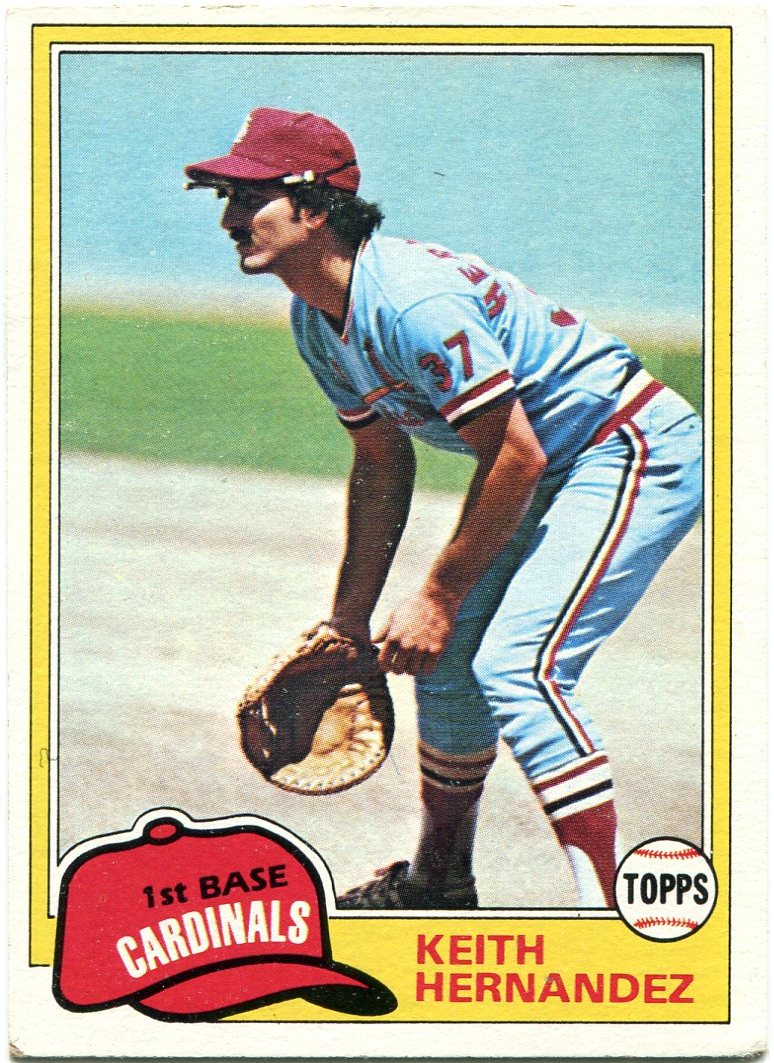
Into the Sunset, Pt. 6: Keith Hernandez
To put it lightly, Keith Hernandez was a heck of a ballplayer.
The guy won 11 career Gold Gloves at first base. He was a five-time All-Star. He shared the NL MVP award with Willie Stargell in 1979.
That's all fine and good, but I typically associate the name "Keith Hernandez" in a slightly different context.
Like it or not, I can't help but think of Seinfeld every time I hear his name. It's been my favorite TV show for as long as I can remember, and Hernandez's two-part episode had to have been one of my first introductions to it.
Phrases like "He spit on us!" and "Nice game, pretty boy!" almost involuntarily pop into my head every time I browse through my cards of his.
It overshadows the fact that he's actually had some pretty nice cards over the years.
I don't have as many of his earlier issues as I'd like, but I find it hard to believe that any could top his '81 Topps card, a perfect specimen for a perennial Gold Glover.
Despite his success with the Cardinals, Hernandez is probably better known for his time with the Mets, which is where we'll start our countdown.
When I started this blog, I maintained that 1989 Bowman was the worst set ever produced.
However, after carefully examining things, I've decided that 1990 Donruss now earns the dubious honor of the single worst baseball card set. Ever.
"Ugly" isn't a strong enough word for this one. I could do a better cropping job than that.
Therefore, it should come as no surprise that Hernandez's '90 Donruss "sunset" issue brings up the rear.
Hernandez had always been in my mind as a possible future "sunset" subject.
However, I was missing a key piece of the puzzle. His 1990 Fleer issue.
After a while, I thought I'd just have to omit it from the countdown. For better or worse, early Fleer isn't exactly commonplace at flea markets or card shows.
That all changed when I decided to pull the trigger on one of those Target repack things a couple weeks ago.
Much to my surprise, the last piece to Keith Hernandez's "sunset" collection was in my hands.
Just another reason to love those repacks, I guess.
Still, this one takes fifth in the countdown.
It could've been a whole lot better without those big, intrusive white borders.
In my book, Score and Pinnacle share the honor of the most underrated card company in the hobby's history.
Score has always been one of those sets that simply lingers in the background without much recognition. If it does get mentioned, it's usually in passing, not often receiving a ton of praise.
However, it's always been a favorite of mine because of the large checklists and lack of posed shots, the latter of which was a rare sight in the overproduction era.
Even if the cropping on this card is a bit odd, Score still did a terrific job of sending Hernandez into the sunset.
Still, it only places fourth on this list.
That's because Donruss, Fleer, and Score all missed a key aspect of Hernandez's final year in the majors, as far as my collection goes.
(Editor's note: Apparently, Hernandez had cards in Fleer and Score's 1991 sets, although I'd never seen them until today. Looks like I have a couple cards to chase, and perhaps an "updated" version of this post in the future. Thanks for the info, Night Owl!)
Unbeknownst to many, he actually finished his career with the Indians.
It took me a while to find out about that. When I first traded for this card, I thought it was a different guy named Keith Hernandez.
Surely the Seinfeld Keith Hernandez didn't play on the Indians, did he? I had to look it up, just to make sure it was true.
Sure enough, Hernandez spent his final season in Cleveland, hitting .200 with one homer in 43 games for the Tribe in 1990.
I give Topps credit for "updating" the collector in their Traded issue that year.
However, there's not a lot to be excited about here aside from that. Shots of the back of a guy's jersey aren't usually favorites in my book.
Plus, Topps' 1990 design may well be my least favorite in their history.
Topps gets the "bronze medal" here.
In an unprecedented upset, Classic actually nudged out Topps for the second spot on this countdown.
The borders aren't exactly pleasing to the eye, but I like the fact that Classic cropped the picture so that it didn't get cut off, unlike the efforts of Donruss and Fleer.
This way, it looks a bit like Hernandez is actually popping out of the frame and into your own living room.
Aside from the fact that these last two have pictured him in an Indians jersey, there's not a whole lot to like about the send-offs that Topps and Classic gave Keith Hernandez.
Score and Fleer provided nice action shots, but did so while he was in a Mets uniform.
If only there were one that gave the collector the best of both worlds.
A great action shot and an Indians jersey.
Luckily, Upper Deck was there to make everything better.
For a few of my past "sunset" subjects, I had a fairly tough time deciding what would ultimately take the top spot in the countdown.
There was never much doubt about Keith Hernandez. This one is better than the previous five combined.
What's not to like about it?
Batting cage shots are and will always be awesome, especially when it comes to "sunset" cards. (I made that known pretty early in this theme.)
Heck, even the back of this one beats the efforts of the likes of Fleer and Topps.
Without UD on the scene, his sunset cards would've been a huge disappointment, a gap that Topps and Fleer wouldn't have filled.
Thanks, Upper Deck.
Wednesday, October 3, 2012
Sneak peek
It's hard to say what my absolute favorite time of the baseball season is.
I guess it all depends on when you ask me that question.
At the beginning of March, I'll say that spring training is the best part of the season. Warm weather and hope are just around the corner.
If you were to ask me in early July, I'd probably tell you that the All-Star game is my favorite. It's amazing to see the best guys in the game under the same roof, actually playing a semi-exhibition game that isn't a travesty. (Which is something I can't say about the All-Star game in most of the other major sports.)
Come July 31st, I always maintain that the trading deadline is the best time of year. The anticipation of finding out who will get moved or stay put is invigorating, right up until that afternoon deadline.
If someone asked me at this very moment what the best part of the baseball season is, I'd have to say that we're living through it right now, especially with the extra Wild Card one-game playoffs on Friday.
I can't wait.
It's pretty much the same with the baseball card season.
With cardboard, there are only two conceivable answers, at least in my mind.
The first is that fateful day when the first releases of the new year are on the shelves. Thankfully, 2012 gave me the first opportunity to display that awesome feeling through writing. My post on the topic is still one of my sentimental favorites from my history as a blogger.
We're right in the middle of my other favorite part of the baseball card calendar.
Topps Update time.
As a collector, it's the first chance I get to see guys immortalized in their new uniforms on cardboard, mostly guys that switched teams during the course of the season. Update also does a great job at filling in some of the loose ends that Series 1 and 2 may have missed.
Although I already pre-ordered a hobby box, I couldn't help myself. After seeing Update pop up around the blogosphere, I wanted to get a little "sneak peek" of my own before the box arrived.
My trip to Target yesterday came up empty. Since I wanted to grab a little lunch anyways, I figured I'd pop in this afternoon and see if anything had changed in Target's card aisle.
Most of the "good stuff" at my local Target is located on the bottom floor. It's usually not even worth it to go to the top floor. It looked like a tornado had swept through the few times I've gone up there.
A quick check once again found that Target hadn't gotten any Update in yet. So I decided to try something I almost never do.
I went to the top floor of my local Target, just to make sure the place was Update-free. I had to rub my eyes once I arrived at the barren top-floor card aisle.
Amongst all the unorganized and mismatched packs, they actually had Topps Update on the shelves. A box full of rack packs, sitting right in front of me.
Since everything was going haywire and all, I figured I'd go a little crazy myself.
I actually purchased the rack pack that was sitting on top of the box, something that's usually a no-no in my book.
As I walked away with my purchase, I noticed the name "Harper" staring at me from the back of the see-through wrapping. My first card of the phenom and the newest "binder inductee".
The top pack proved to be a pretty good choice, after all.
Since I'll probably posting about Update a lot more once my box arrives, I won't go too much in depth with what my rack pack held. I'll just show a few of my favorite pulls to give you an idea of what this year's Update set is shaping up to be like.
So, without further ado...
I'm starting to think that Ryan Theriot is becoming one of those guys who just "looks wrong" in any other non-Cub jersey.
One of the most painful days during my time as a Cubs fan was when they dealt Theriot to Los Angeles at the deadline in 2010. I don't know that I'll ever get over that trade, as he was easily one of my favorites to watch on a daily basis.
He's bounced around since his time on the North Side, playing with the Dodgers and Cardinals before winding up in San Francisco this year.
At least Topps gave him a heck of a shot for his cardboard debut with the Giants.
My first card of Hairston as a Dodger.
I'm still trying to find a copy his Heritage short-print. The chances of that happening in the near future are slim, though. One of the biggest Dodger collectors in the blogosphere didn't track it down until yesterday.
Speaking of which, I don't think I'll ever be able to see one of these awesome "play at the plate" cards without immediately thinking of the blogosphere.
Of course, we all probably know why.
Since the Dodgers are so popular around the blogs and all, I thought I'd give their fans a peek at how their big deadline acquisitions look on cardboard.
I'm fairly certain that the Victorino is an actual, non-photoshopped shot of him as a Dodger. That is Dodger Stadium behind him, isn't it? (I'm awful at the whole stadium identification thing.)
The jury is still out on the Hanley. I've it looked over a few times and I'm still not sure. If I had to guess, I'd say it's real.
These guys look pretty good in the Dodger blue.
Like Victorino, Ryan Dempster is no longer a "zero-year" member.
The Rangers originally drafted him way back in 1995. Seventeen years later, he's finally pitching in Arlington, and I finally get to add him to my Rangers binder.
I have to believe that the Damon will go down as his "sunset" card. Although I'd love to see him catch on with another team next year, I don't see it happening.
A tip of the cap is a fine way to go out in this hobby.
Here's a couple of injury-plagued pitchers making their cardboard debut in new uniforms.
Once I saw the name "Ben Sheets" on the Update checklist, I knew it was a card I had to have.
Now, I can honestly say that I pulled what figures to be his last card on the exact same day he retired from the game.
How cool is that?
Just a couple of other "fun" cards from my rack pack.
It's too bad Greg Dobbs isn't a member of my binders.
A shot of him giving Hanley Ramirez a piggy-back ride would look great in a nine-pocket page.
None of the inserts I pulled ended up being "keepers".
However, I think I stumbled upon a Robinson Cano "hot pack" or something. Two parallels in the same rack pack.
I'm glad Topps chose to bring back the numbered Gold parallels, although I wish they didn't give them the Cognac treatment. The Golds will consist of all 990 cards from Series 1, 2, and Update, like last year's "liquorfractors".
All in all, I'm loving what I see from my "sneak peek" of Update. Needless to say, I'm counting down the days until my box arrives.
Until then, I'll be out enjoying the best time of the baseball year.
Playoff time.
Tuesday, October 2, 2012
Just plain wrong
Much of my collection revolves around teams.
I've stored my "keeper" cards by team for as long as I can remember. In the cases of some players, I pick and choose what to collect, based on what uniform they're wearing. (For instance, I collect cards of Rickey Henderson as a Padre, but not a Yankee.)
This focus on each individual team has had a big impact on how I collect, in many ways.
Perhaps the most obvious example of this is through my inherent fascination with players who only wore a certain uniform for an extremely short period of time.
Most of them can be classified as "unfamiliar". That's what makes them so great, in my view.
However, some manage to completely breeze past the label of "unfamiliar". Rick Ankiel in a Royals jersey is unfamiliar.
Ralph Branca as a Yankee is just plain wrong.
After years of pitching for the rival Brooklyn Dodgers, Branca donned the pinstripes for five games near the end of the 1954 season.
It's hard to believe that a man who became so closely tied with the Dodgers actually went on to play in New York, under the tutelage of Casey Stengel. (Who makes a cameo on this card.)
While we're on the topic of pinstripes...
Throughout the history of baseball, hundreds of players have suited up for both the Yankees and Red Sox during their career.
Among them are Sparky Lyle, David Cone, and, of course, Babe Ruth. (Here's a full list.)
However, none of them looked as awkward as Elston Howard during his brief stint with the rival Red Sox.
He won an MVP award with the Yankees in 1963. His number 32 is retired by the franchise. He's a part of Yankee Stadium's hallowed Monument Park.
It's no wonder that any talk of his time with Boston usually gets swept under the rug. Heck, I didn't even know this card existed until I found it in a quarter bin a couple years ago.
Howard's sudden lack of pinstripes will never look appropriate.
Ever.
This is one of my favorite cards, just because of how very wrong it is.
Steve Carlton had a long, long Hall of Fame career. Perhaps a little too long, judging from what his stats have to say about it.
He pitched for five teams during the final three years of his career. His final stop came with the Twins, a franchise who was only in its fourth year of existence when "Lefty" made his big-league debut way back in 1965.
Everything about this card is wrong. Carlton's facial expression, the seemingly bad lighting, and the uniform.
Especially the uniform.
As far as hometown guys go, John Kruk is an anomaly.
Usually, it's the non-Chicago uniforms that belong in this category. Billy Williams in an A's jersey is wrong. Nellie Fox in an Astros jersey is wrong.
In the case of Mr. Kruk, the opposite is true.
Some fans might remember Kruk as a San Diego Padre. Most probably remember him from his Phillies days.
I think it's safe to say that no baseball fan remembers Kruk from his 45-game tenure with the White Sox in '95.
The Windy City just doesn't suit him.
In terms of my devotion to Chicago baseball, I've always been a bit different from most.
I'm a fan of both teams. Some might see it as blasphemy, but it's just the way I was raised. My family has always had a healthy respect for both teams.
That doesn't mean I don't have a preference, though.
While it was painful to see the White Sox get eliminated from playoff contention last night, it might've been even tougher to watch the Cubs suffer their first 100-loss season since 1966. (It wasn't a good day to be a Chicago baseball fan.)
For better or worse, my heart has always been with the North Siders.
As a result, any Cubs icon instantly looks wrong in any other uniform they don during their career. You have no idea how glad I am that Ernie Banks never played for another franchise.
Not all Cubs mainstays have taken the path of "Mr. Cub", however.
While Kerry Wood certainly had his ups and downs during his time with the Cubbies, there's no denying that he became a major part of Cubs lore during his playing career.
For proof, consider the fact that the entire state of Illinois celebrated "Kerry Wood Day" on September 23rd of this year.
Although he spent a full two seasons away from Chicago during his career, he'll never look right in an Indians or Yankees uniform.
It's just not possible.
Still, one Cub managed to re-define the term "wrong" when it came to baseball cards.
That player is Ron Santo, of course.
Between his Hall of Fame playing and broadcasting career, Santo became quite possibly the most beloved Cub in the long history of the franchise.
He was the biggest Cubs fan on the face of the planet, no matter how well or how awful the franchise fared.
Because of all that, I don't think "wrong" is an appropriate enough term to describe Santo's 1975 Topps card.
In a controversial move, Santo was dealt to the South Siders before the start of the 1974 season. He'd spend the final year of his career there, posting a mediocre .221 average in 117 games.
Everything about this card is wrong. Since when did Ron Santo play second base? (A managerial experiment placed him at second for 39 games during the '74 season.)
In their own odd ways, all of these "wrong" cards are great.
I can't go through my Yankee binder without being fascinated by that Branca card. It's the same with Carlton and my Twins binder.
They're so weird that it's tough to look away. That in itself makes these cards both "wrong" and awesome at the same time.
It's an odd paradox.
Still, even with all that, there's something I have to do every time I look at that Santo card.
I need to make things right again.
That's better.
Much, much better.
Monday, October 1, 2012
Mondays with Hoyt, Episode 18
2009 Topps Heritage "Baseball Flashbacks" #BF-4 Paul Richards/Hoyt Wilhelm
Every once in a while, this hobby can throw you a curveball.
Sometimes, that change of pace is a good thing. There have been a few cases of that thus far in 2012. (Panini's Triple Play offering is a good example.)
Other times, it can just be downright confusing.
That's exactly what we have with this most recent "Mondays with Hoyt" subject.
Topps Heritage is one of the last sets from which I'd expect any sort of "curveball". You pretty much know what you're getting, year-in and year-out.
Yet, in 2009, that's precisely what happened.
One of their "Baseball Flashbacks" inserts featured a photo of a catcher's mitt. Nothing else. A catcher's mitt.
It's not your everyday mitt, though. This particular glove was specifically designed in 1960 by Orioles' manager Paul Richards, an attempt to aid his catchers in their efforts to corral Hoyt's dancing knuckleball.
It proved to be the last of its kind, as MLB banned oversized gloves after the 1961 season due to the complaints of opposing teams.
Although only Richards' name is shown on the front, the listing of this card on "Checkoutmycards" classifies it as a Richards/Wilhelm "combo" issue.
This card has been in my possession for the last three years, and I still don't know what to do with it.
It doesn't show Hoyt's face. Heck, his name isn't even on the front of the card.
Should it really be considered a piece of my Hoyt Wilhelm collection?
Then again, this does represent one of my favorite aspects of Hoyt's career. His knuckleball was so ferocious that it actually forced the hallowed baseball rulebook to be changed.
Before I started writing this post, it was tucked into the "team card" section of my Orioles binder.
Now, I'm thinking it should take its place with the rest of my Hoyt cards. It may look a bit out of place, but that's what makes this particular card so great, after all.
Like I said, baseball cards can toss a curveball when you least expect it.
As far as this one goes, I guess you could say that the hobby threw me a knuckleball.
Subscribe to:
Posts (Atom)