Thursday, June 22, 2023

Encapsulation


We live in an era of encapsulation.

If you ask the masses, the current mode of "enjoying" a card is sealing it up in a case and never holding it again. I've mentioned this many times on the blog before - I don't mean to keep beating a dead horse here - but I just don't understand grading, and never will. The money & flipping part is one thing, but I hear about people grading their own stuff all the time - to which I say, why pay someone to tell you what you already have? And worse, keep you from ever touching it again?

I move my cards within my binders a lot, and should probably do a little better job of preserving my cards than I do. I'm not endorsing a return to the time where we'd throw cardboard against brick walls and fold them into our pockets (though we could learn a lot from those days). But I've always needed to touch my cards to truly make them feel like they're mine. Without that, they're little more than images that exist in a world just beyond my reach.

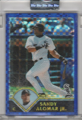
Which is why I wasted no time in jailbreaking this encapsulated and "uncirculated" Sandy Alomar Jr. refractor I generously received from a reader named Xavier H. recently - to me, it seems like the only sane thing to do.


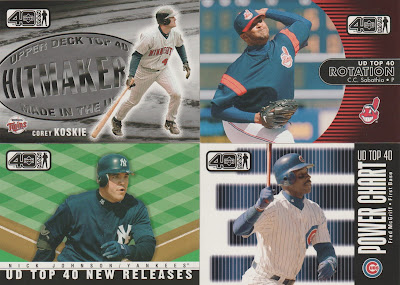
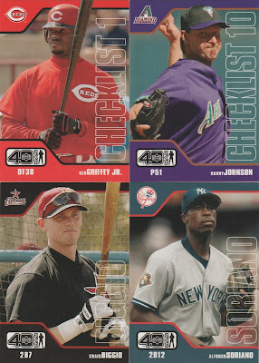
You can tell Xavier has good taste in cards, because who else would send me a stack of UD 40-Man singles, knowing the joy I'd get out of them?

This set is kind of the stepchild of Topps Total, but it was a bit more expensive and never really lasted in the way Total did - you've got a lot of star power in this scan, but 40-Man is great for those of us who want to see bench players and middle relievers more often.


I mean, has anyone ever graded an Upper Deck 40-Man card?

(He asks, not really wanting to know the answer.)


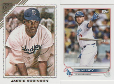
Me: I feel a little weird when someone sends me Dodger cards since I'm a long, long ways away from being the most prominent Dodger fan on the blogs.

Also me: Woo-hoo! Both guys I collect, and both needs!


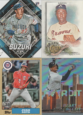
A few of the other recent odds and ends Xavier sent along, including a new card for my growing Seiya Suzuki collection and a nifty skyline-themed Topps Chrome insert.


I live in willful ignorance of those late '80s Topps Big sets - I know there's stuff in them I need, but the originals are both taller and longer than standard cards ('89 Bowmans are just taller) and thus don't fit in a nine-pocket page.

 If these Archives inserts are any indication, I like Topps Big a lot more when it's regular-sized and shiny (Nolan Ryan Mets sighting!).


Here's a few cards from fancier sets that you don't see in trade packages too often (and probably graded all time time) - Transparent Donruss is at least Kinda Interesting Donruss.


Xavier was also nice enough to send me my first jersey card of Tim Anderson, one of my favorite dudes in the game right now.

I'm not nuts about memorabilia-centric stuff - at this point I treat them like any other insert - but this was still fun to see fall out of a trade package. And yes, you know I had to run my thumb over the fabric the minute I saw it, because that, to me, is what collecting is all about. I'd never be able to do that if I just ran to get it graded, or put it in a one-touch, toploader, etc., etc.

Cards, like humans, need to live their best lives - and if you ask me, they can't do that in a plastic shell.
Thursday, June 8, 2023

Junk is junk


I have a fraught relationship with the term junk wax.

There was a time when I used it at will - heck, I named an entire theme on this blog after it - and generally thought it was an apt name for a generally dark period of baseball cards. It's still in wide use - say "Junk Wax Era" to a collector, and chances are they'll know exactly what you're talking about.

But I don't say junk wax much anymore. For one thing, it unfairly banishes a span of time that actually had a lot of good stuff in it to cardboard purgatory. Perhaps more importantly, I don't think it's fair to the people who grew up collecting in those years. I certainly wouldn't like it if someone essentially called my cherished childhood memories of late '90s/early 2000s cards a steaming pile of trash (though I'm sure some already do). 

Still, like any era before or after it, "junk wax" had a fair amount of bad to go with the good - and for some reason the misanthrope in me wanted to take a brand-by-brand look at some of the worst designs of the era, the ones that perhaps rightfully belong in the junk heap.


Bowman - 1989

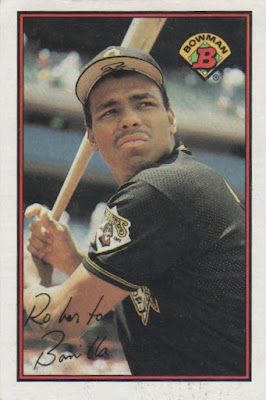
Might as well address the elephant in the room right away - as I've mentioned many times before, 1989 Bowman might well be my least-favorite set in the history of baseball cards.

I'll just say this: when I hear the term "junk wax," I think of '89 Bowman.


Donruss - 1988

Going on the aggregate, Donruss might've had the roughest go of any brand of the "junk wax era" (which I personally define as 1987-1994). 

It wasn't a great time for Donruss - 1987, 1990 & 1991 were all in the running for this dubious honor, but in the end I have to go with '88 Donruss because man does this set suck. There's no interesting photography to speak of, and I always think of the LUDICROUS SPEED! scene in "Spaceballs" whenever I see those borders.

Some overproduction-era sets have have grown on me with age - but '88 Donruss sure hasn't.


Fleer - 1992

If 1989 Bowman didn't exist, there's a good chance '92 Fleer would be my personal Worst Set Ever.

There's just nothing good to say about it. I'm not a fan of vertical font, and every card feels like it's being slowly crushed by one of the hilariously slow-moving doors you see in a bad James Bond ripoff. I think it's telling that you rarely hear anyone mention this set, and when you do, it's apathetic, at best.

I don't doubt that some of the cards in '92 Fleer could've been great, but then you see this odd design lop off half of Dennis Eckersley's arm, and there goes any chance of that.


Score - 1992

Even though the design is a bit more interesting, '92 Score suffers from the same '92 Fleer "closing doors" phenomenon that makes every card in the set feel claustrophobic (see: half of Garry Templeton's right arm floating in some kind of blueish void). 

It's a weird misstep in what was an otherwise solid era for Score - this is really the only one of their designs I'd classify as flat-out bad.


Topps - 1990

Topps probably had the best stretch of any set during the "junk wax" years - I'm a fan of the entire 1987-94 Topps run, and 1990 Topps has the unfortunate honor of being the one I like the least.

The comic-book inspired borders are neat, but '90 Topps suffers from a common overproduction-era flaw, in that the photos are dull with a capital D. Ask me to name a specific guy's '90 Topps card, and there's a good chance I can't do it. I've always gotten the feeling that 98 percent of this set's manpower was used on the design, and the photos chosen as an afterthought.

Sure, the sheer look 1990 Topps is forever stuck in my memory, but somehow the cards themselves aren't.


Upper Deck - 1994

You could make a case that 1994 Upper Deck is the most disappointing set in the history of baseball cards.

I've never heard a bad word about '93 UD - it's gotta be the best set of the "junk wax era," and one of the all-time greats - and Upper Deck followed that up with...this. A weird double-image miasma that makes the horrendous choice of using gold foil on a black background (and not one, but two different vertical fonts!).

Continuing the legacy of Fleer and Score, these cards also feel squished - was there some kind of weird closing-door kink in the early '90s? Unlike other sets, however, there's actually some interesting photography in this one if you can look past the claustrophobia. It's kind of the anti-1990 Topps, in that the photos are good, but the design is awful. And definitely a dud when compared to the greatness of '93 UD.

I think twice when the term junk wax pops into my head nowadays, which is probably a good thing - but every time I see a card from most of these sets, I can't help but wonder if there's something to that unfortunate label.

Thursday, June 1, 2023

Fear and loathing in Topps Heritage


By some minor miracle, I actually managed to find some 2023 Topps Heritage on a Target shelf last week.

I was so surprised at the sight that I might've gone a little overboard - I bought five hanger boxes(!) - but still felt justified since this mid '70s period of Heritage is one I've been waiting for since I was a young fan of the brand. I seemed to be one of the few who enjoyed last year's '73 tribute, and I was eager to see what the '74 edition had in store, and share my findings.

Yet, as someone who didn't actually grow up with these '70s sets in real time, I always feel a little silly writing Heritage posts because I'm admittedly nowhere near the most qualified judge in the room.


Still, whether you're 30 or 60 or 90 years old, there are some universal truths to Heritage - one being that these fake-background photos Topps keeps insisting on using in this set are weird and just not that interesting.

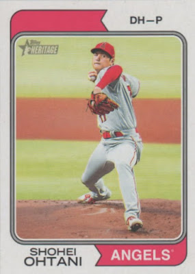
Combine that with the inexplicably blank city name on Angels cards this year (see: Ohtani) and you have the usual flubs that Topps just can't seem to nail down.


But that's not even what I hate most about 2023 Heritage.

No, that dubious honor has to go to the fact that all the Postseason and World Series highlight cards are short-prints this year. I look forward to these highlights cards every single year, and to know I'll never see most of them - because we know how tough Heritage SPs tend to be - is a gut punch to this longtime Heritage devotee (though I did mercifully manage to pull a couple from my hanger boxes). 

If every other Heritage flaw is disappointing, then this one is just plain aggravating. 


But after hopping over the fence of negatives, I found that there's actually quite a bit I like about 2023 Heritage.

Inserts are unnecessary for a supposed "throwback" brand, but I still kinda like them in Heritage - as per my annual tradition, I'll be attempting to complete the "News Flashbacks" set, and dig the Davey Lopes cameo on that Aaron!


Maybe I'm being too lenient here, but in the end I feel like the good parts of this year's Heritage are terrific enough to make me give Topps a pass for the bad parts.

Like they did last year, I think Topps nailed the action shots this time around with a fun (and, more importantly, varied) blend of pictures that ring true to actual '74s. 


The key to what makes the action cards so great this year is that you can actually see the entire player on most of them.

At risk of sounding like a broken record, one of the problems I have with the modern hobby is that almost all the photos are zoomed-in and repetitious after a while, resulting in just plain unmemorable stuff. But a lot of what you'll find in 2023 Heritage is zoomed-out joy that matches the beauty of so much actual vintage.

It's the main reason I think you can safely place this set into the fun category.


The horizontals in this year's Heritage are especially choice - that Jeremiah Estrada is glorious and might be my favorite of any of the cards I pulled (major '74 Milt Pappas vibes!). 


Here's a card that, theoretically, shouldn't work - it uses a photo taken from across the diamond, Witt's body weirdly contorted and his tongue is sticking out, and there's a headless umpire in the background.

But damn if I don't absolutely love this thing (and not just because it also fits into my "42" mini-collection). It proves there's sometimes a backward beauty to baseball cards, in that the most off-kilter stuff tends to impress us. I point to the distant Bobby Witt Jr., the off-center Jeremiah Estrada, and so many other examples here for proof.

Unlike a lot of what you'll find these days, 2023 Heritage understands that fun cards like these make a set of baseball cards a true experience, and not just a fistful of cardboard to be looked at.