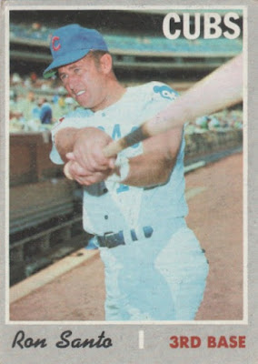
There's something incredibly dull about a collector whose ways are set in stone, and I've always had a vague fear of becoming that person.
To me, baseball cards exist in a seemingly never-ending universe that's a blast to explore, the good with the bad. If you only live in a small corner of that universe, then you'll find yourself with nothing to do after you complete those three sets you love, or chase down all the cards you need of your favorite player.
As much as I love chasing that eternal string of cardboard, I sometimes worry about my tastes never changing. But lately I've noticed a shift in my opinions of a few sets. While there's a certain horror in all that lost time - why'd it take me so long to come around? - it's also kind of a thrill to rediscover something you'd long relegated to the background. It's a sign that our tastes are ever-changing.
A prime example for me is 1970 Topps - a set I'd always considered bottom-of-the-barrel but has recently been growing on me to the point where I'm starting to further cherish the ones I own.
I think I relegated '83 Fleer to also-ran status for the same reason as '70 Topps: drab, boring borders.
A good border is the first hurdle for a design - I've been guilty of immediately assigning sets with dull borders to "blah" status. But like '70 Topps, I've started to come around on '83 Fleer - it's really a fine set once you get past the edges.
By no means am I saying that it's a top-tier Fleer offering, but it's at least deserving of more love than I've given it throughout my collecting life.
I really don't know why I never liked '88 Fleer - you certainly can't accuse this set of being boring with those barbershop borders.
My only guess is that it falls in the general overproduction-era of cards I've seen a million times. I don't remember '88 Fleer grabbing me much when I first saw it as a kid, and I've never really given it a second look in that time.
I unabashedly love '91 Fleer and its yellow borders, but now I'm wondering if Fleer might've hit upon another treasure I'd long overlooked three years prior.
I know perfectly well why I never gave '92 Upper Deck much respect - it's sandwiched between two of my very favorite UD sets, and any set that has the misfortune of coming right before the legend that is '93 Upper Deck is doomed for failure.
Unlike a lot of my shifts in taste, which tend to happen gradually, I looked at this Craig Biggio card last week and a light instantly switched on in my head - wait a minute, this set is great!
I distinctly remember being disappointed when I first opened packs of 2008 Topps as a teenage collector.
I think it's harder to change one's opinion on a set they experienced in real time, and that's probably why I've always tossed '08 Topps aside. I can't help but flash back to that "meh" feeling I had when I first saw it.
I still think the design here crunches the photos in a little too much, but those loveable dotted team names have the distinctness and pizzazz that's been missing from so many modern Flagship sets.
There was a time not long ago when I ranked this as The Worst Topps Set Ever. I can understand why - the player names can be unreadable, and what was with Topps's obsession with bronze borders around the millennium? It's not conducive to
But oh, the photography! In addition to producing my all-time favorite Vlad Guerrero card, it's obvious that Topps went through great lengths to produce some memorable cards for us collectors here. Given how much stock I can admittedly place in photos over design, it's weird that it took me so long to see the greatness here.
So every time I worry I'm becoming that unshakeable old fogey, remind me to go back and remember the harsh words I had for sets like '83 Fleer and '98 Topps once upon a time.

.jpg)
.jpg)
.jpg)
.jpg)
.jpg)
4 comments:
I remember telling you I liked the 2008,while you were more dubious. Glad you're coming around a little!
If you need still some 1983 Fleer nick lmk I'll see what I can find for you
The 1988 Fleer design doesn't do much for me, but I started appreciating the 1991 Fleer design over the past decade or so. As for the 1983 design... I really enjoy it. It's simple and nostalgic for me.
I haven't come around on the 1992 Upper Deck set... but like you... I do appreciate the 1991 and 1993 sets.
As for the 2008 Topps design... I love it. One of my favorite Topps designs from the past thirty years.
Even though I didn't collect vintage cards as a kid (they were much harder to come by and seemingly more expensive at the time), I always liked the look of 1970 Topps. It would be many years before I found out that I was an anomaly in that regard. Though, it does seem like more people have warmed up to the design with the passage of time. '88 Fleer was one that I liked quite a bit as a kid, but am not overly fond of anymore. '92 UD was a big one for me back then as well, and I still really like the look of them after all of these years.
Post a Comment