Sunday, June 30, 2013

The dime box frankenset, Page 3: Numbers 19-27


Best I can tell, there's only one downside to binders.

Unless you can get lucky and find them at a garage sale, pages (and binders themselves, for that matter) don't usually come too cheap.

While I'm chomping at the bit to move these frankenset nominees into their very own binder home, my lack of spare pages isn't allowing me to do so. (I've been using temporary pages from my regular "team binders" for these posts.)

So, to reiterate, if you happen to have any spare nine-pocket pages lying around, please let me know. I can make it worth your while in cardboard.

Begging aside, let's take a look at this week's glorious frankenset inductees. After basking in the glory of a completed page last week, tonight's page is one that still needs a bit of work.

Let's take a look at the stats.

Completion status: 6/9

Numbers missing: #s 21, 24, 25


The card: 1972 Topps #19 Billy Cowan

Why it made the cut...

This is definitely one of my personal favorites from this frankenset.

Although not one of the bigger names or high-dollar cards of the 1970's, Mr. Cowan here has developed a bit of a cult following among the more low-end minded collectors in the hobby.

Of course, this piece comes from one of the more beloved sets in history with '72 Topps. Here, the Topps photographer managed to perfectly place Cowan underneath the huge halo atop the Angels Stadium scoreboard.

While I can't say I'd ever heard of Billy Cowan before this card came around, my heart jumped when I nabbed it from a 12/$1 box earlier this year. I was ecstatic to finally own such a fantastic piece of cardboard.

It's safe to say that Mr. Cowan has a stronghold on the #19 slot at this point.


The card: 1994 Topps #20 Bryan Harvey

Why it made the cut...

Formerly of "Gems of Junk Wax" fame, Bryan Harvey made for one of the more interesting cards from '94 Topps.

The neat "water vapor" effect is one I've only seen used on a couple other cards in my travels. Sure, it might be a bit cheesy. But it's still incredibly neat nonetheless.

Plus, Mr. Harvey came pretty darn close to knocking out one of my all-time favorite cards in this blog's "Gems of Junk Wax" tournament. (He lost by just four votes.)

After all is said and done, I'd probably place this one in the "cult classics" realm of the hobby as well.


The card: 1993 Fleer #22 Chuck McElroy

Why it made the cut...

Against all odds, Chuck McElroy is our first multiple frankenset inductee.

His fantastic '98 Score "behind the camera" card previously made the cut at the #12 spot.

This time around, though, the mean spectacles alone earned McElroy his second place in this checklist.

Like Cowan and Harvey, I'd never heard of Chuck McElroy before I started this whole frankenset business. Then again, that's been another unexpected benefit of such a project.

I've been familiarizing myself with a ton of new ballplayers along the way.


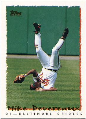
The card: 1995 Topps #23 Mike Devereaux

Why it made the cut...

As one of the few "head over heels" cards I own, it's going to be pretty difficult to knock Mr. Devereaux out of this checklist.

It's easily one of my favorite singles from arguably the most underrated Topps set of all-time.


The card: 1992 Studio #26 Jose Rijo

Why it made the cut...

While '92 Studio is one of the blandest sets on record, it produced an absolute gem with this one.

I should add that this isn't the last time you'll see Jose Rijo mentioned in my frankenset posts. I've received quite a few fantastic cards of his from fellow bloggers over the last few months.

From what I can see, he was one fun-loving individual.

Believe me, this card is just the beginning.


The card: 1993 Upper Deck #27 Dave Nied SR

Why it made the cut...

Today's frankenset page ends with the very first selection of the 1993 Expansion Draft.

Given that 1993 was the inaugural year for Colorado, I'd guess this was one of the first Rockies cards ever printed. (If not the first.)

A highly touted prospect out of the Atlanta organization, Nied would've been the first pick of the draft either way. (The card's back confirms that the Marlins would've taken him if they'd had the initial selection.)

Sadly, Nied never did much during his stint in Colorado, winning just 14 games and sporting a 5.47 ERA in four years with the Rockies.

At best, he'll forever be the answer to a trivia question.

With all the hype surrounding Nied, I have to imagine that this was a fairly coveted card back in the day.

Even though it's simply another common today, Nied's "Star Rookie" issue is still a fantastic piece of cardboard. For starters, it features one of the more awesome backdrops I've ever seen.

Plus, a "tip of the cap" always seems to make cards a million times better.

If you ask me, it's a terrific way to close out the third page of my frankenset binder.

Saturday, June 29, 2013

Missing the days of 29-card packs


My dad has carried on a tradition throughout his lifetime.

Every year, he and a bunch of friends take a trip down to the glorious city of Memphis, Tennessee. Between Beale Street, Sun Studios, and the rather touristy Graceland, it's one of the better vacation spots around.

And, given how much of a music fan my dad is, I'm sure it's like a slice of paradise for him. (That's not even mentioning all the mouth-watering food they have down there.)

As it happens, Memphis is also home to a pretty awesome card shop, to boot. I vaguely remember going there when we took a family trip to Tennessee when I was younger. I do remember getting an absolute boatload of older wax packs at this particular shop, though.

Gratefully, my dad took a detour during his most trip to Memphis a few weeks back to stop at the little card store. He carefully picked out a few miscellaneous packs he thought I'd like.

One of his better finds was a 50-card repack that, due to its inclusion in a half-priced box, cost only fifty cents. (Marked down from its original $1 price tag.)

At such a modest price, I wasn't expecting to find much. Surprisingly, though, a good chunk of it was composed of pre-'81 cardboard.

The above piece for my Amos Otis player collection might've been my best pull of all.


Not to be outdone, this particular repack provided some key additions to a couple of my mini-coillections.

The Reynolds, of course, is a coveted "bat barrel" piece. And the Foli is one of the better "double dip" cards I own. And, ironically, both hail from a set that I'd never much cared for prior to this break.

Perhaps I should start giving 1980 Topps a little more credit.


However, the real treasures from my dad's finds came in the form of bulging overproduction era packs.

Some collectors might scoff at the idea of voluntarily busting assortments of so-called "junk wax".

Not me, though. I absolutely love it. Since I wasn't even born during most of the overproduction era's offerings, I can't say I've had the pleasure of opening many packs from the time period.

That's why these are such an awesome "blast from the past" for me.

I even scanned the wrappers for the purposes of this post. I thought a few of my readers might enjoy the nostalgia they offer.

Up first was a four-pack assortment of 1991 Conlon Collection.


Although I'd already had most of the set, Conlon's inaugural release in '91 is always good for a trip through baseball history.

After all, how often do you see guys named Muddy Ruel these days? Or shots of Hall of Fame second baseman Tony Lazzeri in catcher's gear?

Cards like these are perfect examples of why I will forever be a Conlon Collection fanboy.


As you can probably tell, I was a bit enthusiastic in opening this pack of '94 Score.

One of the things that first caught my attention was just how much cardboard you got for your buck back in the day. As the price tag says, my dad picked this one up for just 59 cents.

However, in the top-right, you can see the original retail price for these 29-card packs. A mere $1.99.

Oh, how I wish we could go back to those days.


Aside from Pinnacle, Score is the one brand that never received their fair share of recognition in this hobby.

They always seemed to produce a perfectly acceptable batch of cardboard, year in and year out. As far as I'm concerned, Score was one of the more consistent brands around at the time.

Their '94 release has long been one of my favorites. Although I pulled quite a few neat cards, the ones you see above were probably the two best.

Thanks to the help of many fellow bloggers, my Darryl Kile collection has nearly doubled within the past few months. Nevertheless, this pack gave me a terrific new piece of the late hero, one that commemorates his September 8, 1993, no-hitter against the Mets.

While it's not the first card I own that features a foul line-leaping Turk Wendell, that particular piece is still makes for a tremendous "frankenset" addition.

As I've found, one cannot have too many Turk Wendell cards.


Next up was a budding 23-card offering of 1993 Donruss.

At just 95 cents, that's one heck of a steal.


While the design isn't all that exciting, I'm still a fan of this set.

After all is said and done, the focus for Donruss in '93 was all about the photography. That's the way it should be.

And, as was the trend at the time, Donruss even gave us a bonus shot on the back as well.

It's amazing that such a fantastic photo of Denny Neagle was warranted to the "flip side" of his '93 Donruss issue.

With a nifty Pirates throwback and an autograph shot, it's an ever-rare "combo" mini-collection need.


This was somewhat like the "holy grail" for my low-end collecting mentality.

Here, we have a 27-card "holographically enhanced" pack of 1993 Upper Deck.

Also known as one of the greatest sets ever made!


As collectors, we tend to disagree on many different aspects of this hobby.

But, at least from my experience, I've found '93 UD to be one of the few near-universal truths of cardboard around.

You'd be hard-pressed to find a collector who doesn't cherish this set. (I'm still waiting for someone to start a 1993 UD set blog, by the way.)

I mean, what's not to like?

I probably could've done a single post each of the 27 cards this pack had to offer. For the sake of brevity, though, let's just focus on the two you see above.

The Jacoby is yet another awesome "flip side" mini-collection need. It's one of the extreme few "argument" cards I've seen in the world of cardboard. Mr. Jacoby doesn't look too pleased with the ump's emphatic "out" call.

Denny Neagle once again makes an appearance in this post. This time, it looks as though he's in the process of emerging from the Wrigley Field ivy.

Shades of Andre Dawson.


As great as a '93 UD break was, though, I think this was the one true gem from my dad's purchase.

For whatever reason, anything Stadium Club-related seems to be a tough find around here. Singles don't seem to pop up all that often, and I don't think I'd ever busted a pack of the stuff before this.

No matter what it contained, I was sure this 14-card "super premium" pack of 1993 Stadium Club was sure to be a blast.

It didn't disappoint.


I can't say I'd ever heard of John Marzano before.

Still, that's one awesome shot right there. That's part of the beauty of Stadium Club, though. It didn't matter how famous anyone was.

With such great photography on Topps' part, you still had the opportunity to become a cardboard legend.

That's not to say that Stadium Club didn't have its occasional slip-up, though.

I very nearly tossed aside that "Members Only" Juan Gonzalez parallel without a second thought. After a few seconds, though, I noticed something interesting.

Topps misspelled his last name. It's incorrectly labeled as "Gonzales" on the front. (Strangely enough, it's spelled correctly on the back.)

An error card!

I know I've been using the word "awesome" quite a bit in this post, but I have to ask.

How awesome is that?


To close things out, I'll leave you with this epic "play at the plate" shot of Mr. Joe Oliver.

Such legendary photography is why I've become such a Stadium Club devotee over the years.

I'm already planning to go with my dad to Memphis next year. It's been way too long since my last visit to such a wonderful town.

And, yes, I'm most definitely planning to hit this very card shop if that comes to fruition.

Until then, though, I'll be basking in the glory of my dad's latest awesome finds for my collection.

Despite what others might have you believe, the overproduction era gave this hobby quite a bit of great cardboard. I hope I've made that point clear in my writings thus far.

If you ask me, it's an era that should be celebrated around collecting circles.

Friday, June 28, 2013

What were they thinking?


I like to think I'm a pretty positive guy.

Of course, I sometimes voice my displeasure with a few things every now and again, but I'm by and large a "glass half full" type of person.

It's a sentiment that's carried over into my love for cardboard over the years.

While I might not like everything on the shelves nowadays, I still try to find every little bit of good I can. No matter how hard I have to try. (Ahem...Gypsy Queen.)

Every so often, though, a set comes along that simply shatters the bottom of the barrel. Those very sets are so bad, in fact, that I can't seem to find a positive word to say about them.

That's what tonight's post is all about.

Yes, as with my collecting habits, I like to keep things fun and positive on the blog as well. But, at times, I think it's healthy to take a look back at some of the absolute worst this hobby has had to offer, if for no other reason than to say...

"At least we don't have to deal with cards like those anymore."

Now, every time I write a post similar to this one, I feel compelled to mention the fact that I'm a fan of 1995 Fleer. Probably the last fan on the face of the Earth, perhaps, but a fan nonetheless.

So, while I know that '95 Fleer is generally regarded as one of the worst sets ever made, you won't see it labeled as such on this blog.

On that note, let's take a look at the "best of the worst" this hobby has given us over the years.


Okay, so maybe there is one positive thing 2004 UD Play Ball had going for it.

The concept.

As a kid, I used to pluck packs upon packs of these out of my local card shops' dollar discount bin. I simply liked the old-time design back then. (I haven't changed much in that regard.)

But, over the years, I've come to realize just how big of a train wreck these monstrosities really were.

It's almost like Upper Deck was trying to give collectors nightmares with those awful retouched photos. I can't be the only one who thinks these look like something out of a bad horror movie.

UD managed to turn a perfectly nice photo of Richie Sexson into some sort of demented ghost somewhere along the production line.

Freaky.


Again, the concept behind '04 Play Ball wasn't all that bad.

I can't say the same about 2008 Topps Moments and Milestones, though. On the contrary, this set may have had the absolute worst concept in the history of cardboard.

See, Topps used certain stat lines for a few players that year. Take, for instance, Jack Cust's 26 homers in 2007.

I have absolutely no idea how this idea was ever green-lighted, but Topps thought it'd be a good idea to make a card for every single dinger Cust hit that year.

So, yes, there are 26 different cards that chronicle one of Cust's 2007 homers, each one numbered to 150 copies. And, if that weren't enough, each of those have other parallels to go along with them, such as black ones limited to 29 copies a piece. And red 1/1s.

A player collector's nightmare, no doubt.


Yeah.

You probably already know about the awfulness of '99 Skybox Thunder. And I really don't feel like delving into the atrocious rap-themed backs they had to offer.

So, for all our sakes, I won't say much more.

Go ahead and read the lyrics for the man they called "Double-U" if you must.


Here's a set that doesn't usually get a lot of play around collecting circles.

Aside from perhaps '95 Fleer, these were perhaps the loudest cards ever made. But, unlike Fleer's LSD-inspired release, I've never seen much charm in the Circa brand.

Between the absurdly large nameplate at the tops, the oddly out-of-place quotes from fellow ballpark figures, and impossible-to-read foil lettering near the bottoms, almost nothing about this set works.

All things considered, I think Circa is a prime case of a set that simply tried too hard.

Then again, I guess you could say that about 90 percent of mid-'90s cardboard.


It'd be hard for me to pick a surefire "worst set ever made".

Right now, I think the dubious honor would have to go to one of the more obscure releases in hobby history.

2001 Fleer Game Time.

While it did give the hobby coveted rookie cards of guys like Pujols and Ichiro, these cards are so ugly that I'm not even sure where to start.

So many random lines and dots and squares and symbols. In fact, these are the only cards I've seen that utilize the obscure "greater than" symbol. (Just below Grieve's name.)

And that's not even mentioning the awful double image concept. Or the weird "caged" photos in the bottom-left corners. I'm guessing Fleer was trying to capitalize on the whole "Matrix" fad at the time.

But they failed.

Miserably.

Not surprisingly, Fleer discontinued the Game Time brand after its lone release in 2001.

Every time I look at one of these things, the same question always seems to pop into my head.

"What were they thinking?"

I don't think we'll ever know for sure.

Thursday, June 27, 2013

The recycling exception


Announcement time!

"Final Four" voting ends tonight, so be sure to have your voice heard! Both of our races are still close. Polls are on the sidebar.

Thank you!

Just like any other era of cardboard history, today's hobby has its fair share of problems.

Collation, failed redemptions, and, of course, the dreaded Topps monopoly are just a few of the concerns I've heard other collectors voice over the past few years.

If I had to pick, I'd say my biggest gripe with the current hobby is one that has snuck up on us rather quickly.

I absolutely hate the fact that Topps feels the need to recycle photos over and over again. I addressed that very concern with my review of this year's Archives release.

True, it's not anything new in the hobby. One of many examples from the past comes from the rather obvious repetition of the same Dick Allen photo in 1970 and '72 Topps.

In my mind, though, it's really starting to get out of control these days. Thousands and thousands of baseball photos are taken in the current game. There's absolutely no reason we need to see the same one more than once.

There's only one exception to the "recycling" fad that has overtaken the hobby. "Campy" there is a nice example, in fact.

No, I don't own an actual copy of his '51 Bowman card. What you see above is a reprint. (Although I'd love to own the real thing one day, of course.)

I've always found it to be one of the more aesthetically-pleasing catcher shots ever snapped.

Luckily, it's not the only time we'd see it in the world of baseball cards.


I'm about 99 percent sure this is the same exact shot that was featured on Campanella's 1951 Bowman issue.

In my dig through my Dodgers binder, I found that this very photo has found its way onto a couple more recent "Campy" issues. Bowman more than likely pasted the shot onto a different backdrop for his '51 Bowman card.

This is the one time I can get on board with the whole "recycling" fiasco.

For whatever reason, I rather enjoy when card companies reuse old vintage photos for more modern cardboard.

And "Campy" is far from the only specimen.


My personal favorite vintage Rod Carew card may well be his '74 Topps issue.

When you get down to it, I'm simply a sucker for neat batting cage shots.

Interestingly, Topps recycled the very same photo for Carew's "Decade Leaders" American Pie insert in 2002.


As I've found, American Pie reused quite a few old Topps photos.

Mark Fidrych was well into the injury-riddled portion of his career by the time 1979 rolled around. That might explain why his '79 Topps card doesn't feature him pitching on an actual mound.

It would've been criminal if "The Bird" wasn't included in Topps' inaugural American Pie set. He pretty much embodies the term, if you ask me.

A zoomed-in example of Fidrych's very same '79 Topps photo was used for his 2001 American Pie piece.

While he might not have been the same "Bird" by 1979, the gold locks were still flowing.


"Catfish" Hunter's card in last year's Archives checklist was awesome for a few reasons.

For one thing, you don't see a whole lot of his cards around these days. Off the top of my head, I'm having a hard time naming any others he's had in the past few years. It's really a shame.

On top of that, "Catfish" never received a card in Topps' 1980 checklist. Although he did pitch in '79, Topps chose not to grant him a true "sunset" piece. As one of the game's all-time greats, I'll never know why.

But, in keeping with the theme of this post, Hunter's Archives card features the exact same shot that was used for his '76 Topps issue.

Topps zoomed in and refined it quite a bit (to the point where it almost looks like a night card), but it's indeed the very same photo.

And, yes, these are proudly displayed right next to each other in my Yankee binder.

I wouldn't have it any other way.


I think my personal favorite example of this phenomenon comes from this particular shot of "Tom Terrific".

His '76 Topps "Record Breaker" card is one of the stranger vintage pieces you'll find. Seaver's piercing stare is awesome in its own right, but that's not what makes it such an interesting issue.

Take a close look at the batter's helmet in the foreground. For whatever reason, it looks heavily airbrushed. Why Topps would choose to mess with the helmet of a fairly unidentifiable player is beyond me.

However, Seaver's 2008 Stadium Club card gives the collector a better look at the very same shot. It doesn't look airbrushed in the slightest this time around.

So, in conclusion...

I still don't know what the heck's going on with Seaver's original '76 issue.

But it's sure nice to see such a cool photo pop up on a more modern baseball card once again.

Don't get me wrong. I'm still wildly against Topps recycling the same photos over and over again of today's stars.

Still, if Topps wants to dip into their archives and reuse shots from old Sandy Koufax or Willie McCovey vintage pieces, they can be my guest.

Even in an era based on glossy cardboard and high-dollar inserts, these are kind of a throwback to the vintage days of the hobby.

That's always refreshing to see.

Wednesday, June 26, 2013

2013 Topps Series 2: Lost in the shuffle


I'm already starting to save for the National.

As a result, I haven't had a whole lot of cardboard rolling in lately. I've had to cut back on flea market trips and pack busting. (Luckily, I don't usually do much of the latter anyways.)

Still, when I heard that Series 2 was on the shelves, I had to treat myself to a little something. I plucked a rack pack from the card aisle at my local Target as a little treat.

By and large, I've always felt that Series 2 gets a bit lost in the shuffle every year.

It doesn't have the beginning-of-the-year hype that usually surrounds Series 1. And it certainly doesn't have the general excitement that seems to swirl around Update.

Nevertheless, Series 2 has earned a great deal of respect from me over the years. It always manages to provide a good bang for my buck.

While the player selection isn't usually what it is in Series 1 or Update, Series 2 is still a perfectly nice set that we should appreciate.

One of the first guys to greet me out of my rack pack was the "Big Papi", as you see above.

If the awesome Red Sox throwback is any indication, it didn't take long to find my first Series 2 masterpiece.


Series 2 gives us our first chances to see some of our favorite players in their new 2013 duds.

That's the first card I've seen of Brett Myers as an Indian, and only my third of Hamilton as an Angel.

Still, I'd very much appreciate if Topps could snap actual photos of guys in their new uniforms. I have no problems with photoshopping a bit here and there, but they've had more than enough time to get shots of these guys in 2013.

Heck. the Hamilton is the same exact airbrushed photo that Topps used for his Opening Day card.

But now we're getting back into the whole "recycled photos" discussion. Most of you probably know how I feel about that.

I don't want to beat a dead horse here.


Airbrushing aside, one of my favorite things about Series 1 involved the sheer amounts of awesome photos Topps used in their checklist.

Although a rack pack is a fairly small sample size, I'd say that the trend has been continued in Series 2. While he may not be a "binder guy", Mr. Gentry made for one of my favorite pulls of the day.

It's a stellar new addition to my "at the wall" mini-collection.


I don't know about you, but I always love a good dugout shot.

Smith's might not be as good as Brandon Inge's Series 1 piece, but it's certainly in the upper echelon in terms of photo quality.

Plus, this is what you could call the ultimate "cameo" card. So many different Oakland A's in one shot.

Including, as it happens, Mr. Brandon Inge himself.


I give Topps a lot of credit for their celebration shots over the past few years.

These "walk-off" home plate shots are among my favorites in the hobby today. A ton of great Reds "cameos" grace the front of Ludwick's card as well.

So, Topps, keep the celebrations coming.

Except the pies in the face, of course.

I'm sick of those.


A couple more nice base cards, courtesy of Series 2.

And, happily, both slot nicely into a couple of my many player collections.

Still, I wouldn't have even shown these...


...had I not pulled their accompanying Target red parallels from my rack pack.

In fact, the third red card I pulled was also the parallel of a base card I pulled in the very same break. (The one not pictured has been set aside for a fellow blogger.)

Coincidence? Perhaps.

Collation issues? More likely.

Still, these do look great in binders.

Especially when I have the base cards to go right alongside with 'em.


We've moved on to the insert portion of this post.

If you busted any Series 1 retail packs, you probably already know that these rather unspectacular foil-based "Chasing History" inserts were exclusive to rack packs.

Well, they're back for Series 2.

Yippee.


Both the "Making Their Mark" and "World Baseball Classic" inserts are new to Series 2.

While I'm glad to add yet another card of Mr. Cespedes to my binders, the "Making Their Mark" series looks to be somewhat of a repeat of the "Chasing the Dream" inserts from Series 1.

It's just another excuse for Topps to shovel more cards of the game's young stars onto the collecting universe.

As opposed to most Series 2 reviews I've read thus far, I'm rather partial to those "World Baseball Classic" inserts. Back when it was going on earlier this year, I'd begged Topps to create a special WBC base set.

Well, as it turns out, they gave us the next best thing. An insert set devoted to the tournament.

I'm still not sure if any members of Team Italy managed to sneak their way into the checklist. I certainly hope so, though.

I can't shy away from an opportunity to chase cards of fellow paisans.


Yep.

The '72 minis are back for Series 2 as well.

However, unlike my largely apathetic attitude towards the "Chasing History" series, I'm more than elated to see these back in the hobby.

This Bautista is certainly a beauty.

While I'm sure I'll bust a bit more of the product sometime soon, that just about does it for my initial venture into Series 2.

Sure, it might not have the fire power that Series 1 and Update command. Most collectors would tell you the same thing.

Nevertheless, it continues to provide me with quite the thrill with each passing year.

I'll always appreciate it for that.

PWE appreciation week


I propose a motion here in the blogosphere.

Sometime in the next week, every blogger in the trading market should pull out a few spare pieces of cardboard, wrap 'em in a PWE, slap on a stamp, and mail them to a fellow blogging buddy of their choice who they'd think would appreciate those very cards.

We'll call it a "PWE appreciation week".

It's just a thought, but it's one that has a lot of history behind it. PWEs have long been an integral part of my trading experience. 

As a broke college student, I rarely have the budget to mail out reams of packages every week. I do what I can, but it's just not always in the cards. (I'm in an exceptional mailing drought as we speak, unfortunately.)

That's where PWEs come into the picture. With the rising cost of bubble mailers, PWEs have continued to hold steady at an affordable price. One stamp (or 46 cents) can net another fellow collector quite a bit of cardboard goodness.

I think that's best evidenced by a few awesome envelopes that arrived on my doorstep a few weeks ago, courtesy of a couple notorious PWE aficionados here in the blogosphere.

The first batch of enveloped cardboard came from Jeff, a friend of the blog and author of the superb "2 by 3 Heroes". While it's still over a month away, I'm pretty sure I'll be meeting Jeff at some point during the upcoming National. I'm excited for that.

Until then, though, he dropped quite a few great cards on me recently. While I'll be keeping the regular UD issue on my "Dime Box Dozen" list for now, I'm certainly pleased to have this '08 Upper Deck First Edition Varitek in my binders.

As you might guess, it's an awesome piece for my new "Award Show" mini-collection, one that features the absolute greatest award of them all.


Here are a couple flip side "pitchers at the plate" that captured my fancy.

For the record, Doug Drabek was a career .166 hitter. Funny, but after seeing that shot, I would've thought it'd be way lower than that.

I can't believe the guy actually hit two homers in the big leagues.


Like the aforementioned "pitchers at the plate" cards, flip sides are always welcome in my mini-collections.

That '95 UD Eric Karros is no exception. And, although I could be wrong, the interviewer on it looks a bit like Joe Morgan. (Although, upon further research, it's most likely not.)

At first, I couldn't quite figure out why Jeff sent me that Smoltz card. I'm not an avid collector of his, and the shot looked like another ordinary pitching action photo at first glance.

That's when I noticed a unique touch on Leaf's part. I can't believe it took me so darn long to notice the cast on Smoltz's left arm. 

I'd certainly never seen that on a baseball card before.


I can't say I'd ever heard of Scott Chiamparino before Jeff dropped this PWE on me.

Still, this nifty '93 Donruss Triple Play piece resonated with my collecting habits on a couple different levels.

1) Chiamparino was a pitcher, which makes his bat pose a part of my "pitchers at the plate" collection. (And, yes, he made the frankenset.)

2) He has one of the most Italian names I've ever heard. I have to do the accompanying hand gestures just saying it.

3) While pictured with the Rangers, Donruss noted that Chiamparino (hand gesture) was drafted by Florida in the expansion draft that year. He'd never play in a single game for the Marlins. (In fact, he'd never pitch again in the bigs after '92.)

In my mind, that makes it a "semi-zero year card".

Awesome.


Another noted legend in the world of PWEs is Kevin, the mind behind the great blog "The Diamond King".

Recently, he managed to drive me to the brink of insanity with a mind-boggling 27 different posts featuring glorious nickel box finds. The cardboard he managed to find for just five cents a piece is simply amazing.

I get giddy (and a bit jealous) seeing other people's terrific dime box scores. But a nickel box?

Like I said...insanity.

We'll get to it in a bit, but I (kind of) claimed the very first card he showcased in that series. Because he's an awesome person, Kevin decided to slip a few non-nickel pieces into the very same PWE.

Deion Sanders's neat 1992 UD "clash of the sports" card is one I've had my eye on for a long time. Even so, I had a bit of a dilemma on deciding which binder should be its home.

Because of the baseball/football combo, I was tempted to put it in my miscellaneous binder, one that features my multi-team and multi-player issues.

In the end, though, I felt it'd have a better home in my official Atlanta Braves binder.

"Neon Deion" is certainly a head-turner when it comes to nine-pocket pages.


The Dickey was pretty much the basis for the first PWE Kevin sent my way.

As I mentioned, it was the very first card he featured in his "nickel box" series. I didn't so much as claim it, per se. More appropriately, I simply expressed my jealousy over finding such an awesome card for a nickel.

Happily, though, I guess Kevin read between the lines. I was ecstatic to see such a great card wind up on my doorstep. I haven't yet tracked down Dickey's regular 2013 Heritage short-print, but I'm hoping to sometime soon.

It'll look great next to that chrome issue in my binders.

And, just for good measure, Kevin decided to add that Garciaparra throwback to the PWE festivities.

Red Sox throwbacks are extremely rare in this hobby.


This one kicked off a second PWE from Kevin, one that arrived just a few days after the first.

Although it may look like two separate pieces in the scan, this is indeed one horizontal card. It features Greg Maddux's famous circle change grip.

It takes me back to Bob Welch's eerie 1991 Score issue. And all the nightmares that went along with it.

At least this one isn't creepy.

Not as creepy, anyways.


These are a couple of especially awesome mini-collection hits.

The Johnson is a neat add to my "behind the camera" collection. In fact, the back notes that he was quite the fan of photography.

Maybe it's just me, but the "Big Unit" doesn't really seem like someone who would be into that sort of thing.

I find it hard to get into the Home Run Derby these days, but I'll certainly take any card that features the event's trophy. Mr. Tejada is holding the very award on his 2005 UD issue there.

I'm not sure what it'll take to get me interested in the Derby again. Shortening the event would help quite a bit. (I'd rather see a longer celebrity softball game anyways.)

And I could really do without Chris Berman announcing the thing.

I get sick of the "back, back, back, GONE!" call after about the second time.


This was the whole reason a second PWE wound up on my doorstep.

Unlike the Dickey, I flat-out claimed Mr. Carlton after I saw it on Kevin's blog. I wasn't about to pass up an opportunity to land such an awesome card.

Yes, it's not the greatest airbrush job in the world. And, true, "Lefty" doesn't look particularly pleased there. (Did he ever?)

Still, the fact that it was Steve Carlton in Giants garb sold it for me. There aren't many cards that feature his brief stint in San Francisco out there.

As it happens, "Lefty" was a Giant for just over a month in 1986, signing with them after being released by the Phillies earlier that year. (He'd sign with the White Sox after the Giants let him go.)

While his tenure in San Francisco was incredibly short, Carlton did manage to notch his 4,000th career strikeout as a Giant. That has to stand for something, I guess.

Before it became a terrific nickel box find, I'd never even seen this particular Topps oddball piece.

But, thanks to a bit of digging and generosity on Kevin's part, it now resides happily within my collection.

Still, it's far from the only one.

See, without the legend that is the PWE, none of these cards would be in my binders as we speak.

I'm sure a lot of you would be missing cherished pieces from your collections without the advent of the PWE.

So, it is for that very reason that I hope you join me for "PWE appreciation week". I already have a couple destinations in mind.

It's the least I could do for those glorious PWEs.

They've given me so much over the years.