Of all the major brands out there these days, you could argue that Archives has the least reason to exist.
It doesn't pay a yearly homage to a single Topps set like Heritage. It doesn't quite fill a niche like A&G. It doesn't offer premium photography like Stadium Club. Archives is a halfhearted tribute to a handful of Topps designs that have (mostly) been reprinted many times over by now. As I sit here thinking now, I honestly can't come up with a single unique thing this set brings to the table.
But while there's not much of a reason Topps needs to keep the Archives brand alive, I do admittedly look forward to it every year for reasons I can't quite put my finger on - which I suppose mirrors a lot of what I enjoy about baseball cards. And since I've already pretty much given up hope of finding any on the shelves, I took the smarter (see: cheaper) route and ordered a hearty chunk of the 2022 Archives singles I wanted for about the cost of a blaster.
Like most sets out there, Archives has some good points and some not-so-good ones - and I've three ups and three downs from my initial scramble through this year's checklist.
+1 - Guys on new(ish) teams!
Topps's massive backloading of sets into the fall and winter months means there haven't been a ton of cards featuring dudes in their new 2022 duds - which seems odd, considering the year's just about over by now.
Archives is among the first major brands to show the bigger names in their fresh uniforms - there's already a good chance Carlos Correa goes down as a prime Short Term Stop for the Twins.
+2 - 1978!!!!!
Like a lot of you, I've been begging Topps to revive the '78s somehow - it's even more of an oversight when you consider Archives has already repeated quite a few designs.
In a prime case of "better late than never," 2022 Archives finally gave us the '78 tribute we've all been clamoring for - the names and colors still look a little off to me but I don't care because WE FINALLY GOT TO SEE 1978 IN ARCHIVES!!!
+3 - Oddball love!
Topps did a nice job in choosing some off-the-wall designs for the SP portion of this year's checklist - these '50s Scoops ones in particular are fantastic - and they have me wondering how much better Archives would be if the whole set was oddball designs.
-1 - Fake backgrounds
I've seen this mentioned on a couple blogs already, but fake backgrounds run rampant in this year's Archives.
I can live with a handful of altered backdrops, but I'd say a good half of the cards I ordered had been tinkered with - it made me feel like I was flipping through someone's 11th grade PowerPoint presentation after a while.
-2 - Too much of nothing
Even from my small sample size, it just doesn't seem like there's a whole lot of memorable stuff in this year's Archives.
I didn't see a single action shot in the '78s I ordered - there were action shots that year, Topps - but I did find a whole lot of grim-faced ballplayers.
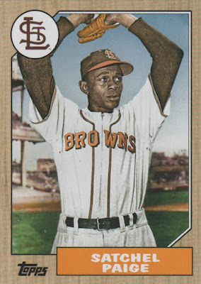
-3 - '87 Topps...again
I don't have the data to prove it, but I'd lay good money on '87 Topps being the most reprinted set in recent memory...and hey, here it is again in 2022 Archives!
Fact is, I like '87 Topps. I really do. But I see absolutely no reason it needs to be anywhere near Archives for the next couple decades or so - especially considering it's already an insert set in Flagship this year. The worst part is that I worry all this overkill is actually making me dread seeing '87 Topps in any way, shape, or form - because like I said, it's a great design in my book. Just not one I need to see 742 times a year.
Safe to say 2022 Archives has some good, some bad, and some ugly - which I suppose is a compliment for a set that really doesn't need to exist in the first place.

.jpg)
.jpg)
.jpg)
.jpg)
.jpg)
.jpg)
Weird they never did '78 but stuff like '87 gets done over and over.. i'll look out for them at Target for ya!
ReplyDeleteI EXPECT MY BRAVES TEAM SET TOMORROW (WAS SUPPOSED TO BE HERE TUESDAY). THE 78'S ARE A PLUS, LOVE THAT AARON PIC TOO.
ReplyDeleteGreat summary of this set. Totally agree with your assessment.
ReplyDeleteI absolutely love the '78 design, but archives isn't doing it any justice with these portraits.
ReplyDeleteI guess the inserts would be the best thing about Archives since they use lesser known or more random designs from their roster. But yes, more variety would be nice.
ReplyDeleteNick:
ReplyDeleteI agree that the 1987 Topps design is the most repeated design I have ever seen.
It does not help much that it was also the first massively produced Topps sets of the "Junk Wax era"
I don't understand why such an over produced set is held in such high esteem to be constantly showcased by Topps.
I'm just glad they dropped that "Here's what our cards will look like in the future" angle that they had last year...
ReplyDeleteThe only reason I'd argue for Archives is their Fan Favorites autographs. They usually have at least 10 guys on their checklist that I'd love to my collection. I guess they could just make it an insert set in their flagship product though. That being said... the Paige and Aaron cards are attractive. I also saw the Johnny Bench on another blog and loved that card too.
ReplyDelete