Sunday, February 22, 2015

The dime box frankenset, Page 52: Numbers 460-468


Yeah...

Win -- 1991 Topps #455 Walt Weiss (25 votes)

Place -- 1976 SSPC #456 Joe Hoerner (6 votes)

Show -- 1996 Score #459 Mark Leiter (5 votes)

...I think we all saw that one coming. Walt Weiss's 25 votes (of 43 total) obliterated the old single-week record of 18 set by Jermaine Allensworth, and for good reason. You could make the case that the Weiss is the best double play card of all-time, which is why it received my tally in a heartbeat.

I felt bad for the other seven contestants on last week's page. A few of them might've had a good chance of winning with almost any other group.

But none of them had a prayer of taking down the almighty Walt Weiss.


I expect the voting to be a lot closer this week.

And, hey, we're back to a full nine with this page.

Let's meet the nominees.


1996 Score #460 Tony Pena

The lighter side of baseball cards.


1990 Upper Deck #461 Rob Murphy

The primitive days of the laptop. 


1996 Upper Deck #462 Luis Sojo

I hope you replaced that base when you were done with it, Mr. Sojo. 


1994 Upper Deck #463 Mickey Morandini

Double dipping with a Tony Gwynn cameo. 


1994 Upper Deck #464 Frank Castillo

Probably the only card I have of a pitcher donning the hallowed warmup jacket. 


1997 Upper Deck #465 Andy Benes

Looks like this pitcher has the bunting form down pat.


1996 Score #466 Jose Lima

Lima Time signing for fans at the old Tiger Stadium. 


1995 Stadium Club #467 Delino DeShields

Another autograph session. 


1973 Topps #468 Tom Griffin

We close with another spectacular gem from 1973 Topps, the unquestioned vintage MVP of this frankenset.

The polls are now on the sidebar.

Happy voting!

Saturday, February 21, 2015

Prep work: Birthday edition


I think I'm old enough to realize that birthday's don't get the hype they once did in my life.

I celebrated my 23rd birthday this past Thursday. While it was nice getting the well wishes from family and friends, the day went by without much fanfare. And I was completely fine with that.

Still, I'd be lying if I said there wasn't still a little inkling to celebrate on my birthday. Luckily, I'll be getting that chance tomorrow. 

As it happens, a semi-local card show just happened to fall on my birthday weekend. It's about an hour away, and, since I'm not generally a fan of driving long distances, I don't hit it that often. But I think I can make an exception for my birthday.

Yes, this is the same place where I found the penny cards last February. My parents were (once again) nice enough to shoot some extra cash my way for my birthday this year so I could hit tomorrow's show.

Here's hoping they have penny cards again.


My favorite thing about this show is the fact that I get to meet up with my buddy Jeff from "2x3 Heroes."

We met up last February and we're planning to get together again at the National this summer, but tomorrow will be a nice little interlude before then. Jeff, if you're reading this, I have a hearty stack of Sox and others for you.

I don't know how many of you have met up with one of your fellow bloggers over the years, but, if you get the chance, I'd definitely recommend doing so.

There's nothing like digging through cards with a fellow cardboard fanatic.


As far as size goes, this show is way smaller than the big tri-annual one I hit every year.

In terms of selection, though, the two really aren't that different. The smaller shows usually have the more low-end collectors in mind, which means that almost every table usually has something for me. It's a far cry from the bigger show, where about nine-tenths of the vendors are there to profit on their HITZZZZZZ.

Because of that, I feel confident in setting a few goals to accomplish tomorrow. Perhaps my biggest focus will be knocking out some of my 2015 Topps insert needs. I picked up the rest of the base I needed thanks to a Just Commons order, but I still need a slew of inserts.

I may not care for many of the designs, but card shows are still a great way to pick them up on the cheap.


Now that people are fully into the 2015 card season, I figure it might be a good time to try and mop up some of my remaining 2014 needs.

I still need quite a few base from Stadium Club, A&G, Archives, etc., and I'm hoping I can knock some of those out tomorrow.

But especially Stadium Club.

My goodness...I'm still reeling over how awesome that set was.


I'll be on the hunt for Kellogg's, Hostess, and pretty much any oddball I can get my hands on tomorrow.

But, if you read this blog at all, you probably knew that already.


Since it's my birthday and all, I feel motivated to make at least one big pickup tomorrow.

I think the most expensive card I bought at this show last year was the '61 Topps Billy Martin you see above. It cost a whole three dollars. 

Here in Dime Boxedonia, I consider "high-end" to be anything five dollars and over. I'm planning on picking up at least one of those biggies tomorrow. I don't know what that fateful card will be, but I'll know it when I see it. Because even the most low-end collectors need a big splash every once in a while.

After all, what fun is a birthday if you can't treat yourself?


Aside from that, I'll just kick back and let the card show take me wherever it may.

That's pretty much my philosophy with most shows. All I can do is plop down in a folding chair (or stand if the vendor doesn't have one available), and let the dime boxes work their charm.

I'm probably most excited about the fact that my dad will be accompanying me to tomorrow's show. He wasn't with me when I went last year. I've tried to describe this show to him many times over the past 365 days, but he'll finally get to see it for himself.

I'll do my best to bring the show to life for the rest of you on this blog as well. Camera phones come in handy at card shows.

Here's hoping for some birthday magic tomorrow.

Thursday, February 19, 2015

February 19th and me


Let's take a look at some notable February 19th events.

1473 -- Noted astronomer Nicolaus Copernicus is born.


1878 -- Thomas Edison patents the phonograph.


1940 -- Music legend Smokey Robinson is born.


1957 -- Fireballer Dave Stewart is born.


1981 -- George Harrison is ordered to pay $587,000 to ABKCO Music for "subconsciously plagiarizing" the melody from the Chiffons' "He's So Fine" for Harrison's "My Sweet Lord."

(The Quiet One wrote a great song about the ordeal.)


1987 -- A's outfielder Josh Reddick is born.


1997 -- Miles Davis receives a star on the Hollywood Walk of Fame.


1999 -- The soon-to-be cult classic Office Space is released in theaters.

(This card -- appropriately #219 in the '83 Topps checklist -- shown due to Mike Armstrong's striking similarity to Milton Waddams.)


2015 -- Cubs pitchers and catchers (along with several other teams) report to Spring Training as the wind chills hit -25 in Chicago.


Oh, and this dime box nut was born in the wee hours of the morning on February 19th, 1992.

Here's to another twenty-three years of dime box hunting!


Wednesday, February 18, 2015

Can you hear me now?


Hello?

Hello?

Can you hear me now?


[fuzz]

Hello? Steve?

Oh, yeah. I hear you now. I was wondering -- 

[fuzz]

Steve? You there?

[click]

Hold on, I have another call coming in.

Hello?

Hello?


Brian? Steve? It's Todd.

Brian?

Steve?

[fuzz]

Hello?


[fuzz]

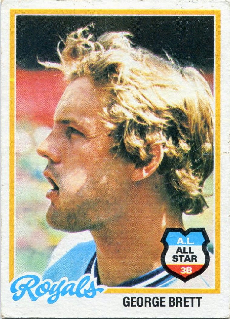
Hello? Who is this? Who's there? It's Brett.

Hello? Hello?

I can't hear anything.

These damn fans behind me won't stop with the "Your Mama" jokes.


This is Eddie from the bullpen.


Eddie! For the millionth time, get off the line! No one invited you!

Steve? Brian? Todd? Anyo--

[click]


Is your refrigerator running?

Well, you better go catch it!


Papi, is that you again? 

It is, isn't it?!?!

[fuzz]

Papi?!

I KNOW WHERE YOU LIVE!


Guys?

Guys?

Anyone?

[fuzz]


[silence]


Rickey's here.

Rickey's a Padre now.

Rickey's wearing sunglasses.

Rickey's got to have the most expensive phone.

Rickey's never losing his signal.

Rickey's -- 

[fuzz]


Rickey, shut up!

Is anyone there?

Anyone?


This is Cal.

Hello? 

[fuzz]

Steve? Brian? Manny, are you there? Mike? Rickey, you have to be there. No? Roberto?

IS ANYONE THERE?!

Stupid cell phones.

No one's ever going to use these things.

[hangs up]

----------------------------------------------------------------------

This is what I imagine a '90s cell phone conversation sounded like.

Can you tell I'm running out of post ideas?

Monday, February 16, 2015

Searching for Ultra


Fleer Ultra was one of those brands that always kind of bubbled under the surface.

It made the rounds in the hobby for a full seventeen years, although I'd bet a lot of collectors don't even know it lasted half that long. Ultra was never the flashiest or most storied brand out there, but I've always felt that it deserved much more recognition than it got over its long career.

It all started back in 1991. Trying to capitalize on the UD-driven "high-quality" card craze, Fleer birthed an entirely new brand called Ultra. With a name like that, the expectations were clear. This was supposed to be a game-changing set.

I've always thought of Ultra as Fleer's response to Topps Stadium Club, but the two were actually first created in the same year. I guess it was just a coincidence that both of the "high-quality" sets took off in 1991. Unlike Stadium Club, however, it took a while for Ultra to get on its feet.

Between the gray borders, strange Ultra logo, and plain white text, the brand's first release in 1991 was a far cry from what we'd see in later years.


Ultra came out swinging the next year.

To me, 1991 was kind of like a test run. This is probably the first set I think of as purely Ultra-esque. The "swoosh" Ultra logo that was introduced in '92 would be used until the brand's dying days in the late 2000s.

These aren't quite full bleed, but they're closer to what Ultra would produce down the line. The photography is solid (again, a sign of things to come), and the design is very economical.

It seemed like the sky was the limit for Ultra.


And then 1993 came along.

If 1992 and 1993 Ultra seem like one in the same to you, you're not alone. I get these two mixed up all the time. Even after a number of years in the hobby, I still can't tell the difference off the top of my head. It may be the most obvious example of a company plagiarizing itself.

Other than a little more liberal use of foil and the fireball in the 1993 Ultra logo, these two designs are pretty much exactly the same.

Even though I wasn't there to see it first hand, I'll bet a lot of collectors at the time soured on the Ultra brand after such blatant laziness and ineptitude.


The next three years of Ultra didn't help matters much.

Sure, these are all original designs, but they sure are boring. And, while I don't think the people at Ultra ever put a lot of effort into layouts and such, the photography in Ultra's early years wasn't good enough to make us ignore the blandness.

If I try to think of 1994, '95, or '96 Ultra, I come up blank. I had to head to the Internet to remember what each of these looked like because they're simply not memory-burning sets. You don't see much of mid '90s Ultra anywhere these days, either. I only have a handful of each.

The one thing that Ultra's "Dark Ages" did have going for it was the fact that it began the transition into vivid, full-bleed designs. That said, there were still some kinks to work out. A lot of kinks.

By 1996, it was obvious that Ultra needed a big shot in the arm.


That's exactly what collectors got the very next year.

The bland, archaic block text of 1996 Ultra was replaced by shiny, cursive font in '97. I don't know if the photography changed that much between 1996 and '97, but the rainbow ribbons of the latter sure make the images pop a lot more.

I'm vehemently opposed to cursive on cardboard about 95 percent of the time, but 1997 Ultra is one of the extreme few sets that actually manages to make it work. In fact, it's probably my favorite design in the entire Ultra catalog.

And, perhaps more importantly, it began what I consider to be a Golden Age for the Ultra brand.


While they stuck with the cursive, Ultra ditched the rainbow foil the following year.

I don't particularly like the sans-shiny script, but, to me, 1998 was when Ultra really started to kick it up a notch in the photography department.

There are some glimpses of greatness in the years beforehand, but '98 was the first to offer solid image after solid image without much of a break in between.


That trend continued the next year.

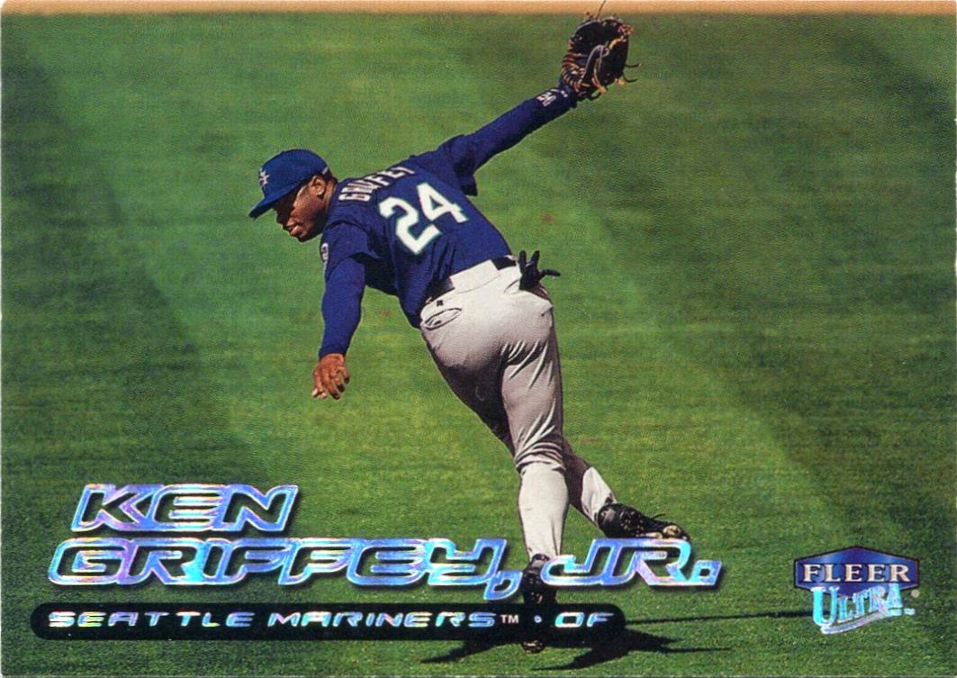
Though it didn't quite pop as much as it did in '97, 1999 Ultra marked a return to rainbow foil. If this Maddux masterpiece is any indication, the brand was firing on all cylinders at this point.

All we seem to hear about here in 2015 is Stadium Club, Stadium Club, STADIUM CLUB!!!!! I'm as guilty as anyone else. But what sometimes gets lost to history is the fact that Ultra was right on par with Stadium Club by the time the '90s were coming to a close.

Pound for pound, there wasn't much difference between the two.


Ultra kept throwing haymakers as the world moved into a new millennium.

Strictly in terms of photography, 2000 might have been the cream of the crop for Ultra. I've dug and dug and dug and I'm sure there are still a ton of fantastic images flying under the radar in this set.

I think Ultra knew that the cursive script was becoming a little stale. Even though they switched to more block-like text, they knew enough to keep the rainbow foil.

Ultra couldn't be stopped.


They responded with yet another gem in 2001.

The beautiful, action-packed photography was still intact. Ultra stuck with the block letters/rainbow foil combo, but, learning from the 1992/1993 fiasco, made it fairly distinguishable from the year prior.

Unfortunately, it would be the last truly great set Ultra would create.


Only now am I realizing how many parallels can be drawn between Ultra and Stadium Club.

Both were born in 1991. Both went through a Golden Age in the late '90s. Both started fizzling out right around 2002 or so. (Unlike Ultra, though, Stadium Club would be revived later on.)

It seems like Ultra tried to copy Topps in 2002 with the ugly gold-foil-over-a-dark-background look. The quality of the photography took a noticeable dip as well.

Maybe it would only be a hiccup.


Sadly, no.

The end was near for Ultra, and I think the last handful of unimpressive designs show that. Between the foil, clashing colors, and oddly large uniform numbers, 2003 is probably the only over-the-top layout in the Ultra catalog.

It became obvious that the brand was on life support.


The 2004 and '05 Ultra releases actually aren't too bad, but they kind of fell into the 1992/1993 trap of looking almost exactly the same.

I still have a hard time telling these two apart. And, while I can appreciate Ultra trying to capture the cursive glory days of the late '90s, there was just something missing from these two designs. I can't put my finger on exactly what it was.

The glory days were gone.


Ultra's last two releases were even less exciting.

While the designs may be painfully bland, I'll always have a bit of a soft spot for Ultra's final years. I broke back into the hobby in late-2005/early-2006, and I bought a decent amount of both of these sets during those first years.

I always see dozens of packs of 2007 Ultra in the $1.49 section of my local Target. I'll still pull the trigger on one every now and then, even if I know the design isn't anything special. I owe it to Ultra.

If anything, I praise Fleer for sticking with the brand until the bitter end. As Donruss had done two years before, Fleer waved goodbye after 2007, closing the book on Ultra's long and fruitful seventeen-year run.

I guess I wrote this post because I like to honor parts of this hobby that don't otherwise get a lot of pub. Even after seventeen long seasons, Ultra almost seems to be all but forgotten here in Topps-heavy 2015. The brand may not have always been perfect, but seventeen years of anything is worthy of a standing O.

It's about time Ultra gets the credit it deserves.