Friday, August 23, 2013

Covering the Bases, Pt. 10: The inaugurals


I've always had an obsession with firsts.

I couldn't tell you exactly why, though. It's just another niche in my endless quest for useless trivia. All I know is that if it's a first, I'm interested.

Firsts are especially fascinating when it comes to baseball. Off the top of my head, I can tell you who hit the first homer in National League history (Ross Barnes), who pitched the first known perfect game (J. Lee Richmond), and who the first catcher to sport shinguards was (Roger Bresnahan).

See, little things like that are what drive my thirst for baseball knowledge.

Cardboard also has its fair share of great first as well, obviously.

One of my favorite things to do is go back and look at the very first designs for some of the hobby's most prominent card companies.

They're almost like "pilot episodes" for baseball cards. Most of the time, it's only a faint glimmer of what that particular brand would go on to become. But, in hindsight, you can spot clues of its future greatness. (Much like the Seinfeld pilot, I must say.)

In tonight's "Covering the Bases" topic, I'll be ranking the inaugural designs for nine major brands.

For sanity's sake, I've decided to omit offshoot sets like Topps Stadium Club, Collector's Choice, etc. (With one possible exception, as you'll soon see.)

I've also decided to leave out pre-war sets like Goudey, T206, and Play Ball, because...well, I don't have any cards from most of those inaugural releases.

For now, we start at #9 with a rather two-faced brand of baseball cards.


#9 -- Bowman (1989)

Yes, I know Bowman got its start way back in the late '40s.

However, I've decided to nominate the set's grand return in 1989 as their unofficial inaugural release for a couple reasons.

Like a lot of other older sets, I simply don't own any cards from Bowman's first official release in 1948. (Although I hope to one day.)

Plus, I think the 1989 release served as the basis for the Bowman we know today. Rookie-based, mostly boring photos, stuff like that.

I've gone on record saying that the ugly, oversized '89 Bowman checklist is my least favorite set of all-time. While it's starting to get some competition from 1990 Donruss, it's still right at the bottom of the barrel.

Just, ick.

All around.


#8 -- Pacific (1993)

Again, there's a bit of a question as to when the Pacific brand really started.

Officially, they put out quite a few stellar "Legends" and Senior League sets throughout the '80s and early '90s.

For this post, though, I've decided to go with their first foray into the current game of baseball in 1993. The Spanish-based checklist isn't widely remembered these days. (None of Pacific's efforts are, really.)

I'll admit, I almost forgot about the little old Pacific brand while prepping for this post. And even after I remembered it, I didn't think I had anything from their first official release in '93.

Luckily, Alan Trammell swooped in to save the day.

Cards from Pacific's inaugural set in '93 are usually tough finds. Even so, they're not all that exciting. Not awful, but not overly flashy.

Just a generally average set.

I guess it's not surprising that '93 Pacific is all but forgotten these days.


#7 -- Ultra (1991)

This is the one semi-offshoot set I decided to include in this list.

From its start in 1991 to its demise in the mid 2000's, the Ultra brand was run by Fleer. Because it lasted so long by doing its own thing, though, I've come to think of it as an entirely separate set. It's not Fleer Ultra to me.

It's just Ultra.

The brand's first set in '91 is another one of those under-the-radar releases from the overproduction era.

Ultra's inaugural effort has a few flashes of greatness, but they're relatively few and far between. The Joyner is near the top as far as photography goes. (As is this one, I might add.)

I could be wrong on this, but I'm pretty sure Ultra was regarded as a semi-high-end set back in the day.

With a name like that, you kind of have to be.


#6 -- Upper Deck (1989)

I already said most of what I have to say about '89 Upper Deck in yesterday's post, so I'll keep it brief here.

While many of UD's future hallmarks were present in their first high-end release in '89, I think it was one of the more average efforts in their two-decade history. Not surprisingly, it ranks right near the middle on this list.

I'm still not sure what possessed the folks at Upper Deck to use this rather unsightly shot of Mr. Valenzuela, though.

The one on the back would've been so much better.


#5 -- Donruss (1981)

Famously, Donurss was one of two card companies to enter the hobby in 1981.

After nearly three decades of pretty much having the hobby all to themselves, Topps finally received a bit of legitimate competition. It's the main reason I mark '81 as the beginning of the "modern era" for cardboard.

From what I've read, the people at Fleer and Donruss didn't have a whole lot of time to prep for their first releases in 1981. Considering that, the inaugural design for Donruss was a pretty darn good one.

Rushed photos are a big drawback from the time crunch they had to work around, as out-of-focus and just generally subpar shots are common within their first checklist.

However, I still rank the inaugural design as one of the best in Donruss history. I'm an avid supporter of color-coded borders. And between the team name, player name, and position, the fronts tell you everything you need to know without being intrusive.

And, hey, there are a few hidden gems in this checklist as far as photography is concerned.

The high leg kick/Wrigley Field backdrop combo on Vida Blue's 1981 Donruss issue has long been a personal favorite.


#4 -- Score (1988)

Score's first set might've been their best one.

I know other collectors might not be huge fans of the concept, but I applaud the different colored borders that Score used in their early years. If I were a set builder, I'd imagine any late '80s/early '90s Score cards would look great together in a binder.

Plus, yellow is a vastly underused color in this hobby. Save for '91 Fleer, I can't think of another set that used it so prominently. (Plus, something about yellow just fits with Mookie Wilson. I'm not quite sure why.)

The only downside I can see with '88 Score is the little white box that they shoved onto each photo. I never quite saw the point of those. They'd look a whole lot cleaner without 'em.

I say this about a lot of individual sets, but I think the Score brand as a whole never got its fair due. Considering they had to deal with cardboard giants like Topps, UD, Fleer, and Donruss during much of their decade-long run, I guess that's not much of a surprise.

To me, Score was always a force to be reckoned with.


#3 -- Fleer (1981)

Some of my ties to '81 Fleer are emotional.

One of the first card-related purchases I can ever remember making involved a giant stack of these from a local flea market for a few bucks. Many of those, like Mr. Oliver, are still in my collection to this day.

It's a set I've known ever since my childhood.

But, taking emotions aside, '81 Fleer is still pretty darn nice. I've always been a fan of the team name baseball. And, again, color-coordinated borders are always a huge plus for me.

It was basically a dead heat between Score and Fleer for the third spot on this list.

In the end, Fleer ranked higher because of that hallowed childhood purchase.


#2 -- Topps (1952)

Yeah, yeah.

I know technically the first Topps cards were the '51 Red and Blue back sets. As famous as the '52 design might be, it wasn't actually the true beginning for Topps.

Unfortunately, I don't own anything from the '51 Topps set. I can't say it's from a lack of effort, though. Most are just out of my price range.

Besides, many collectors generally agree that 1952 was the first "official" Topps release. For the purposes of this post, that'll serve as their inaugural year.

Although it's only my fourth or fifth favorite Topps design of the '50s, the soon-to-be famous company did a nice job with their first mainstream effort.

The nameplates, team logos, and facsimile signatures were innovations that would dominate the hobby in the years to come. As did the genius idea of putting stats on the back of these '52s.

Being the first official Topps set and all, it's quite possible that the iconic '52 Topps might be a tad overrated. But that's not taking anything away from them. They're still sweet pieces of vintage goodness.

The Mize is one of just three cards I own from the groundbreaking '52 checklist.

Not a bad 21st birthday present, I'd say.

Speaking of which...


#1 -- Pinnacle (1992)

The number one set on this list came out the very year I was born.

To me, Pinnacle is still the single greatest first set we've seen to this day. And it's not even all that close.

The darkness. The (again) color-coordinated nameplate. The nifty photography. It's all there.

And I especially like how each photo seems to pop out of the frame. It makes Dave Winfield seem like a giant. (Then again, Winfield was a giant.)

The Pinnacle brand wasn't around for very long, but it managed to do a great deal of damage during its time in the hobby.

From what I've seen, Panini recently revived Pinnacle for 2013 in a very unceremonious piece of news over the last couple weeks. Sadly, I haven't been impressed with what I've seen so far.

I guess it's silly to think that the brand could ever return to what it once was.

As far as firsts go, Pinnacle is at the top of the class.

Thursday, August 22, 2013

When Upper Deck ruled the world


I kind of wish I was around back in 1989.

Most collectors probably didn't know it at the time, but the hobby was about to go through a massive amount of change in the coming years.

And it was all thanks to a little company called Upper Deck.

Simply put, UD revolutionized the hobby, taking it in a completely different direction. Being able to see all that change on the ground floor is why I would've liked to have been collecting back in '89.

Collecting baseball cards has never been boring to me by any means, but I'm sure things were especially exciting after Upper Deck's grand break into the hobby.

Although Topps was on a fairly strong run at the time, UD certainly proved to be a worthy competitor in 1989.

As evidenced by this terrific night shot of knuckleballer Charlie Hough, Upper Deck's checklist featured some of the greatest photography the hobby had seen at that point. Plus, the little hologram on the backs prevented counterfeiting, which was a big concern for collectors back then.

Did Upper Deck's very first release do the unthinkable?

Did they actually top Topps right off the bat?


I don't think so.

Upper Deck's first release is a great set, but I like '89 Topps just a tad better. The photography was nice, the color-coded borders were a great touch, and the design is an absolute classic.

It's no accident that it'll serve as the template for the special insert minis in 2014 Topps.

This close-knit fight wasn't the only one for Topps and Upper Deck, though. In fact, it was just the beginning.

While other companies like Donruss, Fleer, and Score put out some decent sets in the '90s and 2000s, it was basically a battle between Topps and UD over the next two decades.

And, while Topps was the grizzled veteran, the young, hotshot Upper Deck still bested the unquestioned king of the hobby quite a few times.

Going over the 20-plus years both companies were in the baseball card industry, I went back and looked at just how many times UD came out on top in the year-in, year-out competition.

To me, these are the years that Upper Deck raised the banner over Topps.


1990

After a couple great sets in '89, both UD and Topps produced complete busts in 1990.

Continuing with the "baseline" theme that they established the year before, Upper Deck produced an similar design in 1990. Unfortunately, it paled in comparison to its inaugural release.

Still, in my eyes, Topps might've hit their absolute low in 1990. Try as I might, it's a set I've never particularly liked. Boring design, boring photos, just boring in general.

In 1990, Upper Deck pretty much won by default.


1993

After a nice two-year run by Topps, Upper Deck pulled out the big guns in 1993.

Most collectors will tell you that '93 marked the absolute pinnacle for Upper Deck. I tend to go by that train of thought.

Between the amazing photography, clean design, and large checklist, 1993 Upper Deck is one of my favorite sets of all-time. UD made some nice sets both before and after '93, but none even come close to matching their greatness that year.

Still, Topps was no slouch in 1993, either. I've always thought '93 Topps was one of the more overshadowed sets of the overproduction era. I rather like the banner nameplate they incorporated into the design that year.

That said, it pales in comparison to 1993 Upper Deck.


1997

The mid '90s were a fairly dark period for Upper Deck.

UD's 1994 release was a far cry from their legendary '93 checklist. Their 1995 release wasn't much of an improvement. And '96 might just be my least-favorite UD design ever.

Topps, meanwhile had a nice little run of sets in the early '90s, one that ended with one of their most dismal efforts in 1996. Still, since I don't particularly care for '96 UD, Topps took the nod there.

By the time 1997 came around, it was clear Upper Deck wanted to step up their game, and they did so in monumental fashion. As far as I'm concerned, their "dated" 1997 checklist is superior to all their other sets but one. (1993, of course.)

Meanwhile, Topps was digging themselves a deeper hole in 1997. The drab borders and hard-to-read font makes for a worthy candidate for "Worst Topps Set Ever".

In what might have been the biggest blowout during the two-plus decades they were in the hobby, Upper Deck absolutely trampled Topps in '97.


2000

The new millennium marked another victory for Upper Deck.

Neither company made particularly nice sets in either 1998 or '99, but I had to give Topps the slight edges in both years.

Topps continued their average string of checklists in 2000, with what might be their absolute most average set. It's a set that's always been just...there for me. I've never really had much to say about it. Not bad, not good. Right smack dab in the middle.

Upper Deck, however, rolled out a perfectly nice set in 2000. While the nameplates aren't exactly scan-friendly, it's a nice set as far as photography goes.

I still think it's one of the more underrated releases in their catalog.


2002

Upper Deck had one of their finest hours in 2002.

I absolutely love the white nameplates UD used that year. They give the cards a rather sophisticated feel, which, in this instance, I like. And, of course, Upper Deck did a nice job with the ever-important topic of photography in '02 as well.

Topps, on the other hand, hit a bit of a bump that year. The foil lettering can be awfully tough to read at times. Plus, I've never liked the dark orange/gold border choice.

And I've never understood why Topps felt the need to stick that "2002 Topps" decal onto these. It's like they thought we'd forget what year it was or something.

Upper Deck earned the nod in a heartbeat.


2006

This was probably UD's slimmest margin of victory.

Both Upper Deck and Topps produced some of their finer sets of the decade in '06.

For a while, I thought I liked Topps better. Their 2006 checklist helped reintroduce me to the hobby after a year-long collecting phase, so I'll always appreciate it for that. Similar to 1993, the banner-like nameplate is a nice touch.

In the end, though, I have to give the victory to Upper Deck. They somehow managed to mix a 1200-plus-card checklist and a ton of stellar photography into one single set. I still don't know exactly how they did it.

I'm still finding new gems to chase from '06 UD.

And I'm sure that'll continue for years to come.


2007

This is another case where Upper Deck simply won by default.

While I bought a lot of it, I was never fully on board with Upper Deck's 2007 checklist. The claustrophobic design does have a few gems, but it wasn't one of the more well thought-out efforts on their part.

That said, 2007 Topps was even worse. Black borders can be hit-and-miss at times, and '07 Topps missed by a wide margin. Not to mention they scan worse than almost any other set in history.

It's probably one of my five least favorite Topps designs ever.

So, yes, Upper Deck gets the victory here.

But take that with a grain of salt.


2008

As it turns out, 2008 would be Upper Deck's last victory over Topps.

The 2007 and '08 Topps sets might be the the worst two-year run they've ever had. At least they rebounded with a great '91 set after the subpar 1990 design.

I like 2008 Topps a bit better than '07, but not by much. They really dropped the ball with the photography that year. I think that's more a product of the rather overbearing borders, though.

Upper Deck, meanwhile, had their last moment in the sun in 2008. It's still one of my personal favorite releases in UD history. Nice, clean, basically everything you'd want in a modern set.

Unfortunately, after a couple decent releases in 2009 and 2010 (the latter of which was an unlicensed checklist), Topps won the ultimate battle.

They flat-out knocked Upper Deck out of the hobby, starting their almighty "Topps monopoly" in the process.

I don't know about you, but I'm about ready to see UD make a comeback in the world of cardboard. If the past is any indication, they certainly know their way around the hobby.

Plus, I think it's about time someone gave Topps some competition.

Why not Upper Deck?

GPA


I start school on Monday.

On the one hand, I'm looking forward to it. Since I'll be starting at a new school, it's almost like one giant college do-over. New people, new teachers, new classes. New everything.

But, then again, it's school. Although my schedule probably won't be too taxing, it still means less time for other things, like my collection.

One of the downsides of the school year is that I don't usually get the time to soak in many of the new cards I get. That's especially true when it comes to trade packages.

During the summer, I can pretty much dig through my new cards as much as I want. Over the past few months, I've spent a good deal of time simply glossing over new cardboard I've received in the mail.

One such doozy of a trade package came a few weeks ago from Adam, author of the great blog "The Topps Baseball Fanatic". He's been hoarding Topps cards since '92. (His words, not mine.)

Oddly enough, though, one of the cards Adam sent came from a UD-branded set with the above Collector's Choice Jordan, a former "Dime Box Dozen" need of mine.

I'm an avid collector of any baseball pieces of "MJ". What makes this particular shot so interesting. however, is the fact that it actually features a photo of someone taking a photo of Jordan. Strange.

Plus, I don't think I've ever seen a briefcase on a baseball card before.


As great as the Jordan is, though, the vast majority of the other cards Adam sent helped knock out a bunch of my 2013 needs.

I love getting more recent cardboard because...

a) They're a blast to go through.

b) It saves me money, and...

c) It saves me money.

So, since school is starting soon, (and the fact that I'm running out of things to say about 2013 products), I've decided to grade some of Topps' efforts so far this year. (The aforementioned Jordan receives an A+, by the way.)

On its own, this Series 2 Brian Roberts certainly warrants an A. He seems rather shocked at the umpire's call on (what I assume was) a Bryce Harper stolen base attempt.

But how does the rest of Series 2 stack up?


Adam ended up sending over about 30 Series 2 cards I needed.

In keeping with Topps' Flagship theme so far in 2013, it was just one great photo after another. I'm loving the Helton celebration shot and the "double dip" Alexei Ramirez. Oh, and let's not forget the magnificent PATP/throwback combo on the Quentin.

Topps did a nice job with the player selection in this set as well, which is a lot more than I can say about most of their other releases.

Guys like Jose Molina deserve recognition in this hobby just like everyone else. According to my binders, he's had exactly three cards issued in the last three years. And they've all come from Flagship checklists.

Overall, Series 2 is a great effort on the part of Topps.

Final grade:

A


As I've said time and time again, the concept for Archives is a great one.

I wish someone would tell Topps that, though. They don't seem to give two you-know-whats about it. Reused photos, subpar designs, and ugly trademarks are some of this set's major flaws. I'm still not quite sure why Topps chose to honor the 1990 design this year.

Nevertheless, Archives does show flashes of greatness at times, a signal of what it one day could be. The McCutchen is superb. And I love the sky blue-yellow color combo for the Rays on the '85 design. It's very '80s, if you ask me.

Still, if I were grading a set like this, I'd have to give it a "Needs Work!" note at the top of the page.

In big, thick red ink.

Final grade:

B-


On to Gypsy Queen we go.

I especially like getting GQ cards in trade packages because I don't plan on buying anymore of these things. While I'm not a huge fan, I do still need quite a few GQs for my myriad of player collections.

Trades and the occasional card shows are my only hope.

If you ask me, the design is probably the worst of any current product. And, as far as recent guys go, the player selection isn't much to write home about, either. With guys like Hamilton and Fielder, it's basically still the common suspects.

I do like the selection of retired players Topps incorporated into this set, though. You don't see Don Sutton in too many checklists these days.

Unfortunately, the retirees are about the only thing Gypsy Queen has going for it, which isn't too great considering it's, you know, a current set.

Final grade:

C


Adam knocked out my last six Heritage base needs with his trade package.

He also whittled my Opening Day wants to a mere few with the three you see at the bottom of this page.

While I didn't like the 2013 edition as much as past releases, this year's Heritage was still a mighty fine set. I think it might've helped me warm up to the original '64 design a little bit, too.

As far as the base cards go, Opening Day is more of the same. A nice set with wasted potential, in that most of the photos are simply reused in Series 1 and/or Series 2.

If anything, Topps should maybe consider releasing Opening Day before the actual baseball season starts.

Final grades:

2013 Topps Heritage: B+

2013 Topps Opening Day: B


Adam was nice enough to send a budding stack of 2013 inserts along as well.

While I like the original '72 design much better than the '87s, I enjoy 2012's '87 minis better than this year's '72s.

I'm not quite sure why.

Maybe it's because Topps is oversaturating the mini market these days. Or maybe it's because Topps, for whatever reason, chose to repeat the '72 design in this year's Archives.

Probably a little of both.

Final grade:

B+


The inserts in Gypsy Queen are way better than the base cards.

Even if the design itself is a bit bland, the "No-Hitters" series is a decent concept. Once again, though, the effort seems to be lacking on the part of Topps.

The "Dealing Aces" cards, however, are easily the best things GQ has going for it. It's easily one of the better insert series we've seen so far in 2013.

Plus, that throwback Tigers jersey on Mr. Verlander is mighty fine.

Final grades:

"No-Hitters": B-

"Dealing Aces": A


I happen to be in the pro-World Baseball Classic camp.

It's tough to get a real feel for how the rest of the baseball community feels about the WBC, but it seems quite divided. I sure had a blast rooting for Team Italia this year.

At the very least, I'm glad Topps gave the event its own insert checklist in Series 2. Even if the design isn't all that great and that gosh-darn foil is nonexistent on my scans, it's still nice to see a Team Venezuela jersey on a baseball card.

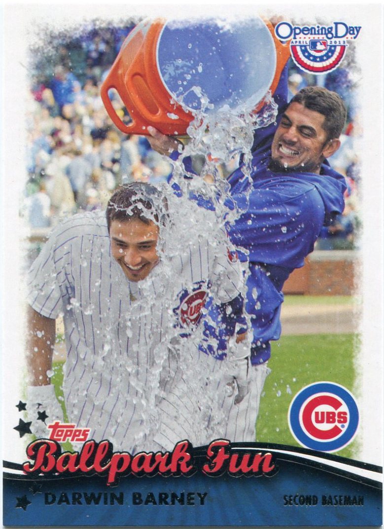
Call me crazy, but I think this year's "Ballpark Fun" inserts from Opening Day might be my sleeper pick for "Insert Set of the Year". They're a great break from all the standard "action" shots we're used to seeing by now.

And, more than that, they're a great reminder that Topps can still produce great, budget-friendly cardboard if they put their minds to it.

If only, if only.

Final grades:

"World Baseball Classic": B

...


"Ballpark Fun": A+

Hey, my beloved Cubbies don't get many chances to celebrate these days.

It's good to see guys like Matt Garza and Darwin Barney basking in the joy of a rare win.

If you total it up, Topps' GPA for 2013 thus far is probably somewhere in the B range, which isn't too bad. They haven't been perfect this year by any means, but Topps is still doing a decent job.

I honestly don't know how my grades would compare with those of other collectors. I bet GQ is a solid D to many. Or maybe even an A to others.

Still, since I'm planning to pursue a teaching degree in the coming years, I guess I might as well get the hang of this grading thing now.

Wednesday, August 21, 2013

Cleaning out the garage


Up until this year, local garage sales were never exactly a goldmine for cardboard.

I'd see some every once in a while, sure. But everything I found was along the lines of wildly-overpriced 1989 Topps or 1990 Donruss boxed sets.

Aside from a couple successes in years past, I've mostly come away empty-handed from garage sales.

My luck seems to be changing this year though. In probably my greatest find ever, I scored real vintage cards of "Hammerin' Hank", "The Mick", and others for a staggering price.

As it turns out, that wasn't all the garage sale gods had in store for me.

Last weekend, my dad wanted to hit a local garage sale. The ad he'd found advertised records, singles, etc. An avid record collector, my dad managed to find a decent stack of 45s from the boxes this garage sale had on display. (Bargain hunting is in my genes.)

While my dad was doing his thing, I decided to take a stroll through the vendor's front lawn. It had your usual garage sale accessories. Tools, books, DVDs, that kind of stuff. Soon afterward, however, I found something spectacular.

Baseball cards!


According to my dad, cards were nowhere to be found in the ad for this garage sale.

It was just by pure luck and chance that I happened to stumble upon this particular display of cardboard.

There they were, though. Two boxes of individually-priced singles, grouped by player.

Under normal circumstances, the cards would've been a tad overpriced for my liking. However, this particular sale was offering a "buy one, get one free" deal on the cardboard. Seeing that, I dug in with glee.

All in all, I ended up finding 31 cards for a meager eight bucks, which comes out to about a quarter each. Not overpriced in the slightest.

Including the one at the top of the post and the piece you see above, six of those cards featured Mark Grace, probably my favorite Cub to collect.

Plus, between the mid '80s Sutter, the wacky late '90s cards of "Gracie"...


...and quite a few more recent issues, these boxes did indeed have a little of everything.

Both of these fill spots in my new Kemp and "CarGo" player collections.


Most of the guy's inserts and parallels were way overpriced.

But these two, for whatever reason, were carried fairly reasonable price tags. For what amounted to around a quarter, I'll definitely take a neat refractor of "Joey Bats".

A red parallel from the long-lost Turkey Red set, the Randy Johnson is an absolute beauty.

It's not often you see cards of "The Big Unit" from his brief Astros days.


What would a discount bin be without a few mini-collection hits?

Between Mr. Glavine at the plate and a rather heroic shot of "The Big Hurt" signing for a few lucky fans, this haul certainly had its fair share of those.


What?

Did I do it again?

Did I find another authentic vintage piece of "The Mick" at some garage sale?

Well...no. This is actually an ad for some sort of Mantle-themed sweepstakes from 1996 Topps.

Probably a mere filler card to some other collectors.


But not me.

Both of these are truly spectacular reprints of cards I'll probably never own.

And since they were advertisements at the time, I'm sure a lot of collectors just threw these out back in 1996. Which means that they're probably not all that easy to find these days.

I sure know I'd never seen them before this garage sale came along.


I wouldn't say I collect either Larry Walker or the late Kirby Puckett, but the photography on these was just too good to pass up.

Not surprisingly, they both come from the stupendous '93 Upper Deck checklist.

And we all know how great that set is.


Almost involuntarily, I've found myself picking up mullet cards recently.

It's not on the Mitch Williams level, but Mr. Glavine has a bit of a party going on in the back there. Thankfully, that hairstyle didn't stay in style very long.

Seeing as how I don't collect him, I'm not sure why I took a peek through this guy's stack of Jason Giambi cardboard. I'm glad I did, though, because it ended up resulting in one of my more interesting finds of the afternoon.

Those particular Oakland jerseys struck me as odd. I'm no uniform expert, but I couldn't ever remember the A's sporting all-white duds in the past.

After a little research, I found that they wore those for exactly one game on July 4th, 1999. (Which explains the red, white, and blue color combo.)

One game!

Little nuggets like that are what make the discount bin life so rewarding.


I'm at a loss for words in describing this one.

But I'll give it a shot.

Featured on this masterpiece is former World Series hero Joe Carter in a spectacular 1940's Negro League Kansas City Monarchs throwback, complete with a bat that looks to be about from that same era.

Just adding to the legend of this amazing piece is the Negro League crowd in the backdrop. Pure genius on the part of the Studio brand.

I've never seen a card run with the "throwback" theme as much as this one does.


Finally, we have what was easily the most shocking find of the day with Fergie here.

As the last card I needed to complete my "sunset" collection of his, it'd been sitting on my "Dime Box Dozen" list for the past month or so.

And now, from quite an unlikely source, I now have an '84 Fleer Fergie Jenkins in my collection. The "sunset" quest is now complete.

I went through thousands and thousands of cards at the National without even so much as a hint of it.

And yet Fergie and a whole bunch of other awesome pieces managed to show up at some local garage sale a few blocks from where I live. On a day where I wasn't even expecting to find any cardboard, to boot.

You just can't make this stuff up.

Tuesday, August 20, 2013

A hoot and a half


Before I became a blogger, the Dodgers seemed like a lost and faraway franchise.

Sure, I'd see their highlights on TV every once in a while. But I sure couldn't tell you anything about their top prospects or bullpen anchors or anything along those lines.

I can't say any of my few baseball-loving friends cared much about the Dodgers. And I didn't run into many Dodger fanatics on the forums. I was practically devoid of anything Dodgers.

Upon joining the blogosphere, however, I was absolutely blown away. Anything I could or would ever know about the Dodgers (card or non-card related) was being written around here on a daily basis.

As of right now, I probably know of at least four or five Dodger-centric blogs. And I'm sure there are a few more floating around that I haven't found yet.

From the title of this post, I'm sure you've guessed what this post is about by now. Why, yes, it's a great assortment of cardboard I received from the man at the forefront of the Dodger fan base here in the blogosphere, Greg of "Night Owl Cards".

As I've mentioned over and over again, Greg is the one who first introduced me to this whole blogging business. You probably wouldn't be reading this post about him without...well, him.

After nearly six years in the blogosphere, the man certainly knows his way around a trade package.

Here's a nice "behind the camera" shot of the observing Andres Galarraga, courtesy of the '95 Skybox Emotion brand.

Goodness, what an odd set that was.


While his Dodger-centric collection might not be all that random, Greg has shown that he's able to help out a crazy collection like mine from time to time.

Here's former Rockie first baseman Jim Tatum doing...something with his bat. I can't say I've ever seen that particular instrument before, certainly not on a baseball card. It's something wood bat-exclusive, I'm guessing.

We used aluminum bats in Little League. I still hear that familiar ping sound in my head a lot, but I couldn't tell you the first thing about applying pine tar or whatever that thingy is on Tatum's card.

Part of me wishes we got to use wood bats back then.

Ping.


I can't say the Listash fits snugly into any of my various mini-collections.

But it's a card I love anyways. Like the Tatum, I'm not quite sure what's going on there. But that sense of mystery draws me to it all the more.

The Wade, however, makes for a nice "At the Wall" addition. Although I'm having a hard time believing he actually made a game-saving catch at the wall there. A very minor league effort by the photographer.

Actually, I guess that's kind of fitting for a minor league set.


Whether recent stars or HOFers, I always love adding cards to my player collections.

That X-themed parallel (from, you guessed it, Upper Deck X) helps me add to my most prominent collection with Vlad. The Williams, meanwhile, is a beautiful new piece for both my Cubs and Cooperstown themes.

Yes, I actually just described a Gypsy Queen card as beautiful.

I need help.


These are a couple of the greatest cards Greg has ever sent me.

You don't see a whole lot of cards featuring "The Great Bambino" during his Red Sox pitching days too often. Much less amazingly colorized shots like that one. Another great new addition to my HOF collection, without a doubt.

The Conlan is as well, although in a slightly different manner.

After two unspectacular years as an outfielder with the White Sox, Jocko Conlan would go on to have a Hall of Fame career as an umpire, the first modern "man in blue" to be inducted into Cooperstown. (His umping career actually started by accident, funny enough.)

Conlan's prestigious 25-year stint as an ump in the National League made his two-year playing stint in Chicago all but forgotten. That's the first card I've ever seen of him in a White Sox uniform.

I didn't even know any existed before this package came along.


Being a Dodger fan and all, Greg was gracious enough to donate a few of his extra Matt Kemps to my new player collection of his.

It's a task that's actually budding quite well. I'm up to 50 different Kemps as of this writing.

A lot for me, but probably a mere fraction of Greg's and other Dodger fans' Kemp collections.

As long as great writers like Greg and other Dodger fanatics keep blogging, it's safe to say that the Dodgers are going to be part of my daily reading for as long as I'm a part of this place.

And I'm more than okay with that.

I look forward to hearing about guys like Matt Kemp in the years to come.

Thanks, Dodger fans.